
PIVOTs

Dive into everything about Excel pivot tables. From basic setup to advanced calculations, pivot charts, and data modeling — find tutorials, tips, and real-world examples to master pivots and transform your data analysis.

CUBEVALUE & CUBESET: Query Data Model from Formulas

Understand how Excel CUBEVALUE and CUBESET functions work with Power Pivot and data models in this practical tutorial. Learn how to retrieve specific values, define member sets, build dynamic reports, connect formulas to slicers, and create flexible dashboard calculations. Ideal for Excel users, analysts, finance teams, and Power Pivot learners who want to build advanced reports using cube functions.


DAX SUMX & AVERAGEX: Iterative X‑Functions Explained

DAX SUMX & AVERAGEX: Iterative X‑Functions Explained

Understand how DAX SUMX and AVERAGEX work in Power Pivot with simple, practical examples. This tutorial explains iterator functions, row-by-row calculations, calculated totals, weighted averages, and when to use SUMX or AVERAGEX instead of regular SUM or AVERAGE. Ideal for Excel users, analysts, finance teams, and Power Pivot learners who want to build more accurate and flexible DAX measures.

DAX RANKX: Ranking with Ties & Custom Order

DAX RANKX: Ranking with Ties & Custom Order

Understand how the DAX RANKX function works in Power Pivot with practical ranking examples. This tutorial explains how to rank sales, products, employees, customers, or categories, handle ties, use ascending or descending order, and build dynamic ranking formulas based on filter context. Ideal for Excel users, analysts, finance teams, and Power Pivot learners who want to create accurate ranking calculations in DAX.

DAX ALL & ALLEXCEPT: Remove Filters for Advanced Calculations

DAX ALL & ALLEXCEPT: Remove Filters for Advanced Calculations

Understand how the DAX ALL and ALLEXCEPT functions work in Power Pivot with simple examples. This tutorial explains how to remove filters, keep specific filters, calculate grand totals, create percentage-of-total formulas, and control filter context in Excel Power Pivot. Ideal for Excel users, analysts, finance teams, and Power Pivot learners who want to build more flexible and accurate DAX calculations.

DAX EARLIER Function: Row‑by‑Row Calculations in Power Pivot

DAX EARLIER Function: Row‑by‑Row Calculations in Power Pivot

Understand how the DAX EARLIER function works in Power Pivot with simple row-by-row calculation examples. This tutorial explains row context, calculated columns, nested calculations, ranking logic, and common EARLIER use cases in Excel Power Pivot. Ideal for Excel users, analysts, finance teams, and Power Pivot learners who want to build stronger DAX formulas and understand how calculations work across rows.

Power Pivot KPI feature image showing a PivotTable with four regions where North has 102% attainment and a green traffic light, South has 82% and a yellow light, East has 67% and a red light, and West has 98% and a green light, alongside the three status threshold zones (Bad below 80%, Neutral 80-95%, Good 95%+), the Total Revenue DAX measure, the five-step KPI creation path through Power Pivot Manage, and six example pills including Revenue vs Budget, Customer Satisfaction, Defect Rate lower-is-better, and YoY Growth.

Power Pivot KPIs: Create Key Performance Indicators with Icons in Excel

A KPI in Power Pivot is more than a number — it is a comparison with a visual verdict. You define a base measure (Actual Revenue), a target (Budget Revenue), and two threshold values that divide performance into bad (red), neutral (yellow), and good (green). Power Pivot calculates the ratio automatically and displays a traffic light, arrow, or star icon in the PivotTable alongside the value and the goal. No conditional formatting setup is needed — the logic lives in the data model and updates on every refresh. This guide covers the full five-step creation workflow, the three KPI components, how to handle reversed thresholds for metrics where lower is better (defect rate, churn), Year-over-Year growth KPIs with a zero baseline, Sales Attainment with star rating icons, and the correct way to display Value, Goal, and Status fields together in a polished PivotTable layout.

Power Query Fuzzy Matching feature image showing a company name match table where Microsoft Ltd matches Microsoft Limited with a similarity score of 0.82 in green and IBM UK fails to match IBM United Kingdom at 0.68 below the 0.75 threshold in yellow, a Transformation Table panel showing Ltd mapped to Limited and Corp. mapped to Corporation, a five-step threshold selector from 0.9 strict to 0.5 risky, and six example pills including company name matching, self-merge deduplication, product normalization, and performance at scale.

Power Query Fuzzy Matching: Merge Tables with Approximate Text Joins

“Microsoft Corp.” in one table. “Microsoft Corporation” in the other. A standard merge returns zero matches. Fuzzy matching solves this by joining rows based on similarity rather than exact equality — you set a threshold between 0 and 1, and any pair scoring above it is treated as a match. The Transformation Table feature takes this further, letting you pre-map known abbreviations (Ltd → Limited, Corp. → Corporation) so they match exactly before the similarity calculation even runs. This guide covers the five-step fuzzy merge workflow, the similarity threshold selector, when to use the Transformation Table, a self-merge technique for finding near-duplicate names within a single table, product name normalisation, performance strategies for large datasets, and a frank assessment of when cleaning the data first with Trim, Text.Lower, and exact replacements is a faster and more reliable alternative to fuzzy matching.

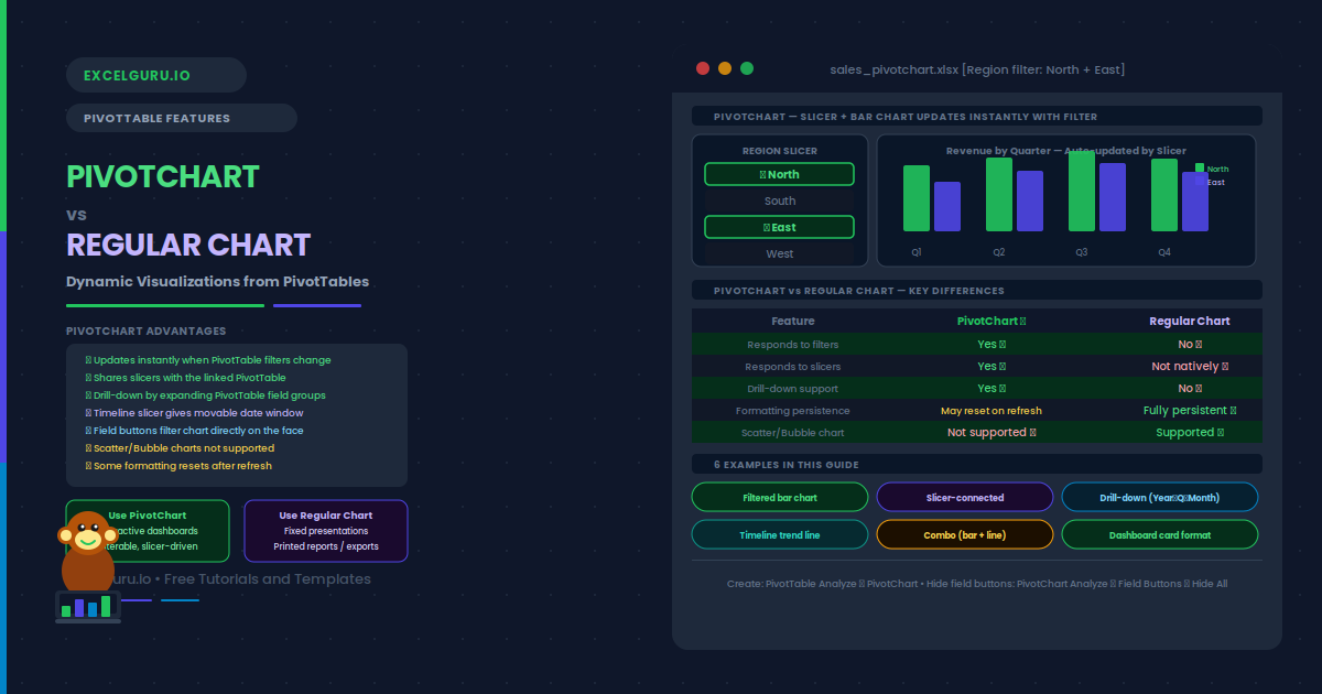
PivotChart vs Regular Chart in Excel — showing a Region slicer with North and East selected driving a live bar chart with quarterly revenue grouped by region in green and indigo bars, a five-row feature comparison table marking PivotChart with green ticks for filter response, slicer support, and drill-down and Regular Chart with red crosses for those same features, six example pills from filtered bar chart through combo chart and dashboard card, and a how-to note for creating a PivotChart via PivotTable Analyze.

PivotChart vs Regular Chart: Dynamic Visualizations from PivotTables

A regular chart reads a fixed range and stays fixed. A PivotChart is linked directly to a PivotTable — every filter, slicer click, and field expansion instantly redraws the chart with no manual editing required. Change the Region slicer from All to North and East, and the bars update in real time. Expand a Year node and the quarterly breakdown appears automatically. This guide explains exactly how PivotCharts work and how they differ from regular charts, with a clear decision rule for choosing between them. Six practical examples cover: a filtered column chart that updates with PivotTable filters, a slicer-connected chart shared across multiple PivotTables, a drill-down hierarchy chart from year to quarter to month, a dynamic trend line driven by a Timeline slicer, a Combo chart pairing revenue bars with a margin percentage line on a secondary axis, and a polished dashboard card with field buttons hidden and formatting locked. It also explains why Scatter and Bubble charts are not supported in PivotCharts and how to work around this using GETPIVOTDATA.

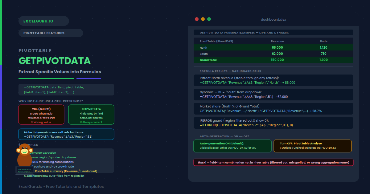
GETPIVOTDATA in Excel tutorial showing how to extract specific values from PivotTables using dynamic formulas

PivotTable GETPIVOTDATA: Extract Specific Values into Formulas

Stop manually searching through PivotTables for individual numbers. This practical GETPIVOTDATA tutorial shows you how to extract specific values from a PivotTable using formulas that reference fields, items, and filters. Learn the GETPIVOTDATA syntax, how to build dynamic references, retrieve values based on multiple criteria, and troubleshoot common formula errors. You’ll also see how GETPIVOTDATA can make financial reports, KPI dashboards, management summaries, and recurring Excel analysis more reliable and easier to maintain. Ideal for analysts, accountants, finance professionals, auditors, and advanced Excel users who work with PivotTables.

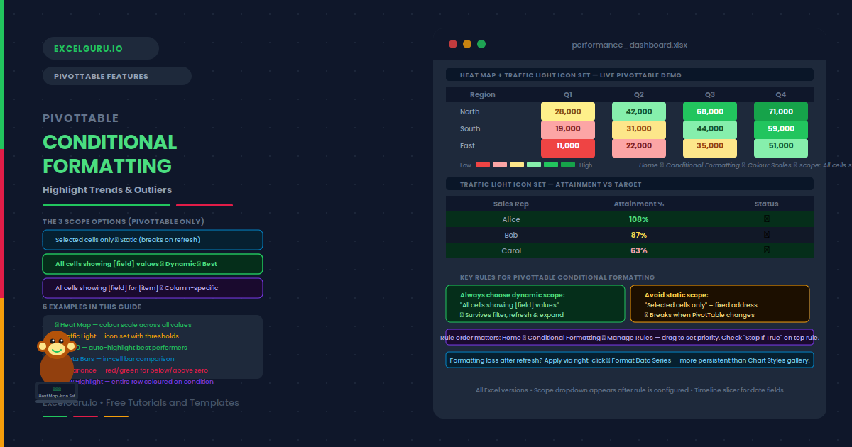
conditional formatting in PIVOT Table - complete tutorial blogpost.

PivotTable Conditional Formatting: Highlight Trends & Outliers

A PivotTable showing 200 rows of revenue data tells you everything and nothing at once. Conditional formatting changes that — it applies color scales, icon sets, data bars, and threshold rules automatically, so outliers and top performers become visible at a glance. The key is choosing the right scope. Using “Selected cells only” creates a static rule that breaks the moment you filter or refresh the table. Using “All cells showing [field] values” creates a dynamic rule that follows the data everywhere it moves. This guide covers all three PivotTable scope options, with six practical examples: a green-yellow-red heat map across all revenue cells, a traffic light icon set with exact percentage thresholds, a Top 10 auto-highlight that recalculates on filter, data bars for in-cell visual comparison, a positive/negative variance rule pair, and a formula-based row highlight with a warning about its limitations.

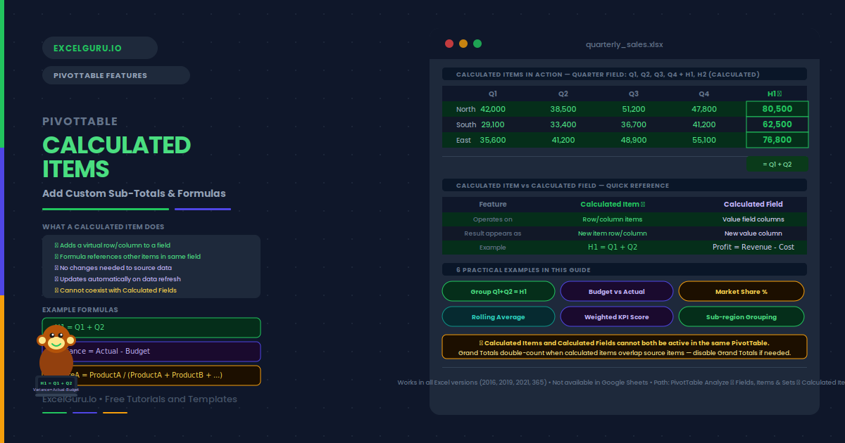
Blogpost tutorial on PivotTable Calculated Items: Add Custom Sub-Totals and Formulas Without Changing Your Data

PivotTable Calculated Items: Add Custom Sub‑Totals & Formulas

Your PivotTable shows Q1, Q2, Q3, and Q4. You want a row for H1 (Q1+Q2) and another for H2 (Q3+Q4) — without adding columns to the source data. Calculated Items make this possible. Each one inserts a virtual row or column. Its value comes from a formula referencing other items in the same field. The result appears in the PivotTable as if it were real data, but it lives entirely inside the PivotTable itself.

This guide explains what calculated items are and how they differ from calculated fields. It also covers creation, editing, and deletion. You will learn when to use them, what their key limitations are, and six practical examples. Examples include grouping quarters into halves, computing market share, and creating a budget‑versus‑actual variance row.

PIVOT Table Tutorial in Excel Blogpost Feature Image

PivotTable Tutorial: From Beginner to Data Analyst in 20 Minutes

Master Pivot Tables in Excel with this complete beginner-to-advanced tutorial. Learn how to summarize, analyze, and transform raw data into meaningful insights using simple, practical steps. Whether you’re starting out or aiming to become a data analyst, this guide helps you unlock the full power of Pivot Tables for smarter decision-making.