pub » Page 30 of 70 » excelguru.io

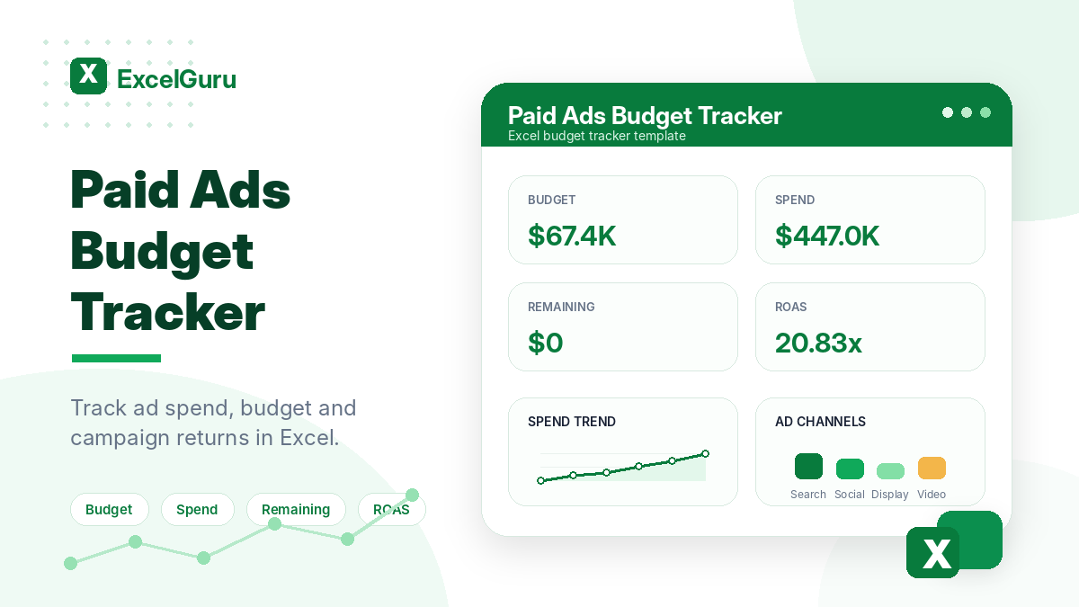
Paid Ads Budget Tracker Excel template preview with KPI cards for budget, spend, remaining budget, and ROAS in a clean green ExcelGuru-style design.

Paid Ads Budget Tracker

Track and control your paid advertising spend with this free Paid Ads Budget Tracker Excel Template. Monitor planned budget, actual ad spend, remaining budget, impressions, clicks, conversions, CPC, CPM, CTR, CPA, ROAS, and campaign performance in one clean Excel dashboard. Ideal for marketers, agencies, and business owners managing Google Ads, Meta Ads, LinkedIn Ads, TikTok Ads, or other paid media campaigns.
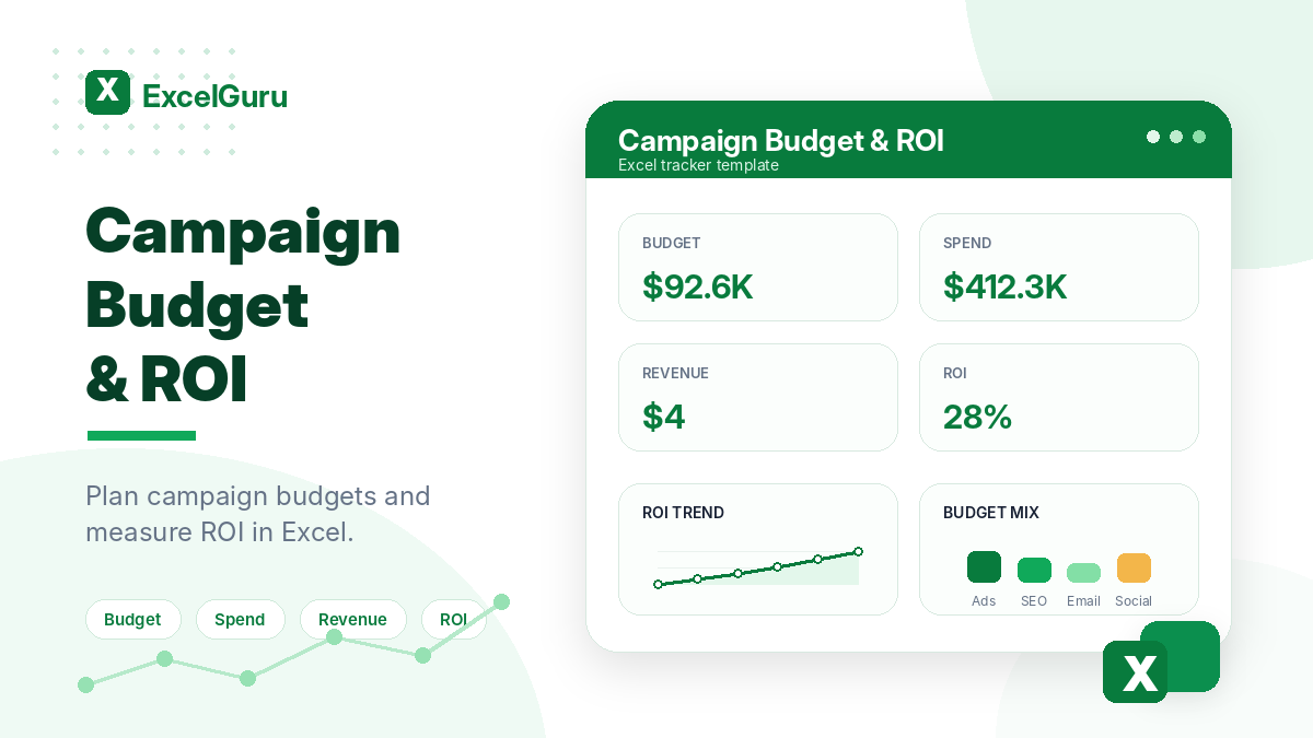
Campaign Budget and ROI Excel template preview with KPI cards for budget, spend, revenue, and ROI in a clean green ExcelGuru-style design.

Campaign Budget and ROI

Measure campaign profitability with this free Campaign Budget and ROI Excel Template. Track planned budget, actual spend, campaign revenue, ROI, ROAS, cost variance, and performance by campaign in one easy-to-use Excel file. Ideal for marketers, agencies, founders, and business owners who want a simple way to compare marketing spend against returns and make better budget decisions.

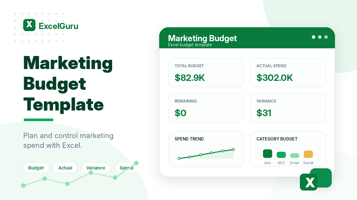
Marketing Budget Excel template preview with KPI cards for total budget, actual spend, remaining budget, and variance in a clean green ExcelGuru-style design.

Marketing Budget

Plan and control your marketing spend with this free Marketing Budget Excel Template. Track campaign budgets, actual costs, remaining budget, monthly burn rate, owners, timelines, and key performance indicators in one clean Excel dashboard. Ideal for business owners, founders, agencies, and marketing teams that need a simple, editable budget tracker for better planning and reporting.

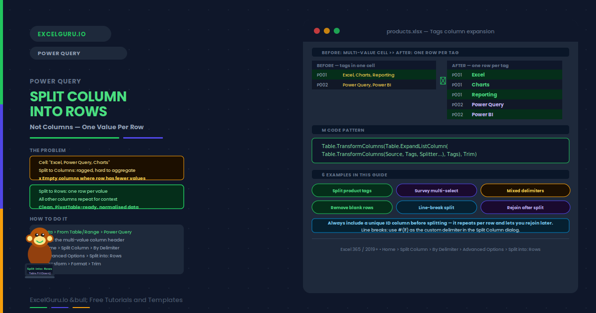
Power Query Split Column into Rows feature image showing a before-and-after comparison where a cell containing "Excel, Charts, Reporting" for product P001 is expanded into three separate green-highlighted rows (one per tag), alongside the five-step process, the M code pattern using Table.ExpandListColumn, six example pills including product tags and survey multi-select, and a tip to always include a unique ID column before splitting.

Power Query: Split Column by Delimiter into Rows (Not Columns)

When a cell holds “London, Paris, Berlin” and you need three separate rows, Split Column into Rows is the answer. Unlike Split to Columns — which creates a wide, ragged table with empty cells — splitting to rows stacks every value vertically under the same header. The result is clean, normalized data that works perfectly with PivotTables and Power Pivot relationships. This guide walks through the full five-step process, explains how to handle comma, semicolon, and line-break delimiters, shows how to remove blank rows caused by trailing delimiters, and covers six worked examples including product tag expansion, multi-select survey answers, mixed delimiter handling, and a rejoin-after-split pattern for tag popularity scoring.

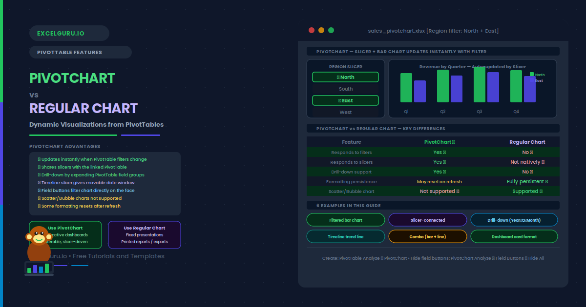
PivotChart vs Regular Chart in Excel — showing a Region slicer with North and East selected driving a live bar chart with quarterly revenue grouped by region in green and indigo bars, a five-row feature comparison table marking PivotChart with green ticks for filter response, slicer support, and drill-down and Regular Chart with red crosses for those same features, six example pills from filtered bar chart through combo chart and dashboard card, and a how-to note for creating a PivotChart via PivotTable Analyze.

PivotChart vs Regular Chart: Dynamic Visualizations from PivotTables

A regular chart reads a fixed range and stays fixed. A PivotChart is linked directly to a PivotTable — every filter, slicer click, and field expansion instantly redraws the chart with no manual editing required. Change the Region slicer from All to North and East, and the bars update in real time. Expand a Year node and the quarterly breakdown appears automatically. This guide explains exactly how PivotCharts work and how they differ from regular charts, with a clear decision rule for choosing between them. Six practical examples cover: a filtered column chart that updates with PivotTable filters, a slicer-connected chart shared across multiple PivotTables, a drill-down hierarchy chart from year to quarter to month, a dynamic trend line driven by a Timeline slicer, a Combo chart pairing revenue bars with a margin percentage line on a secondary axis, and a polished dashboard card with field buttons hidden and formatting locked. It also explains why Scatter and Bubble charts are not supported in PivotCharts and how to work around this using GETPIVOTDATA.

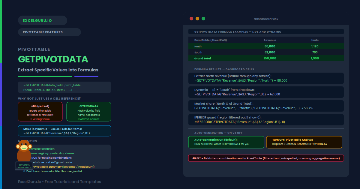
GETPIVOTDATA in Excel tutorial showing how to extract specific values from PivotTables using dynamic formulas

PivotTable GETPIVOTDATA: Extract Specific Values into Formulas

Stop manually searching through PivotTables for individual numbers. This practical GETPIVOTDATA tutorial shows you how to extract specific values from a PivotTable using formulas that reference fields, items, and filters. Learn the GETPIVOTDATA syntax, how to build dynamic references, retrieve values based on multiple criteria, and troubleshoot common formula errors. You’ll also see how GETPIVOTDATA can make financial reports, KPI dashboards, management summaries, and recurring Excel analysis more reliable and easier to maintain. Ideal for analysts, accountants, finance professionals, auditors, and advanced Excel users who work with PivotTables.

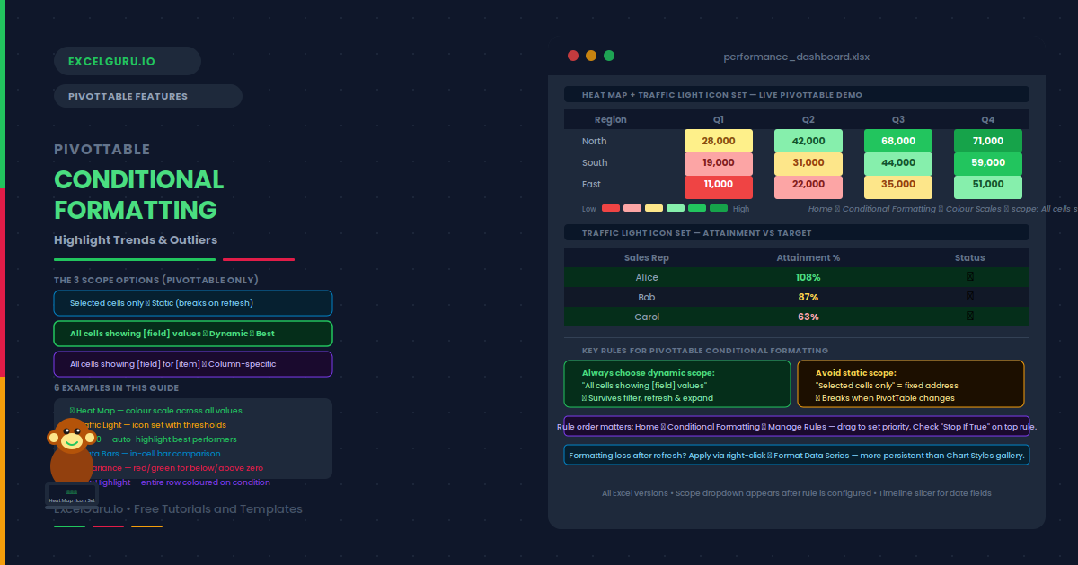
conditional formatting in PIVOT Table - complete tutorial blogpost.

PivotTable Conditional Formatting: Highlight Trends & Outliers

A PivotTable showing 200 rows of revenue data tells you everything and nothing at once. Conditional formatting changes that — it applies color scales, icon sets, data bars, and threshold rules automatically, so outliers and top performers become visible at a glance. The key is choosing the right scope. Using “Selected cells only” creates a static rule that breaks the moment you filter or refresh the table. Using “All cells showing [field] values” creates a dynamic rule that follows the data everywhere it moves. This guide covers all three PivotTable scope options, with six practical examples: a green-yellow-red heat map across all revenue cells, a traffic light icon set with exact percentage thresholds, a Top 10 auto-highlight that recalculates on filter, data bars for in-cell visual comparison, a positive/negative variance rule pair, and a formula-based row highlight with a warning about its limitations.

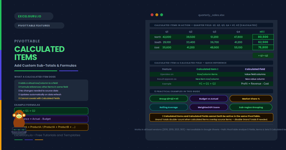
Blogpost tutorial on PivotTable Calculated Items: Add Custom Sub-Totals and Formulas Without Changing Your Data

PivotTable Calculated Items: Add Custom Sub‑Totals & Formulas

Your PivotTable shows Q1, Q2, Q3, and Q4. You want a row for H1 (Q1+Q2) and another for H2 (Q3+Q4) — without adding columns to the source data. Calculated Items make this possible. Each one inserts a virtual row or column. Its value comes from a formula referencing other items in the same field. The result appears in the PivotTable as if it were real data, but it lives entirely inside the PivotTable itself.

This guide explains what calculated items are and how they differ from calculated fields. It also covers creation, editing, and deletion. You will learn when to use them, what their key limitations are, and six practical examples. Examples include grouping quarters into halves, computing market share, and creating a budget‑versus‑actual variance row.

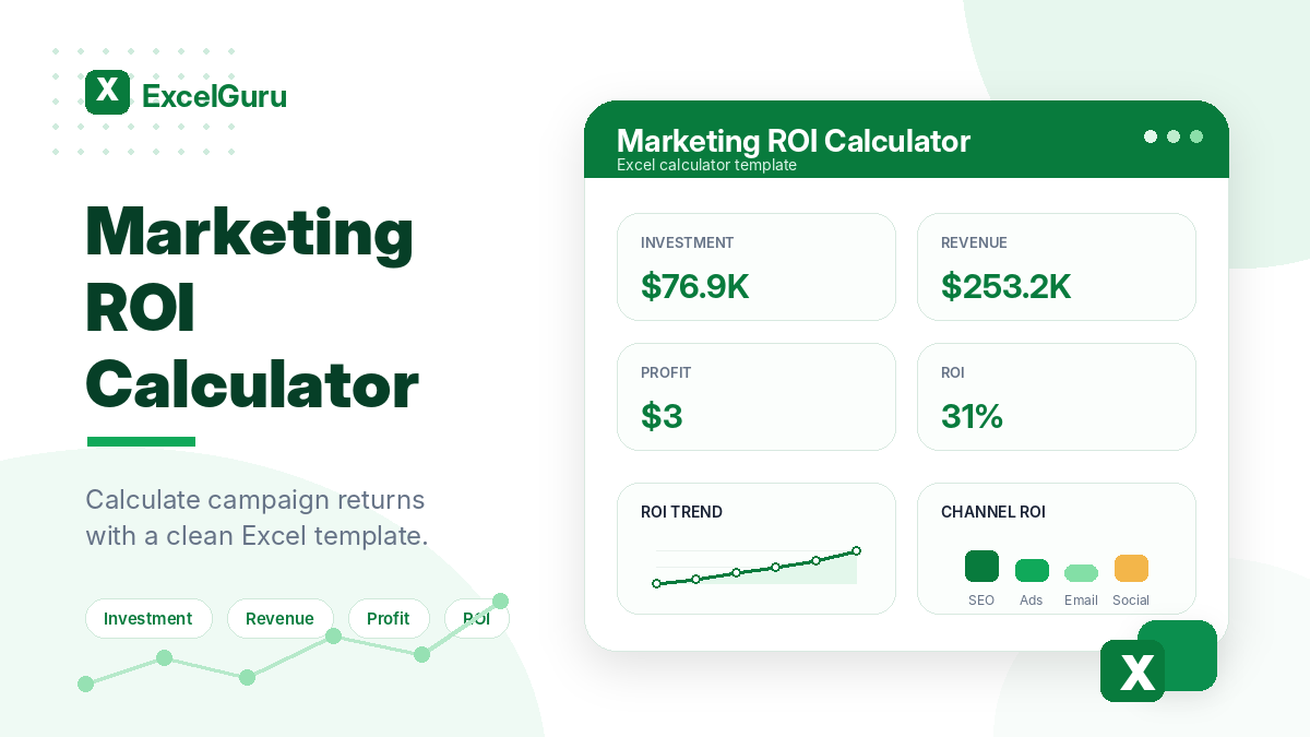
Marketing ROI Calculator Excel template preview with KPI cards for investment, revenue, profit, and ROI in a clean green ExcelGuru-style design.

Marketing ROI Calculator

Download this Marketing ROI Calculator Excel template to track campaign investment, revenue, profit, and ROI in one simple dashboard. Ideal for marketers, agencies, and business owners who want to measure returns and improve budget decisions.

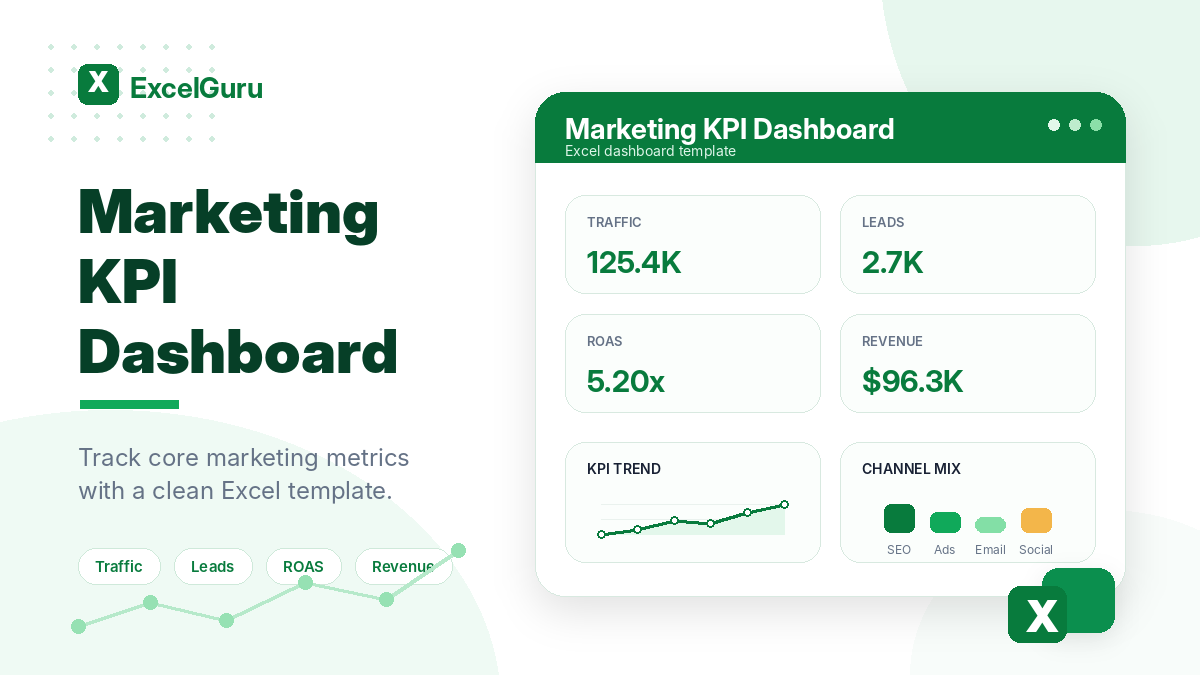
Marketing KPI Dashboard Excel template for tracking traffic, leads, spend, revenue, ROAS, and campaign performance in ExcelGuru style.

Marketing KPI Dashboard

Tired of chasing numbers across five different ad dashboards and email reports? Stop letting messy data stall your meetings. This Excel dashboard turns noisy marketing activity into a clear, accountable system. Designed for teams who are tired of ‘busy but not controlled’ work, it brings KPIs, targets, owners, and status into one visual hub. Spot wasted spend and missed follow-ups before they burn your budget. Get faster decisions, instant performance explanations, and indicators that actually mean something. Start controlling your marketing.

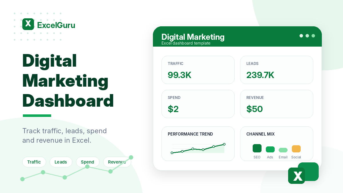
Digital Marketing Dashboard Excel template preview with KPI cards for traffic, leads, spend, and revenue in a clean green ExcelGuru-style design.

Digital Marketing Dashboard

A good digital marketing dashboard should do more than store rows of data. It should help a marketer make faster decisions, see what needs attention, and explain performance without digging through multiple tools. This Excel template is designed for digital marketers and small business teams who want a simple but useful way to combine SEO, ads, email, social, and conversion KPIs into one dashboard.

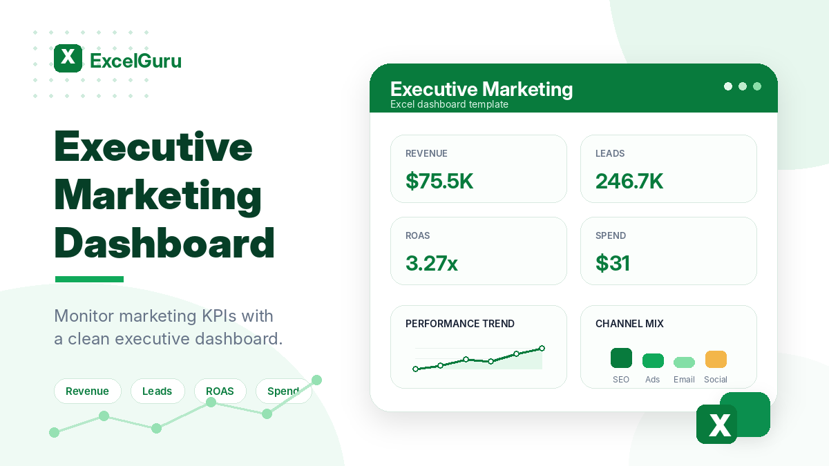
Executive Marketing Dashboard Excel template preview with KPI cards for revenue, leads, ROAS, and spend in a clean green ExcelGuru-style design.

Executive Marketing Dashboard

A good executive marketing dashboard should do more than store rows of data. It should help a marketer make faster decisions, see what needs attention, and explain performance without digging through multiple tools. This Excel template is designed for CMOs, founders, directors, and senior managers who want a simple but useful way to present high-level marketing KPIs in a board-ready format.