A PivotTable showing 200 rows of revenue data tells you everything and nothing at the same time. The numbers are there, but patterns stay hidden. Conditional Formatting on a PivotTable fixes this. It applies colour, data bars, icon sets, and heat maps automatically — so outliers, trends, and top performers become visible at a glance. Better still, it updates when you filter, refresh, or expand the PivotTable.
This guide covers how to apply conditional formatting to PivotTables correctly. It explains the three scope options that are unique to PivotTables, and gives six practical examples. These range from a traffic-light icon set to a heat map, a top-10 highlight, a variance colour scale, and a dynamic threshold rule. Each example also covers how to make the formatting persist when the PivotTable changes layout.
Why Does PivotTable Conditional Formatting Work Differently?
Conditional formatting on a regular range is fixed to specific cells. When you apply it to a PivotTable, Excel offers three scope options instead. These options control which cells the rule applies to as the PivotTable updates. Choosing the wrong scope is the most common source of formatting that breaks when the PivotTable is filtered or refreshed.
| Scope option | What it covers | Best for |
|---|---|---|
| Selected cells only | Only the specific cells you selected when creating the rule | One-off highlights that do not need to update |
| All cells showing [field] values | All value cells for that field, including new rows/columns added later | Dynamic heat maps, data bars, icon sets on a full table |
| All cells showing [field] values for [item] | All value cells for a specific row or column item | Highlighting a specific product, region, or category consistently |
How Do You Apply Conditional Formatting to a PivotTable?
Examples 1–6: Conditional Formatting on PivotTables
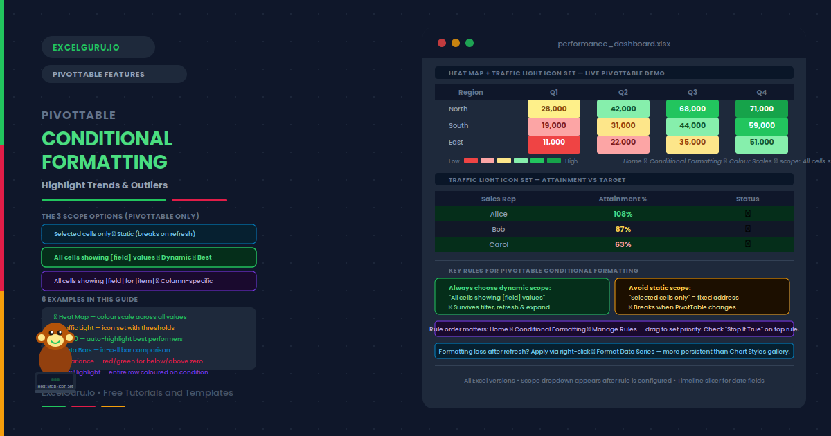
A colour scale heat map shades every cell from a low colour (typically red) to a high colour (typically green) based on its relative value. Applied to all PivotTable revenue cells, it makes the highest-performing regions and months immediately visible without reading any numbers.
To apply: click any value cell → Home → Conditional Formatting → Colour Scales → Green-Yellow-Red. In the scope dropdown, choose All cells showing Revenue values. The entire body of the PivotTable gets the heat map, and it updates automatically when the table is filtered or refreshed.
Icon sets display a symbol (circle, arrow, or flag) in each cell based on where the value falls within defined thresholds. A three-colour circle set creates a traffic light: green for on-target, yellow for near-target, and red for below-target. This is one of the most effective formats for executive dashboards.
To apply: Home → Conditional Formatting → Icon Sets → 3 Traffic Lights. In Manage Rules → Edit Rule, set the thresholds to Number (not Percent) and enter the specific cutoffs. For example, green when value ≥ 100%, yellow when ≥ 80%, red for anything below. In the scope dropdown, choose All cells showing Attainment values so the icons follow every row.
Examples 3–4: Top N and Data Bars
The Top/Bottom Rules option highlights the N highest or lowest values in the PivotTable automatically. This is more reliable than manually identifying top performers, because it recalculates whenever the data is filtered or refreshed. Additionally, you can choose top 10 by count or by percentage.
To apply: Home → Conditional Formatting → Top/Bottom Rules → Top 10 Items. Set the count to 10 (or any number you need). Choose a fill colour — green fill with dark green text works well for a positive highlight. In the scope dropdown, select All cells showing Revenue values. The top 10 cells stay highlighted even after filtering, because Excel re-evaluates the ranking against whichever cells are currently visible.
Examples 4–6: Data Bars, Variance, and Row Highlights
Data bars fill each cell with a proportional coloured bar. The longest bar corresponds to the highest value. They effectively turn the PivotTable into an in-cell bar chart. Data bars are particularly useful for single-column PivotTables where you want immediate visual comparison between row items without switching to a chart.
To apply: Home → Conditional Formatting → Data Bars → choose a gradient or solid fill. In the scope dropdown, choose All cells showing Revenue values. For negative values, set a midpoint axis in Manage Rules → Edit Rule → Bar Direction so negative bars extend left and positive bars extend right.
When a PivotTable contains a budget-versus-actual comparison, highlighting positive and negative variances in different colours makes the picture immediately clear. Two separate rules achieve this: one for values above zero, one for values below zero. Both use the "All cells showing" scope so they persist through refreshes.
To apply: click a value cell in the Variance column. Home → Conditional Formatting → Highlight Cell Rules → Greater Than. Enter 0, choose Green Fill. Apply scope to All cells showing Variance values. Repeat with Less Than 0 and choose Red Fill. Both rules appear in Manage Rules and evaluate independently. Cells with exactly zero receive no formatting, which is correct since they represent on-budget performance.
Example 6: Row-Level Highlighting
By default, conditional formatting in a PivotTable applies only to value cells. However, you can also apply it to row label cells using a formula-based rule. This makes it possible to colour an entire label when its corresponding value crosses a threshold — for example, highlighting the Region label in red when that region’s total falls below target.
To apply: select the row label column. Go to Home → Conditional Formatting → New Rule → Use a formula. Enter a formula that references the corresponding value cell, for example =$C2<40000 where C2 is the first revenue cell. Choose a red fill. This formula locks column C but allows the row to vary, so the rule applies independently to each region row.
Common Issues and How to Fix Them
Formatting disappears after refresh or filter
This is almost always a scope problem. The rule was set to "Selected cells only" — a fixed address range. When the PivotTable refreshes or new rows appear, those cells fall outside the original range. To fix it, open Manage Rules, select the rule, and click Edit Rule. Look for the scope option at the top and switch it to "All cells showing [field] values". Then click OK and the formatting will follow the data dynamically.
Multiple rules conflict and show unexpected colours
Excel evaluates conditional formatting rules in order from top to bottom in the Manage Rules panel. The first rule that matches wins. If a "Greater Than 0" green rule and a "Top 10" rule both apply, cells in the top 10 will use whichever rule appears first. Open Home → Conditional Formatting → Manage Rules and reorder rules by dragging or using the arrow buttons. Additionally, check the "Stop If True" checkbox on the higher-priority rule to prevent lower rules from overriding it.
Frequently Asked Questions
-
How do I apply conditional formatting to a PivotTable?+Click any value cell in the PivotTable. Go to Home → Conditional Formatting and choose your rule type. After configuring the rule, look for the scope dropdown at the top of the dialog. Choose "All cells showing [field name] values" so the formatting applies to the full field and updates dynamically. Avoid "Selected cells only" for PivotTable rules — that option creates a static address range that breaks when the table is filtered or refreshed.
-
Why does my PivotTable conditional formatting disappear after refresh?+The formatting was applied with the "Selected cells only" scope. This creates a rule tied to a specific cell address range. When the PivotTable refreshes, data rows may shift or expand beyond that range and the rule no longer applies. Fix it by opening Manage Rules, editing the rule, and changing the scope to "All cells showing [field] values". This makes the rule follow the entire field dynamically rather than a fixed address.
-
Can I apply a colour scale to just one column of a PivotTable?+Yes. Use the scope option "All cells showing [field] values for [item]" rather than the full-table option. This restricts the colour scale to a single column or row item. For example, you can apply a colour scale only to Q4 values while leaving Q1, Q2, and Q3 unformatted. Select a value in the Q4 column, apply the colour scale rule, and choose the item-level scope option from the dropdown.
-
How do I use icon sets in a PivotTable?+Apply an icon set via Home → Conditional Formatting → Icon Sets. Choose a set (3 traffic lights, 3 arrows, 5 ratings, etc.). In the Edit Rule dialog, set the thresholds using Number type rather than Percent or Percentile — this gives you precise control over which values get each icon. Set the scope to "All cells showing [field] values" so the icons follow the data after refresh. To hide the numbers and show only icons, check "Show Icon Only" in the Edit Rule dialog.