A regular chart is static — it reads a fixed range of cells and shows whatever data is there. A PivotChart is dynamic. It is directly linked to a PivotTable, so every filter, slicer, and drill-down you apply to the table instantly updates the chart. When you change the Region filter, the bars change. When you expand a product group, new series appear. No manual range editing is needed. PivotCharts are the right choice whenever the chart needs to respond to user interaction.
This guide explains exactly how PivotCharts work and how they differ from regular charts. It also covers how to create them, their key limitations, and six practical examples. These include a filtered bar chart, a slicer-connected column chart, a drill-down chart, a dynamic trend line, a combined PivotChart with a secondary axis, and a PivotChart formatted as a dashboard card.
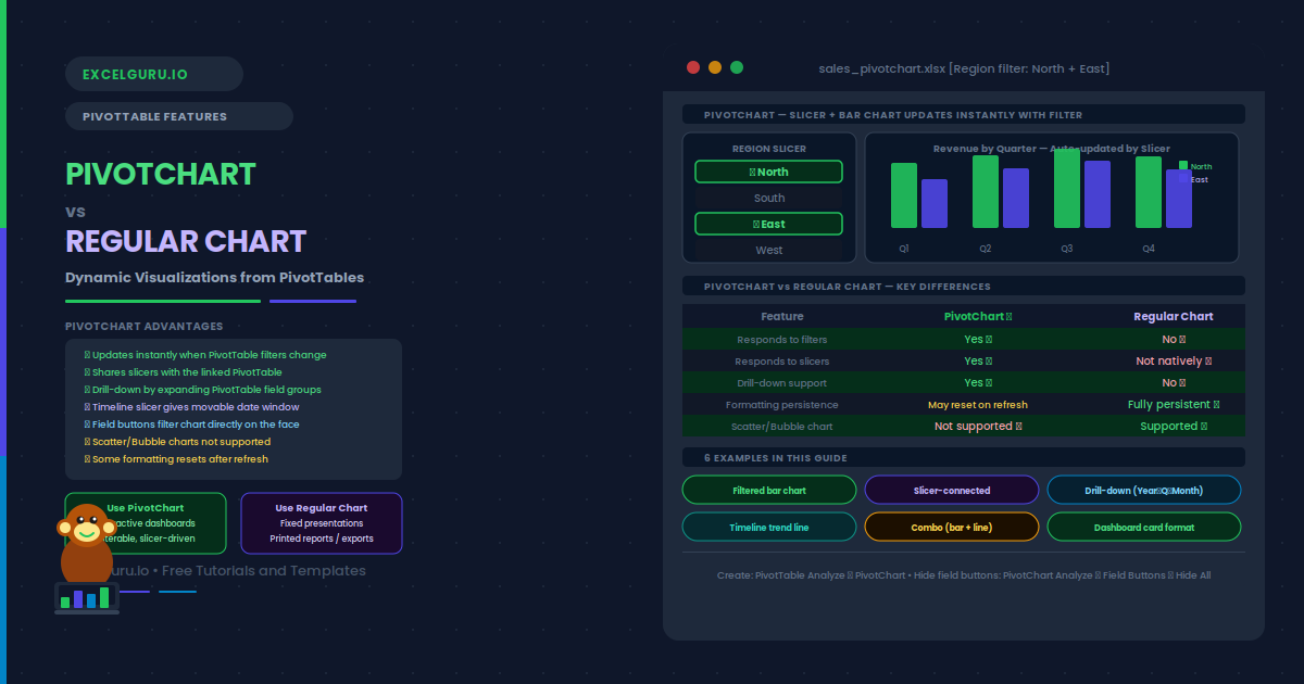
PivotChart vs Regular Chart: Key Differences
Understanding when to use each chart type saves significant time. The table below shows the key differences, followed by a simple decision rule.
| Feature | Regular Chart | PivotChart |
|---|---|---|
| Data source | Fixed cell range | Linked PivotTable (dynamic) |
| Updates when data changes | Yes, if range includes new rows | Yes, on PivotTable refresh |
| Responds to filters | No — shows fixed data only | Yes — filters apply instantly |
| Responds to slicers | Only if connected via Power Query | Yes — shares slicers with PivotTable |
| Drill-down capability | No | Yes — expand/collapse PivotTable fields |
| Chart type flexibility | All chart types | Most types (scatter and bubble not supported) |
| Formatting persistence | Fully persistent | Some formats reset after refresh |
| Best for | Fixed presentations, standalone reports | Interactive dashboards, self-service analysis |
How Do You Create a PivotChart?
Examples 1–4: PivotChart Scenarios
The most basic PivotChart scenario is a bar or column chart linked to a filtered PivotTable. When the user applies a Region filter to the PivotTable, the chart automatically shows only the filtered regions. No chart editing is needed. This is the core reason PivotCharts exist.
To build this: create a PivotTable with Region in rows and Revenue in values. Insert → PivotChart → Column. Now use the Region filter dropdown on the PivotTable. The chart updates immediately to show only the visible rows. Additionally, the PivotChart has its own field buttons — clicking the Region button on the chart also applies the filter. Both the table and the chart stay in sync at all times.
Slicers are the most user-friendly way to filter a PivotChart. They are large clickable buttons that filter the connected PivotTable and chart simultaneously. A slicer for Region lets users click "North" and instantly see only the North data in both the table and the chart. Slicers can also connect to multiple PivotCharts at once.
To add a slicer: click the PivotTable or PivotChart. Go to PivotTable Analyze → Insert Slicer. Check the fields you want as slicers (Region, Quarter, Product). Click OK. The slicers appear as floating panels. To connect a slicer to a second PivotChart, right-click the slicer → Report Connections → check the additional PivotTable. Both charts then respond to the same slicer simultaneously.
Examples 3–4: Drill-Down and Trend Charts
A PivotChart inherits the PivotTable’s grouping hierarchy. When the PivotTable has Year containing Quarters, which contain Months, the PivotChart can show any level. Expanding a Year node in the PivotTable adds the Quarter bars. Collapsing it returns to the Year-level view. This is impossible with a regular chart without completely rebuilding the data range.
To enable drill-down: place a date field in the PivotTable rows. Right-click a date label → Group → choose Years, Quarters, and Months together. The PivotTable now shows a collapsible hierarchy. The PivotChart responds to each expand or collapse instantly. Alternatively, use a Power Pivot data model to create explicit hierarchies — these also drill down through the PivotChart with a single click.
A Timeline slicer combined with a PivotChart line chart creates a dynamic trend viewer. The user drags the timeline handles to change the date range. The PivotChart immediately redraws with only the selected period. This is a standard pattern in financial and sales dashboards where users need to compare different time windows.
To build this: place Date in rows, Revenue in values. Insert → PivotChart → Line. Then Insert → Timeline → check the Date field. Connect the Timeline to the PivotChart’s PivotTable. Now drag the timeline to select any range of months or quarters. The line chart redraws to show only the selected window. For a cleaner look, hide the PivotChart field buttons and move the Timeline above or below the chart.
Examples 5–6: Advanced PivotChart Techniques
A Combo chart combines two chart types on one plot area. For example, bars show Revenue on the primary axis and a line shows Margin % on a secondary axis. This is one of the most effective dashboard charts because it shows volume and efficiency together. PivotCharts support Combo charts through the same Change Chart Type dialog as regular charts.
To build this: add both Revenue and Margin % as value fields in the PivotTable. Right-click the PivotChart → Change Chart Type → Combo. Set Revenue as Clustered Column on the Primary Axis. Set Margin % as Line on the Secondary Axis. Check "Secondary Axis" for the Margin % series. Click OK. The chart now shows bars for Revenue and a floating line for Margin %, both updating together when the PivotTable is filtered.
For a polished dashboard, PivotCharts need to look like designed visualisations, not analysis tools. This means hiding the field buttons, removing gridlines, simplifying the title, and controlling the colours. When done well, users cannot tell the chart is a PivotChart — they just see a clean, interactive chart that responds to the slicers.
= and reference a cell that contains a dynamic heading. The title updates when the cell changes.Common Issues and How to Fix Them
The PivotChart does not update when I apply a filter
First, check that the chart is still linked to the PivotTable. Click the chart and look at PivotChart Analyze — if the tab is missing, the chart was accidentally disconnected and is now a regular chart. Reconnecting a disconnected PivotChart is not straightforward; it is generally easier to delete the chart and create a new one from the PivotTable. Also verify that the PivotTable itself updates correctly when the filter is applied — if the table does not update, the chart cannot either.
Formatting resets after PivotTable refresh
This is a known PivotChart limitation. Custom colours, data labels, and some axis formats may reset after a refresh. The most reliable fix is to apply formatting at the series level (right-click the series → Format Data Series) rather than using the Chart Styles gallery. Series-level formatting survives most refreshes. For consistently styled PivotCharts in a team environment, also consider using a custom chart template saved via Save as Template, so the format can be reapplied quickly.
Frequently Asked Questions
-
What is a PivotChart in Excel?+A PivotChart is a chart directly linked to a PivotTable. Unlike a regular chart, it updates automatically whenever the PivotTable is filtered, sorted, expanded, or refreshed. It supports slicers, timeline filters, and field-level drill-down. When a user filters the connected PivotTable by region or quarter, the PivotChart redraws instantly to reflect only the visible data. PivotCharts support most standard chart types, though Scatter and Bubble charts are not available.
-
What is the difference between a PivotChart and a regular chart?+A regular chart reads a fixed cell range and does not respond to PivotTable filters or slicers. A PivotChart is linked directly to a PivotTable and responds to every change: filters, drill-downs, field changes, slicers, and data refreshes. Regular charts are better for static presentations and printed reports. PivotCharts are better for interactive dashboards where users filter and explore the data. The main trade-off is that PivotCharts may lose some custom formatting on refresh, while regular charts retain all formatting permanently.
-
Can I connect a slicer to a PivotChart?+Yes. Slicers connect to a PivotTable, and because a PivotChart is linked to that PivotTable, the chart responds to the slicer automatically. To add a slicer, click the PivotTable and go to PivotTable Analyze → Insert Slicer. To connect an existing slicer to additional PivotTables (and therefore additional PivotCharts), right-click the slicer → Report Connections and check each additional PivotTable. Multiple PivotCharts can share the same slicer and stay in sync simultaneously.
-
Why are Scatter and Bubble charts not available in PivotCharts?+Scatter and Bubble charts require explicit X and Y values for each data point. PivotTables aggregate data into row and column totals rather than individual X-Y pairs, which makes the data structure incompatible with Scatter chart requirements. Also, the Scatter chart type does not support the field-item hierarchy that PivotCharts are built on. To create a Scatter chart from PivotTable data, extract the values using GETPIVOTDATA formulas into a separate regular range, then build a standard Scatter chart from those cells.