A KPI in Power Pivot is more than a number — it is a comparison. You define a base measure (Actual Revenue) and a target (Budget Revenue). Thresholds then determine whether performance is good, acceptable, or poor. Power Pivot stores that logic and surfaces it in PivotTables as a value, status icon, and goal percentage — from one KPI definition. Power Pivot KPIs turn raw measures into meaningful, colour-coded performance indicators with no manual conditional formatting needed.
This guide covers the full KPI setup, status threshold options, goal types, and six practical examples. Examples include a Revenue-versus-Budget KPI, a Defect Rate indicator, a Sales Attainment percentage, and Year-over-Year growth.
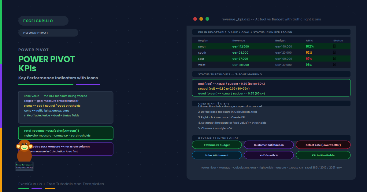
What Is a KPI in Power Pivot?
A KPI (Key Performance Indicator) in Power Pivot consists of three components. The Base Value is the measure you are evaluating — for example, Total Revenue. The Target is the goal, either a fixed number or another measure such as Budget Revenue. The Status Thresholds set two cut-offs that divide performance into three zones: bad (red), neutral (yellow), and good (green).
Power Pivot divides Base Value by Target and maps the result to a status icon. Adding the KPI to a PivotTable exposes three fields: Value, Goal, and Status icon. All three appear side by side without any conditional formatting.
| KPI Component | What it is | Example |
|---|---|---|
| Base Value | The measure being evaluated | [Total Revenue] = SUM(Sales[Amount]) |
| Target | The goal to compare against | [Budget Revenue] or fixed value 500000 |
| Status Thresholds | Two cut-off points for bad/neutral/good | Bad < 0.8, Neutral 0.8–0.95, Good ≥ 0.95 |
| Status Icon | The visual indicator (traffic light, arrows, etc.) | 🔴 Red / 🟡 Yellow / 🟢 Green |
How to Create a KPI in Power Pivot
Total Revenue:=SUM(Sales[Amount]). Press Enter.Examples 1–4: KPI Configurations in Practice
The most common KPI compares actual revenue to a budget target. Below 80% attainment is red. Between 80% and 95% is yellow. At or above 95% is green. The threshold comparison is automatic — Power Pivot divides Actual by Budget and maps the ratio to the status zone.
A satisfaction score measured out of 10 has a fixed target (for example, 8.0). Instead of using a measure as the target, use an absolute value. Thresholds are set as ratios: below 0.75 (score below 6) is red, 0.75–0.9 is yellow, 0.9 and above (score 7.2+) is green. The same traffic light logic applies to any bounded score.
KPIs where a lower value is better — defect rate, cost per unit, churn rate — require reversed threshold logic. Power Pivot allows this by moving the Bad threshold above the Good threshold. Alternatively, define a Quality Rate (1 minus defect rate) so higher values mean better performance.
A Year-over-Year growth KPI uses 0% as the baseline target. Any positive growth is good; zero is neutral; negative growth is bad. Set the target to an absolute value and use actual percentage thresholds rather than ratios.
Examples 5–6: Advanced KPI Patterns
A Sales Attainment KPI uses a quota as the target and expresses performance as a percentage of quota. Icon sets with stars (1-5 stars) or numbered ratings communicate attainment levels intuitively to sales teams. The five-zone icon set requires four threshold values instead of two.
Once defined, the KPI appears in the PivotTable field list with three sub-fields: Value, Goal, and Status. Adding all three gives a complete row: the number, the target, and the icon. Formatting and layout tips make the PivotTable presentation polished and professional.
Common Issues and How to Fix Them
The Create KPI option is greyed out
KPIs can only be created on DAX measures, not on raw columns. Right-click a measure in the Calculation Area, not a column header. If the measure is missing, define it first in the grey Calculation Area below the data rows. Also verify that your Excel edition includes Power Pivot — the Home and Student editions do not include it.
KPI Status always shows the same icon for all rows
The likely cause is a target measure that ignores filter context — often a CALCULATE with a hard-coded filter. Add the target measure as a plain value to verify it responds to PivotTable filters. Also verify your date table is related to the fact table so time filters affect both measures.
Frequently Asked Questions
-
What is a KPI in Power Pivot?+A KPI (Key Performance Indicator) in Power Pivot compares a base measure to a target and maps the comparison to a status icon. It has three components: Base Value (the measure, e.g. Total Revenue), Target (a goal or fixed number), and Status Thresholds (two cut-offs for bad, neutral, and good). The KPI appears in PivotTables as three fields: Value, Goal, and Status icon.
-
How do I create a KPI in Power Pivot?+First define a DAX measure in the Power Pivot Calculation Area (for example, Total Revenue:=SUM(Sales[Amount])). Right-click the measure and choose Create KPI. Set the target, drag threshold sliders, and choose an icon style. Click OK. Click OK. The KPI then appears in the PivotTable field list with Value, Goal, and Status sub-fields.
-
How do I create a KPI where lower values are better?+The most reliable approach is to invert the measure so that higher values mean better performance. For a defect rate, define Quality Rate = 1 minus Defect Rate. Apply the KPI to Quality Rate with a target of 1.0 (zero defects). Alternatively, drag the Bad threshold above Neutral in the slider — this reverses the colour so high values turn red.
-
Can I use custom icons or colours in Power Pivot KPIs?+Power Pivot offers built-in icon sets (traffic lights, arrows, stars, checkmarks) but no fully custom icons within the KPI definition. However, after adding the KPI Status field to a PivotTable, you can apply standard Conditional Formatting on top of the Status column to use any icon set or colour available in Excel’s Conditional Formatting panel. The Status field outputs -1 (bad), 0 (neutral), or 1 (good), which can drive any conditional formatting rule.