
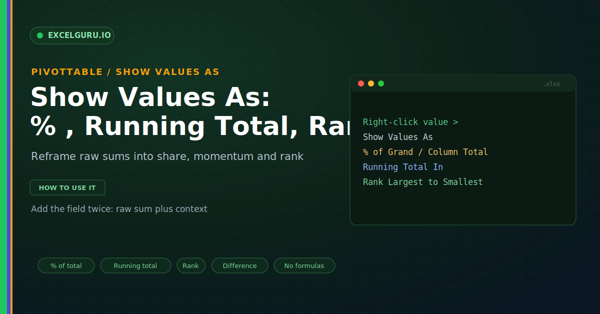
A PivotTable sums your numbers well, but raw totals only go so far. A cell showing 400 in sales raises more questions than it answers. What share of the total is that? How does it stack up over the year? And who ranks first? The Show Values As feature answers all three. It restyles any value as a percentage, a running total, a rank, or a difference, with no formula at all.
This guide shows how to reframe your numbers for real insight. First, it explains what Show Values As does. Then it covers percentages, running totals, ranks, and differences. Real examples and a full troubleshooting section follow. By the end, you will turn plain sums into a story anyone can read.
What "Show Values As" Does
Show Values As changes how a number appears, not the data. The same field can display as a share or a rank. Crucially, your source stays exactly the same. So one field can tell several different stories. The infographic below shows four at once.
Each view answers a different business question. The percentage shows share, while the rank shows position. Meanwhile, the running total shows momentum over time. As a result, one column becomes a full mini-report.
Percentages: Choose the Right Base
Percentages are the most popular choice here. Yet the base you pick changes the meaning entirely. Percent of grand total measures share of everything. Percent of column total measures share within one column, as shown below.
Running Totals for Momentum
A running total shows progress as it builds. It adds each period to the ones before it. This turns monthly sales into a climbing cumulative line. Therefore you can see how the year adds up, as below.
Rank Your Results
Ranking answers a simple, powerful question. It tells you who or what comes first. Excel can rank largest to smallest in one click. Consequently, your top performers rise straight to the eye.
Difference and % Difference From
Sometimes the story is change, not the level. Difference From compares each value to a chosen base. For example, it can compare each month to January. As a result, growth and decline become obvious.
How to Apply Any Calculation
Every option lives in the same two places. You can right-click a value for the quick menu. Alternatively, open Value Field Settings for the full list. Both routes lead to the Show Values As tab.
Troubleshooting Show Values As
All three problems below are the most common. Each has a clear cause and a quick fix.
Every cell shows 100 percent
This usually means the base does not vary. For instance, % of Row Total on a single-column pivot gives 100% everywhere. Each row simply equals its own total. First, check which percentage base you picked. Then switch to % of Grand Total or % of Column Total instead. Match the base to the layout of your pivot. After that, the shares spread out as expected.
The running total looks wrong
A running total depends on the order of the base field. So an odd sort order produces an odd cumulative line. First, confirm the base field is the one you meant, such as Month. Then check that the field sorts in date order, not alphabetically. Month names sorted as text run April before January. Fix the sort, and the running total climbs correctly. A proper date grouping usually solves it for good.
Ranks show ties or blanks
Ranking needs numbers to compare against a base field. Blank or text values can produce gaps or ties. First, make sure the value field holds real numbers. Then confirm you chose the correct base field for the rank. If two items share a value, they will tie by design. Clean the source of blanks, then refresh the pivot. After that, the ranking reads cleanly from top to bottom.
Frequently Asked Questions
- What does Show Values As do?+It restyles a value as a percentage, running total, rank, or difference. Importantly, it never changes your source data. So one field can answer several questions. You can even add the field twice for both views.
- How do I show each value as a percent of the total?+Right-click the value and choose Show Values As. Then pick % of Grand Total for share of everything. For share within a column, choose % of Column Total instead. So match the base to your question.
- Why does my running total look wrong?+Because it follows the order of the base field. Month names sorted as text run out of order. So group the dates or sort them properly. Then the cumulative total climbs correctly.
- Can a PivotTable rank my results?+Yes, add the value field again and open Show Values As. Then choose Rank Largest to Smallest and a base field. The pivot numbers each item by size. Moreover, the ranking updates on every refresh.