
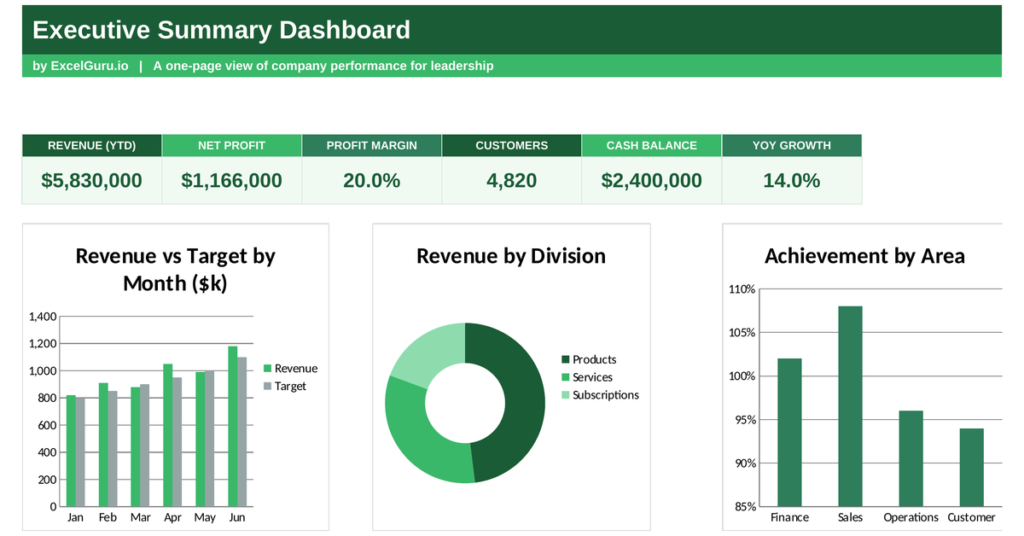
Leaders do not need every number; they need the few that reveal whether the business is winning. An executive dashboard delivers exactly that, rolling company performance up into a single high-level view. This free Excel template summarises revenue against target, breaks it down by division, and scores achievement across the business. Below you will learn what an executive dashboard shows, the formula behind it, and how the template rolls everything up.
What is an executive dashboard?
An executive dashboard is a high-level summary of company performance built for leadership. It strips detail away to show the handful of figures that matter most.
It covers total revenue, performance against target, the split across divisions, and how well each area is achieving its goals. Because executives make broad decisions, they need the big picture, not a spreadsheet of detail. So an executive dashboard turns mountains of data into the few numbers that guide strategy and key decisions.
Why leaders need a high-level view
Detail is the enemy of a fast decision. A leader buried in figures cannot see the shape of the business.
A summary view shows whether revenue is on track, which divisions carry the load, and where performance lags. Because leaders steer rather than operate, they need altitude, not granularity. So the dashboard filters the noise, leaving only the signals that shape the next big move.
The achievement formula
The dashboard scores each area of the business the same simple way. It compares what was achieved with what was planned.
Achievement = Actual ÷ Target
Total revenue = sum of each period’s revenue
So achievement divides an area’s actual result by its target, giving a percentage where 100% means the goal was met exactly. Total revenue simply adds up the periods. Because every area is scored the same way, a leader can compare divisions and functions on a level footing. So a single ratio turns diverse results into one comparable language.
How the executive dashboard rolls up performance
The template needs your revenue and target by period, your revenue by division, and achievement by area. From there it summarises everything for you.
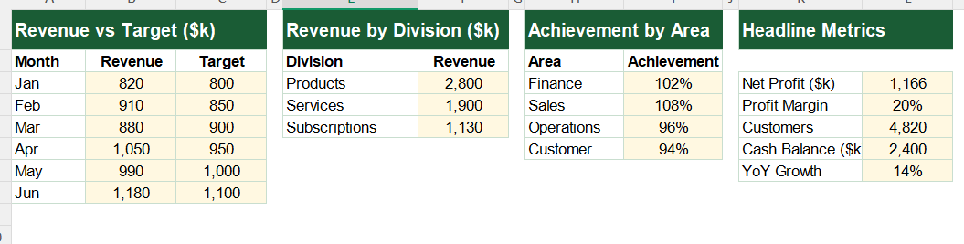
Total revenue sums the monthly figures across the year. Revenue against target compares the two totals, and the division figures feed the breakdown. Achievement by area comes straight from actual over target for each area, so a result of 1.02 reads as 102% of goal. The dashboard also surfaces headline figures such as profit and growth. So one summary view captures the whole business at a glance.
A worked achievement example
Take one area and the maths is clear. Suppose the finance function targets a result and comes in slightly ahead of it.
If its actual result divided by its target works out to 1.02, its achievement reads 102%, just above goal. An area at 0.95 would read 95%, a shade behind. Because the same ratio applies everywhere, a leader can line up every area and see instantly who is ahead and who is behind. So the dashboard makes comparison effortless.
Reading the charts
See the dashboard shown above for this part.
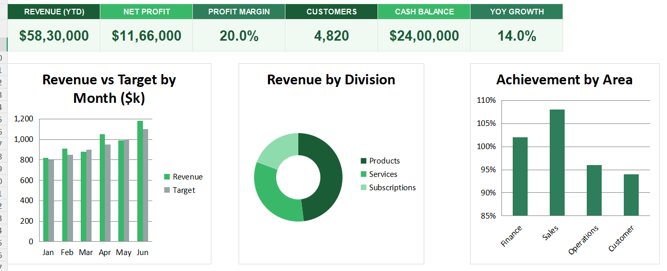
The first chart plots revenue against target across the year, so you can see whether the business is on plan. A revenue line above target is the reassuring sign leaders look for.
The second chart is a doughnut splitting revenue by division, showing where the money is made. The third chart ranks achievement by area, revealing the leaders and laggards. Because you see the trend, the mix and the scores together, the whole business comes into focus. So together the charts give leadership a complete picture in seconds.
Lead with the laggards. The area scoring lowest against target is usually where leadership attention shifts the numbers most.
Who uses an executive dashboard
Executives and directors use it to monitor the whole business at a glance. It gives them altitude.
Business owners use it to keep the big picture in view. Board members use it for a quick, honest read on performance. Managers use it to see how their area fits the whole. Because every leader needs a summary view, the dashboard suits many settings.
Making the template your own
The template is a starting point, not a fixed form. You can swap in your own divisions and areas. You can change which headline figures appear.
The dashboard bends to your needs, so you can add a profit-margin trend alongside revenue. A quick edit does it. You might also add a year-on-year comparison. The structure welcomes that kind of extension without complaint.
Leadership runs on clarity, not on detail. An executive dashboard rolls the whole business into a handful of figures, so leaders see what matters at a glance. So download the template, enter your numbers, and give your leadership the high-level view that drives good decisions.
Turning numbers into decisions
A dashboard only earns its place if it changes what leaders do. Numbers alone are not the point.
The value comes when a lagging division prompts a resource shift, or a strong one wins more investment. So the best executive views are built around the decisions they inform, not the data they can display. Because attention is a leader’s scarcest resource, the summary should point straight to where that attention pays off most.
The one-page principle
The best executive views fit on a single screen. If a leader has to scroll, the summary is already too detailed.
Keeping it to one page forces hard choices about what truly matters, and those choices are exactly what make the dashboard useful.