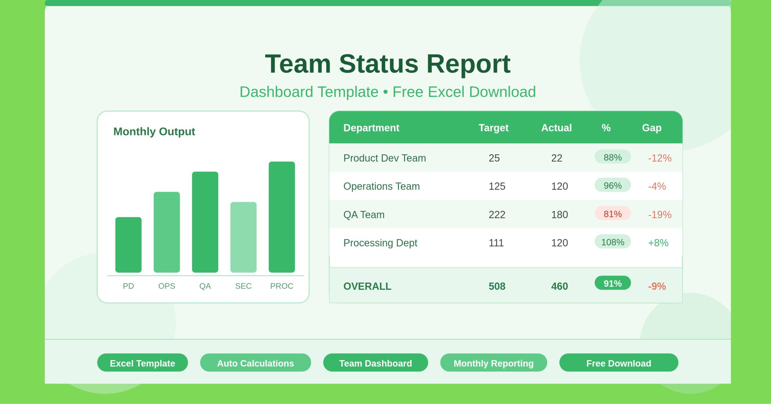
The Team Status Report Dashboard Template is a professionally structured Microsoft Excel spreadsheet. It gives managers, team leads, and department heads a clear, instant snapshot of their team’s monthly productivity. The template captures each department’s monthly production target alongside actual output. It then calculates performance as a percentage and flags the gap — called the “lacking” metric — so you always know where your team stands against its goals.
The workbook contains two key sheets. The Data sheet holds all inputs and calculations. The Team Status Chart sheet serves as the visual dashboard for at-a-glance reporting. This dual-sheet structure keeps raw data separate from presentation. The result is a template that is both functional and polished enough to share directly in team meetings or management reviews.
Also check out other human resources templates by ExcelGuru.
Who Can Use This Template?
This template works for anyone who monitors team or departmental output each month. Project managers, operations leads, HR managers, and small business owners will all find immediate value in it. It suits anyone who sets monthly targets and needs to track delivery against those targets.
The template includes five pre-loaded departments: Product Dev Team, Operations Team, Quality Assurance Team, Security Dev Team, and Processing Department. These make it relatable to teams in technology, manufacturing, professional services, and corporate environments. Even if your organization uses different department names, you can swap them in seconds. Any team that sets a numeric monthly target and measures actual delivery can start using this template right away.
Individual contributors can also use it to self-report progress to leadership. Executives will find it useful for getting a consolidated view of performance across the organization — without reading through multiple separate reports.
Key Features of the Team Status Report Dashboard Template
This template uses built-in Excel formulas to handle all calculations automatically. Enter a department’s monthly production target and actual production figure. The template instantly computes the production percentage (actual ÷ target) and the lacking percentage (shortfall from 100%). This removes any risk of manual calculation errors.
The OVERALL summary row at the bottom uses SUM formulas to total figures across all departments. It gives leadership one consolidated number for the organization’s monthly performance. This makes it especially useful for executive reporting and board-level summaries.
The Team Status Chart sheet turns data into a visual dashboard. Trends and performance gaps become immediately obvious. Visual dashboards speed up comprehension in team meetings and cut down review time significantly.
The template is also lightweight and fast to load. It runs on native Excel functionality with no macros or third-party add-ins. It opens on any version of Microsoft Excel and works in free alternatives like LibreOffice Calc and Google Sheets, with only minor formatting adjustments needed.
How to Use the Team Status Report Dashboard Template
Getting started takes less than five minutes. Open the Data sheet and update the report period in the header. Replace “AUGUST” with the current month and year. Then replace the pre-filled department names in column A with your own team names. You can include as few as two departments or expand the list as needed.
For each department, enter the Monthly Production Target in column B. This is the goal or quota for the period. As the month progresses, enter the Actual Production figure in column C. The formulas in columns D and E update immediately to show the performance percentage and any shortfall. The OVERALL row and dashboard chart refresh automatically — no extra steps needed.
At the end of each month, save a copy with a new filename — for example, “Team_Status_Report_September_2025.xlsx.” Do this each month to build a historical archive. Over time, this archive becomes a valuable record for performance reviews, trend analysis, and strategic planning.
How to Modify the Template
The template is fully editable. It adapts easily to a wide range of organizational structures. To add more departments, insert new rows between the last department row and the OVERALL summary row. Copy the formulas in columns D and E down to the new rows. Then update the SUM range in the OVERALL row to include the new rows so totals stay accurate.
To rename departments, click any cell in column A and type the new name. No formula changes are needed. Column A contains only text labels.
Some organizations track production in units other than a simple numeric count. Examples include revenue in thousands, hours logged, or tickets resolved. In those cases, update the column headers in row 2 to reflect the correct unit. The formulas use ratios, so they work correctly with any unit — as long as target and actual figures use the same one.
To add conditional formatting, use Excel’s built-in tool on columns D or E. Highlight underperforming departments in red and overachievers in green. This takes under two minutes and makes the dashboard much easier to read in presentations.
Advanced users can build a month-over-month comparison tracker. Duplicate the Data sheet for each month, then add a summary sheet that pulls performance totals from each tab. This creates a rolling annual performance tracker with minimal extra effort.
Why Monthly Status Reporting Matters
Consistent monthly status reporting is one of the most effective habits any team can build. Without a structured process, performance gaps often go unnoticed. They compound quietly until they become larger problems. A team status dashboard helps managers spot which departments are on track, which are falling behind, and which consistently exceed targets. That insight drives smarter decisions around resource allocation, recognition, and early intervention.
Teams with clear, visible performance metrics are more engaged and more productive. When team members see their contributions in a shared report, accountability grows naturally. This template delivers that visibility without needing a dedicated analyst or expensive business intelligence software.
Managers save significant time each month with a pre-built, auto-calculating dashboard. Instead of pulling figures from multiple sources, they update this template in minutes. A professional, presentation-ready report is ready to share the same day.
Conclusion
The Team Status Report Dashboard Template is a practical Excel tool. It brings structure, consistency, and clarity to monthly team performance reporting. It tracks production targets, measures actual output, and highlights performance gaps — all in one place. The template adapts to virtually any industry or team structure. Anyone comfortable with Excel can use it from day one. Download it, customize the department names, enter your monthly figures, and your team status report is ready in minutes.