Inventory ties up cash, so it should earn its keep. The trouble is that a stock list alone never tells you how hard your inventory is actually working.
This free KPI dashboard answers that question. You enter a few figures, and the sheet calculates turnover, days of inventory and fill rate for every item. You will also find realistic sample data already inside the file. Therefore, you can explore every formula, dropdown and chart first, and then replace the samples with your own records in minutes.
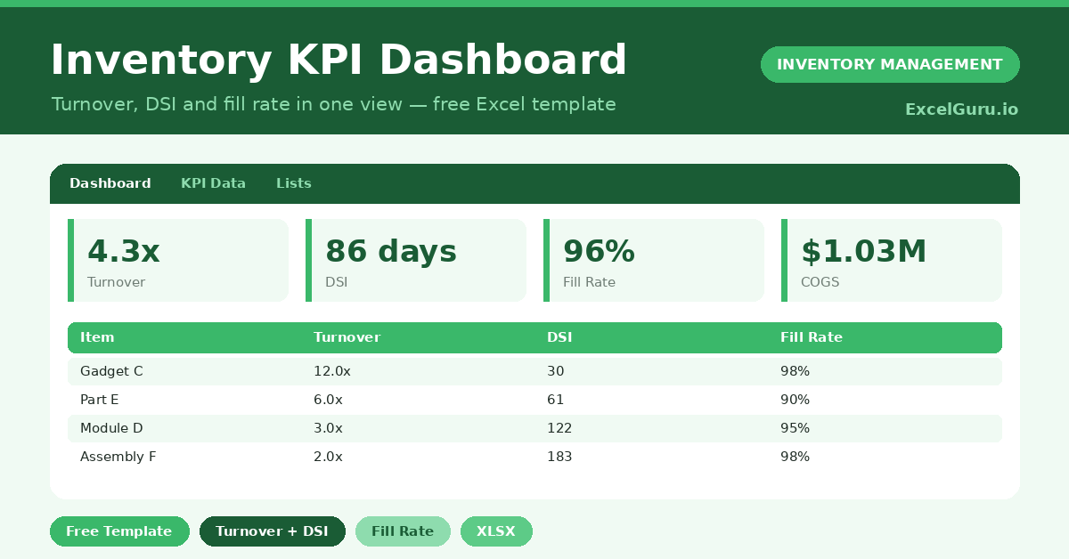
Below, we explain the metrics, the formulas, and how to adapt the dashboard to your own products.
What Is an Inventory KPI Dashboard?
An inventory KPI dashboard measures the health of your stock with a few key ratios. It focuses on turnover, days sales of inventory and fill rate.
These metrics show how fast stock sells and how well you meet demand. As a result, you can spot lazy stock and weak service in seconds.
Why Do Inventory KPIs Matter?
Gut feel cannot tell you whether stock is too high or service too low. Numbers can, and they make the trade-offs visible.
KPIs turn inventory into something you can manage and improve. Therefore, you can free up cash from slow stock while protecting the items customers actually want. Tracked over time, they also prove whether your changes are working.
Why Use This Template?
Clear metrics drive better stock decisions. In particular, this one helps you:
- Calculate turnover and DSI for every item.
- Measure how well you meet demand with fill rate.
- See an overall health figure for all stock.
- Compare items quickly with built-in charts.
- Track improvement period after period.
What’s Inside the Template?
The workbook has four tabs:
- How to Use — a built-in guide.
- Dashboard — overall KPIs plus per-item charts.
- KPI Data — the working sheet with all inputs.
- Lists — the metric reference notes.
What Formulas Does the Template Use?
The dashboard uses dependable Excel formulas:
| Formula | What it does |
| =Annual COGS / Avg Inventory Value | Calculates the inventory turnover. |
| =365 / Turnover | Converts turnover into days of inventory. |
| =Units Fulfilled / Units Demanded | Calculates the fill rate. |
| =SUM(COGS) / SUM(Avg Inventory) | Calculates the overall turnover. |
| =SUM(Fulfilled) / SUM(Demanded) | Calculates the overall fill rate. |
How Do You Use the Template?
The KPIs build from a few inputs. Just follow these steps:
- Open the KPI Data tab and list your items.
- Enter the annual cost of goods sold for each.
- Add the average inventory value held.
- Enter units demanded and units fulfilled.
- Let turnover, DSI and fill rate calculate.
- Review the overall KPIs and charts on the Dashboard.
What Are the Best Use Cases?
The dashboard fits many businesses, such as:
- Retailers reviewing stock efficiency.
- Wholesalers managing working capital.
- Operations teams reporting to leadership.
- Finance teams analysing inventory cost.
- Owners benchmarking against last year.
How Can You Modify the Template?
You can adapt it easily. To add metrics, insert a column such as gross margin return on investment, then chart it.
You can also group items by category and summarise each group separately.
In addition, the sheet covers 40 items by default, and you can copy the formulas down for more.
What Mistakes Should You Avoid?
A few habits distort the metrics. Therefore, avoid these common mistakes:
- Mixing cost and retail values in one figure.
- Using a single month’s inventory as the average.
- Reading turnover without checking fill rate.
- Comparing your numbers to unrelated industries.
Tips to Get the Most From It
- Use a true average inventory value, not a single snapshot.
- Read turnover and fill rate together for balance.
- Set targets per category, since norms differ.
- Review the dashboard monthly to catch drift early.
Frequently Asked Questions
What is a good inventory turnover?
It varies by industry. Groceries turn over very fast, while machinery turns slowly. The template lets you set your own target rather than chasing a universal number.
What does DSI tell me?
Days sales of inventory estimates how many days your current stock will last. A lower figure usually means leaner, healthier inventory.
Why track fill rate alongside turnover?
High turnover can hide poor service if you run out often. Fill rate shows whether you are actually meeting demand.
Can I use it for the whole business?
Yes. The overall KPIs combine every item, so you get both a company view and a per-item view.
Does it work in Google Sheets?
It does, with minor adjustments to formatting after importing.
Download the Template and Get Started
What gets measured gets managed, and inventory is no exception. This dashboard turns your stock into numbers you can act on.
Download the Inventory KPI Dashboard and measure your stock health today.