Daily standups reveal what the team did yesterday. Sprint reviews reveal whether the sprint succeeded. But neither tells you in real time whether the work is burning down fast enough. A team can be busy every single day and still miss the sprint deadline — because busy and on-track are not the same thing.
An iteration burndown chart makes the difference visible. It plots planned effort remaining against actual effort remaining, day by day across the sprint. When the actual line drifts above the planned line, the team is behind. When it dips below, the team is ahead. That gap — early, visible, and quantified — is what makes corrective action possible before the deadline passes.
This free Excel Iteration Burndown Chart Template gives you a ready-to-use daily tracking sheet for a sprint of any length. Enter your features, plan the work across days, log actual hours, and the burndown chart plots itself automatically. No specialized software. No Jira subscription. Just a clear, honest view of where the sprint stands today.
Download the free Iteration Burndown Chart Template and see your sprint’s trajectory before it surprises you.
What Is the Iteration Burndown Chart Template?
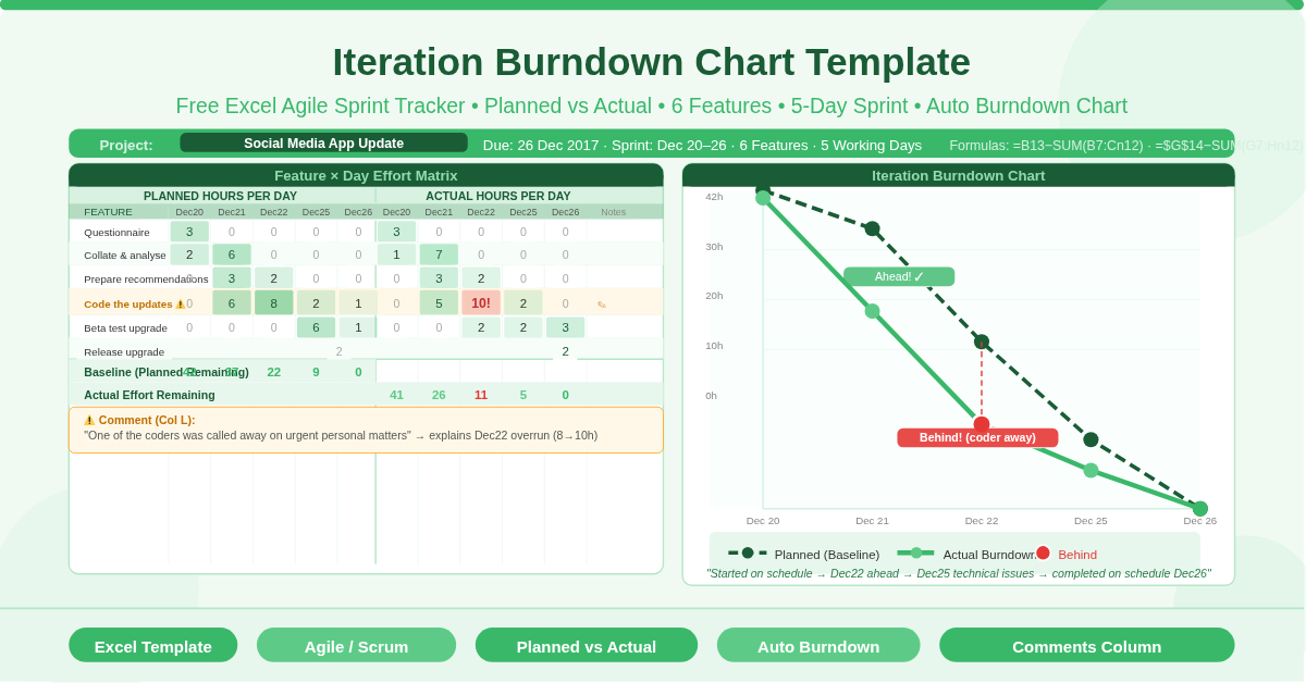
The Iteration Burndown Chart Template is a free Microsoft Excel workbook with a single sheet named Iterations. It tracks both planned and actual effort remaining across every day of a sprint, plots them as two separate lines on a burndown chart, and includes a commentary section for narrative context.
The template uses a project from real sample data — a Social Media App Update sprint running from December 20 to December 26, 2017 — to demonstrate the full tracking workflow. Six features, five working days, and a real-world interruption (a coder called away on urgent personal matters) make the sample data instructive rather than generic.
Three project fields anchor the sheet: Project Due Date (December 26), Project Name (Social Media App Update), and Updated On (December 20). The updated-on date acts as the data entry timestamp, signaling when the actual hours were last recorded.
How the Feature Table Works
The core of the template is a feature-by-day matrix. Rows represent individual features or tasks. Columns represent each working day of the sprint, split into two groups — planned hours and actual hours.
Planned Effort Columns
The left group of date columns (Days 1–5 in the sample: Dec 20, 21, 22, 25, 26) holds the planned effort for each feature on each day. Each cell records how many hours that feature was expected to require on that specific day. Features that span multiple days have planned hours spread across those days.
The six features in the sample demonstrate realistic sprint planning:
- Questionnaire for users — 3 planned hours on Day 1 only. A short, contained task completed in one session.
- Collate and analyze data — 2 hours on Day 1, 6 hours on Day 2. Data collection flows immediately into analysis.
- Prepare recommendations — 3 hours on Day 2, 2 hours on Day 3. The output of the analysis drives Day 3 documentation.
- Code the updates — 6h on Day 2, 8h on Day 3, 2h on Day 4, 1h on Day 5. The heaviest task, spanning four days.
- Beta test the upgrade — 6h on Day 4, 1h on Day 5. Testing follows coding.
- Release the upgrade — 2h on Day 5 only. The final delivery step.
Actual Effort Columns
The right group of date columns (same five dates) holds the actual hours logged per feature per day. These are entered as the sprint progresses. The template compares planned columns against actual columns to produce both the burndown lines and the variance narrative.
In the sample, the “Code the updates” row shows 10 actual hours on Day 3 (December 22) against 8 planned — with the comment: “One of the coders was called away on urgent personal matters.” This single note explains why the actual burndown line crossed above the planned line on Day 3, giving anyone reading the chart the context they need to understand the trajectory.
The Two Burndown Lines — Baseline and Actual
The burndown chart plots two lines against the daily x-axis of the sprint.
Baseline Effort (Planned Burndown)
The Baseline Effort row uses a cumulative subtraction formula: =B13-SUM(B7:C12) for Day 2, =B13-SUM(B7:D12) for Day 3, and so on. Cell B13 holds the total planned hours across the entire sprint — the starting point of the burndown. Each subsequent column subtracts all planned hours from Day 1 through the current day, giving the planned hours remaining. This line descends from the total planned effort at Day 1 to zero at the final day, forming the ideal burndown trajectory.
Actual Effort (Real Burndown)
The Actual Effort row uses a parallel formula structure: =$G$14-SUM(G7:H12) for Day 2, =$G$14-SUM(G7:I12) for Day 3, and so on. Cell G14 holds the total actual hours (calculated as =SUM(G7:K12) — the sum of all actual work logged). Each column subtracts actual hours completed from the start through that day, giving the actual remaining effort. This line is the sprint’s real trajectory — the one that tells you whether the team is on track, ahead, or behind.
Reading the Chart
When the actual line sits below the baseline, the team is ahead of schedule. When it rises above the baseline, the team is behind. The sample sprint’s commentary captures the story precisely: “The project started on schedule. On the third day (22-Dec) it was ahead of schedule. At the end of the fourth day (25-Dec) the team encountered some technical issues and were a bit behind schedule, but were able to complete on schedule at the end of the fifth day.”
This narrative accompanies the chart in A37. Together, the visual line chart and the written commentary give sprint stakeholders a complete picture of how the iteration unfolded.
The Comments Column — Context Behind the Numbers
Column L in the feature table is a Comments column. It captures the narrative explanation for any variance between planned and actual hours on a specific feature.
The sample uses this column to record the coding interruption — “One of the coders was called away on urgent personal matters.” This is not just anecdotal. In a sprint review or retrospective, this comment explains why the coding row shows 10 actual hours against 8 planned on Day 3, and why the burndown line dipped behind the baseline on that day. Without the comment, a reviewer might assume poor estimation. With it, the data tells the correct story.
Good use of the Comments column turns a burndown chart from a performance measurement into a learning tool. Patterns in the comments — recurring interruptions, repeated underestimation of testing effort, consistent coding overruns — become visible across multiple sprints and drive meaningful process improvement.
Practical Use Cases
Agile development teams running one- or two-week sprints will use this template to track feature-by-feature progress without requiring a dedicated project management tool. The chart updates with each day’s actual hours, giving the team and scrum master a daily velocity check.
Scrum masters facilitating daily standups will use the burndown chart as the visual anchor for the “are we on track?” question — replacing subjective team assessments with a concrete data line.
Product owners and project sponsors who attend sprint reviews will find the chart and commentary together give them a clear, honest retrospective of what happened during the iteration and why — without needing to understand the technical work.
Freelance developers and small agencies who deliver work in iterative sprints but cannot justify enterprise PM software will use this template as a lightweight, no-cost alternative that covers the core tracking requirement precisely.
Operations and non-technical teams running improvement projects, event planning sprints, or any time-boxed delivery effort will adapt the feature rows to their specific tasks and use the same burndown structure to track daily progress toward a fixed deadline.
How to Set Up Your Own Sprint
Open the workbook. Update the three project fields: Project Due Date, Project Name, and Updated On. Replace the five sample dates in the column headers with your sprint’s actual working days. Add or remove date columns to match your sprint length.
Replace the six sample features with your sprint’s actual tasks or user stories. Enter planned hours for each feature across the days you expect to work on it. The Baseline Effort row calculates automatically.
As the sprint progresses, enter actual hours for each feature on each day in the Actual Effort columns. The Actual Effort row updates the burndown line immediately. Add comments in column L for any day where actual hours deviate significantly from the plan.
At the sprint’s end, write a brief summary in the Commentary cell (A37) describing how the iteration unfolded — whether the team finished on time, where variances occurred, and what caused them. This closes the loop on the sprint record and builds the institutional knowledge that improves future planning.
Download the Free Iteration Burndown Chart Template
Tracking a sprint’s daily progress does not require expensive agile tools. This free Excel template gives you a feature-by-day effort matrix, a planned vs actual burndown chart, and a comments column for context — everything you need to manage a sprint’s trajectory and learn from each iteration.
Download the free Iteration Burndown Chart Template now and know exactly where your sprint stands — every single day.