When you manage more than two or three projects simultaneously, the real danger is not the projects themselves. It is the gaps between them. A risk escalating on Project Alpha. A budget overrun quietly growing on Project Beta. A headcount conflict that nobody flagged until it became a crisis. None of these appear on a single-project tracker — because single-project trackers only show one thing at a time.
A project portfolio dashboard puts everything in one place. Status, budget, resources, risks, and issues across every project in your portfolio — visible on a single screen, updated from a single data sheet. Decision makers get the overview they need. Project managers get the consolidated view they always wanted but never had time to build.
This free Excel Project Portfolio Dashboard Template gives you exactly that — five connected dashboard panels, a structured data entry sheet, RAG health scoring, and a Gantt delivery roadmap, all ready to use for up to 10 concurrent projects.
Download the free Project Portfolio Dashboard and stop managing your portfolio from memory.
What Is the Project Portfolio Dashboard Template?
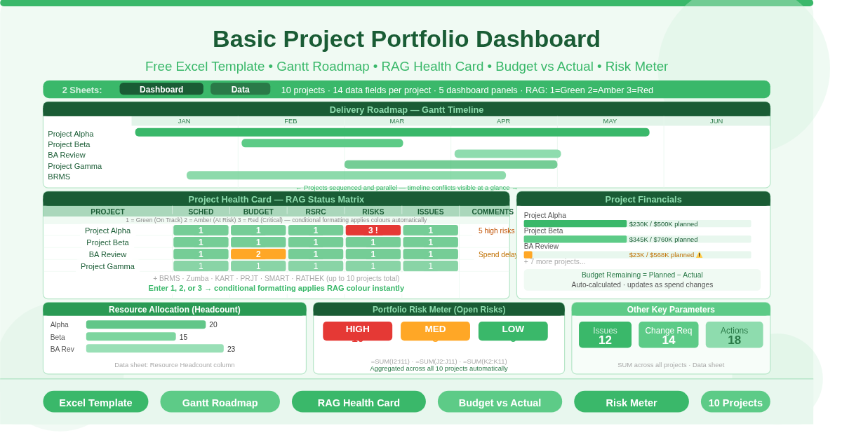
The Basic Project Portfolio Dashboard is a free Microsoft Excel workbook with two sheets. The Data sheet is where all project information is entered. The Dashboard sheet is the visual output — five panels that transform the raw data into an at-a-glance portfolio view automatically.
The template tracks up to 10 projects simultaneously. Each project has 14 data fields: start date, finish date, duration, planned budget, actual spend, remaining budget, resource headcount, high/medium/low risk counts, open issues, open change requests, and pending actions. Every dashboard panel draws from this single source of truth.
No charts need to be rebuilt. No formulas need editing when you change project names. Update the Data sheet, and all five dashboard panels reflect the changes instantly.
The Delivery Roadmap — Your Gantt in One Glance
The top of the Dashboard sheet displays a Delivery Roadmap — a Gantt-style horizontal timeline that shows every project’s start and end date as a colored bar across a shared calendar scale.
Each project occupies one row. The colored bar spans from the project’s start date column to its finish date column, giving an immediate visual sense of project sequencing, parallel delivery, and timeline congestion. When projects overlap in the same period, the Roadmap makes the conflict visible before it becomes a resourcing problem.
This view is particularly useful for portfolio review meetings. Rather than presenting ten separate project plans, you show one consolidated timeline. Stakeholders see the full delivery picture in a format they can read without any explanation.
The Project Health Card — RAG Status Across Five Dimensions
Below the roadmap, the Project Health Card is the operational heart of the dashboard. It displays a color-coded status matrix — 10 projects across five health dimensions — using the standard RAG (Red, Amber, Green) scoring system.
The Five Health Dimensions
Every project is scored across five areas: Schedule (is the project on track?), Budget (is spend in line with the plan?), Resources (is headcount adequate and available?), Risks (are open risks under control?), and Issues (are active issues being managed?).
How RAG Scoring Works
Each score is a number entered in the Data sheet: 1 = Green (on track), 2 = Amber (at risk, needs monitoring), 3 = Red (critical, needs immediate attention). Conditional formatting on the Dashboard converts these numbers into the corresponding colors automatically. You enter a number; the card shows a color.
In the sample data, Project Alpha carries a Risk score of 3 — the only red cell in the health matrix. This immediately flags Alpha’s risk position to any reviewer scanning the dashboard, without requiring them to open a separate risk register. That is the value of the consolidated health card: critical signals surface immediately, not after a meeting.
Adding Comments
The Health Card includes a Comments column to the right of each project row. Use this to add a brief narrative — one sentence explaining the amber or red score, or noting an action already in progress. Comments keep the dashboard self-explanatory and reduce the need for verbal briefings.
Project Financials — Budget vs Actual at a Glance
The Project Financials panel occupies the middle section of the Dashboard. It shows each project’s planned budget against actual spend as a visual comparison, drawn directly from the Data sheet’s Budget Planned, Budget Actual, and Budget Remaining columns.
The Data sheet calculates Budget Remaining automatically using =Budget Planned – Budget Actual. This figure feeds the financials panel without any additional input. As actual spend updates, the remaining budget and the visual comparison both update simultaneously.
The sample data illustrates the range of financial positions a portfolio typically contains. Project Alpha has spent $230,000 of a $500,000 plan — 46% utilized. Project Beta has spent $345,000 of $760,000 — also roughly on track. BA Review shows only $23,000 spent against a $567,777 plan, suggesting the project has barely started or spend has been significantly delayed.
This panel is the fastest way to identify budget outliers across the portfolio — projects running significantly over or under their spend profile — without reviewing individual project financial reports.
Resource Allocation and the Portfolio Risk Meter
The lower section of the Dashboard contains two side-by-side panels covering the two most commonly under-tracked portfolio dimensions: people and risk.
Resource Allocation (Headcount)
The Resource Allocation panel displays headcount per project as entered in the Data sheet’s Resource Headcount column. In the sample data, Project Alpha uses 20 people, Project Beta uses 15, and BA Review uses 23. When all projects are entered, this panel shows at a glance which projects are the heaviest consumers of people — and, by implication, where resource conflict risk is highest.
Portfolio Risk Meter
The Portfolio Risk Meter aggregates all open risks across the entire portfolio into a single gauge view. It draws from the High Risks, Med Risks, and Low Risks columns in the Data sheet, summing them using =SUM() across all projects. The meter shows the total count of High, Medium, and Low open risks in the portfolio, providing an instant sense of the portfolio’s overall risk exposure without requiring a separate risk register review.
High risk counts above single digits typically signal that the portfolio needs a dedicated risk review session. The meter makes this trigger visible at a glance.
Other Key Project Parameters
The bottom panel of the Dashboard captures three additional metrics that individual project trackers frequently miss at portfolio level: Open Issues, Open Change Requests, and Pending Actions. These columns sum across all projects in the Data sheet, giving portfolio-level totals for each metric.
A large number of pending actions relative to the number of projects typically signals that action ownership and follow-through are weak across the portfolio. Similarly, a high change request count suggests scope instability. These signals are invisible when projects are tracked separately — but obvious when summed and displayed side by side on a single dashboard panel.
Practical Use Cases
Program managers overseeing a portfolio of parallel workstreams will use the Health Card in weekly governance meetings as the primary status report. One sheet replaces ten individual updates.
PMO teams responsible for portfolio-level reporting to executives will use the Financials and Risk Meter panels to populate board packs and steering committee decks without manually compiling data from multiple project managers.
Project sponsors and directors who need a quick read on overall portfolio health before a review meeting will open the Dashboard sheet, scan the RAG colours, note any reds, and have their agenda for the meeting set within 60 seconds.
Team leads managing a mix of large and small projects will use the Delivery Roadmap to identify timeline conflicts and resource overcommitments before they escalate into delivery problems.
Anyone transitioning from spreadsheet chaos — separate trackers per project, manually compiled summary slides — will use this template as the foundation for a structured, repeatable portfolio reporting process.
How to Set Up the Dashboard
Open the workbook. Go to the Data sheet and replace the sample project names in column A with your own. Enter start and finish dates in columns B and C — the Duration column calculates automatically. Enter Budget Planned in column E and update Budget Actual as spend is recorded. The Budget Remaining column calculates itself.
Fill in Resource Headcount, High/Medium/Low Risks, Open Issues, Change Requests, and Pending Actions for each project. Switch to the Dashboard sheet to see all five panels update.
To update RAG scores on the Health Card, return to the Dashboard sheet and enter 1, 2, or 3 directly in the Schedule, Budget, Resources, Risks, and Issues columns for each project. Conditional formatting applies the colours automatically.
Download the Free Project Portfolio Dashboard Today
Consolidating a portfolio into one view does not require expensive software. The Basic Project Portfolio Dashboard gives you a Gantt roadmap, RAG health matrix, budget tracking, headcount allocation, and risk aggregation — all in free Excel, all from a single data sheet.
Download the free Project Portfolio Dashboard Template now and give your portfolio the visibility it deserves.