The purpose of a project status dashboard is clarity. A sponsor opening a dashboard should see in seconds whether the project is on budget, how far through delivery it is, and whether anything needs their attention. If they have to read a table of numbers and mentally calculate percentages, the dashboard is not doing its job.
A proper project status dashboard puts two pieces of information on screen: where is the money, and where is the work? A budget chart answers the first question. A progress chart answers the second. Together, they deliver the entire status story at a glance — without a single meeting, a slide deck, or a verbal briefing.
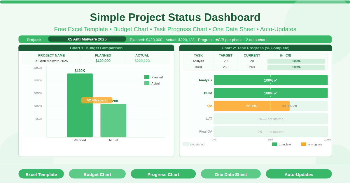
This free Excel Project Status Dashboard Template gives you exactly those two charts — a clustered column chart comparing planned versus actual budget, and a 100% stacked bar chart showing task completion percentage across five project phases — both driven automatically by a single data sheet you update in under a minute.
Download the free Project Status Dashboard Template and make every project update as fast as it should be.
What Is the Simple Project Status Dashboard?
The Simple Project Status Dashboard is a free two-sheet Microsoft Excel workbook. The Data sheet is where you enter and update project information. The Project Status Dashboard sheet displays two auto-updating charts that visualise that information in a format instantly readable by sponsors, stakeholders, and project managers.
The template uses a real project as its sample: the X5 Anti Malware 2025 project, with a planned budget of $420,000 and five tracked delivery phases — Analysis, Build, Quality Assurance, User Acceptance Testing, and Final QA. The sample data reflects a project that is well advanced: the first two phases are fully complete, the third is in progress, and the final two are yet to begin.
The design philosophy is deliberate simplicity. Two charts. One data sheet. No complex formulas beyond =C/B for percentage completion. No pivot tables, no macros, no external data sources. Update the numbers, and the charts update instantly.
The Data Sheet — Two Tables, One Update
The Data sheet contains two tables. Both are simple to maintain. Both drive a chart directly.
The Project Budget Table
The first table has three columns: Project Name, Planned Budget, and Actual Budget. Enter the project’s total planned spend and the current actual spend, and the clustered column chart on the Dashboard sheet updates to show both figures as side-by-side bars.
The sample data for X5 Anti Malware 2025 shows a planned budget of $420,000 and actual spend of $220,123. The visual comparison makes the budget position immediately clear: the project is roughly halfway through its planned spend. Whether that represents good news — the project is on track and 52% spent — or a concern — actual spend is lagging behind planned spend — depends on context the project manager can explain in the comment field or verbal briefing. The chart surfaces the data. The manager provides the narrative.
The Project Progress Percentage Table
The second table tracks task completion across five delivery phases. It has four columns: Tasks (the phase name), Target (Days) (the planned duration), Current (days completed to date), and Percentage (calculated automatically as =Current/Target).
The five phases in the sample demonstrate a realistic mid-project snapshot. Analysis is 20 days planned, 20 days complete — 100%. Build is 260 days planned, 260 days complete — 100%. Quality Assurance is 3 days planned, 2 days complete — 66.7%. User Acceptance Testing is 2 days planned, 0 days complete — 0%. Final QA is 2 days planned, 0 days complete — 0%.
The stacked bar chart on the Dashboard converts these percentages into a horizontal progress indicator for each phase. Completed phases show as full bars. In-progress phases show as partial fills. Phases not yet started show as empty. The visual pattern — from Analysis and Build completed at the top to UAT and Final QA empty at the bottom — tells the delivery story in one chart without any written explanation.
The Two Dashboard Charts
The Dashboard sheet displays both charts in a clean single-page view. Neither chart requires any configuration after initial setup. Enter new data in the Data sheet, and both charts reflect the changes automatically.
Chart 1: Budget Comparison (Clustered Column Chart)
The budget chart is a clustered column chart with two bars per project: one for Planned Budget and one for Actual Budget. The height difference between the two bars immediately communicates whether spend is ahead of or behind plan.
This chart is most useful for sponsor-level reporting, where the budget question — are we spending as expected? — is typically the first and most important one. A large gap between the planned and actual bars prompts a conversation. A small gap, or bars of similar height, provides immediate reassurance.
Chart 2: Task Progress (100% Stacked Horizontal Bar Chart)
The progress chart is a 100% stacked horizontal bar chart showing one bar per project phase. Each bar is divided into three segments: completed work (current days), remaining planned work (target minus current), and — implicitly — not yet started (zero current, full target remaining).
The horizontal format makes the chart naturally readable as a timeline from top to bottom — Analysis and Build at the top, fully complete; QA partially filled; UAT and Final QA empty at the bottom. This visual structure aligns with how people naturally think about project sequencing: earlier phases at the top, later phases below.
The 100% stacking means every bar is the same total width, making percentage completion easy to compare across phases with very different day totals. A 10-day phase and a 260-day phase both occupy the same visual width — so a bar that is half-filled always means 50% complete, regardless of the underlying day count.
How to Update the Dashboard for Your Project
Open the workbook and go to the Data sheet. In the Project Budget table, replace the project name, planned budget, and actual budget with your own figures.
In the Project Progress table, replace the five sample phase names with your project’s actual phases or workstreams. Enter the planned duration in days and the days completed to date. The Percentage column calculates automatically using =C/B. You do not need to enter percentages manually.
Switch to the Project Status Dashboard sheet. Both charts have already updated to reflect your new data. Review the visual output to confirm the charts are reading correctly, then share the Dashboard sheet as a PDF or printed page for your next status update.
To add more than one project to the budget chart, add additional rows to the Project Budget table in the Data sheet. The clustered column chart can display multiple projects side by side. Similarly, to track more than five phases in the progress chart, add rows to the progress table and extend the chart’s data range.
Practical Use Cases
Project managers producing weekly or fortnightly status updates for sponsors and steering committees will use the Dashboard as the visual summary to accompany or replace their status report narrative. Two charts communicate the essential status information faster than any text update.
Program managers overseeing multiple projects will maintain one dashboard file per project and use the consistent format across all dashboards to make portfolio-level review efficient. The same two charts, in the same position, for every project — reducing the cognitive load of switching between updates.
PMO teams responsible for executive reporting will extract the Dashboard sheet as a PDF and include it in board packs, steering committee papers, and portfolio review presentations without any additional formatting work.
Team leads in non-IT functions — marketing campaigns, product launches, facility projects — will replace the software phase labels (Analysis, Build, QA) with their own workstreams and use the same two-chart structure to track any effort-and-spend project.
Freelancers and consultants reporting project progress to clients will use the Dashboard as a professional, clean client-facing update that avoids the complexity of project management software while still communicating status with visual authority.
Download the Free Project Status Dashboard Template
Two charts. One data sheet. Thirty seconds to update. This free Excel template gives you a professional project status dashboard that any sponsor or stakeholder can read instantly — budget position on the left, task progress on the right, no explanation required.
Download the free Simple Project Status Dashboard Template now and deliver your next project update in the time it takes to open Excel.