
Key takeaways
- The fastest way to turn a CSV into a formatted Excel report is a repeatable script, not manual formatting you redo every month.
- Excel Report Generator is free and open-source (MIT), built in Python with
pandasandopenpyxl. - It adds a totals row with real
=SUM()formulas — not pasted values — so the report stays live in Excel. - Conditional formatting highlights negatives in red and high values in green automatically.
- One flag adds a bar chart built natively into the worksheet.
To auto-generate a formatted Excel report from raw data, run a free tool called Excel
Report Generator, which turns a plain CSV or Excel file into a styled, presentation-ready report
in one command. It adds a styled header, a totals row with live SUM formulas,
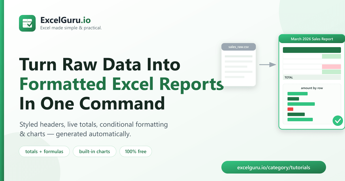
conditional formatting, and a chart — automatically, and identically every time you run it.
Why manual report formatting wastes hours
Most reports are the same job on repeat: export raw data, then spend 20–30 minutes making it presentable. You bold the header, colour it, freeze the top row, widen columns, add a totals row, colour-code the numbers, and maybe drop in a chart. Next week or next month, you do it all again.
It's repetitive, and it's easy to get slightly wrong — a missed total, an inconsistent colour, a forgotten freeze. A script removes that entirely: define the formatting once, and every future report comes out identical and correct.
What is Excel Report Generator?
Excel Report Generator is a free, open-source command-line tool that converts a raw CSV or
Excel export into a fully formatted .xlsx report. It's written in Python and
released under the MIT license, so it's free for personal and commercial use.
In a single command it applies all of this automatically:
- A styled header row — green fill, bold white text, centered.
- A frozen header so column names stay visible while scrolling.
- A totals row with live
=SUM()formulas for every numeric column. - Conditional formatting — negatives in red, high values in green.
- Auto-sized columns and an optional bar chart.
How to install the tool (2 minutes)
You need Python 3.9 or newer. Clone the repository and install its two dependencies:
git clone https://github.com/Synth88Labs/excel-tool-reportgen.git
cd excel-tool-reportgen
pip install -r requirements.txt
Get Excel Report Generator on GitHub (free)
How to generate a formatted Excel report — step by step
Step 1 — Start with your raw data
Any CSV or Excel export works. For example, a flat sales_raw.csv with columns
region, salesperson, product, units, amount.
Step 2 — Run the report command
Point the tool at the file, give it a title, and choose a column to chart:
python make_report.py sales_raw.csv -o march_report.xlsx --chart amount --title "March 2026 Sales Report"That's it. Open march_report.xlsx and you'll find a styled, chart-ready report.
Step 3 — Tune the highlight threshold (optional)
By default, numeric values of 2000 or more are highlighted green. Change it with
--highlight-min:
python make_report.py sales_raw.csv -o report.xlsx --highlight-min 1000=SUM() formulas, so if you edit a
number in Excel afterwards, the total updates automatically — just like a report you built by hand.
What the formatting looks like
Here's how a few sample rows are treated, based on the default rules:
| region | salesperson | units | amount | How it's formatted |
|---|---|---|---|---|
| West | Alice | 12 | 2400 | 🟩 amount ≥ 2000 → green |
| East | Bob | -2 | -440 | 🟥 negative → red |
| South | Eve | 3 | 450 | no highlight (below threshold) |
| TOTAL | =SUM(...) | =SUM(...) | live totals row | |
Real work use cases
- Weekly & monthly sales reports — same format, refreshed data, zero manual styling.
- Finance summaries — instantly flag negative balances and large amounts.
- Marketing performance reports — turn an ad-platform export into a clean deliverable.
- Operations dashboards — a totals row and chart for any metric export.
- Client-ready deliverables — hand over a polished workbook, not a raw dump.
Common mistakes to avoid
- Non-numeric columns won't total. Numbers stored as text (e.g.
"1,200"with a comma) are treated as text, so they're skipped in the totals row. Clean numeric formatting first. - Charting the wrong column.
--chartexpects a numeric column name that exists in your data; a typo simply skips the chart. - Overwriting your source. Always send output to a new file with
-oso you never overwrite the raw data. - Expecting pivot tables. This tool formats and summarizes a flat table; it doesn't build pivot tables. Combine data first if you need a single tidy dataset.
Frequently asked questions
How do I turn a CSV into a formatted Excel report?
Run python make_report.py yourfile.csv -o report.xlsx --title "Your Title". The tool
reads the CSV and writes a formatted .xlsx with a styled header, totals row, and
conditional formatting.
Does the totals row use real Excel formulas?
Yes. Numeric totals are written as live =SUM() formulas, so they recalculate
automatically if you edit values in Excel afterwards.
Is Excel Report Generator free?
Yes. It's open-source under the MIT license, free for personal and commercial use. The full source is on GitHub.
Do I need Excel installed?
No. It writes .xlsx files using the Python library openpyxl, so it runs
on machines without Microsoft Excel installed.
Can it add a chart automatically?
Yes. Add --chart COLUMN with a numeric column name and the tool inserts a native bar
chart into the worksheet.
Can I change which values get highlighted?
Yes. Use --highlight-min N to set the green-highlight threshold. Negative values are
always highlighted red.
What file types can it read?
It reads .csv, .xlsx and .xls files and always outputs a
formatted .xlsx.
Summary
Formatting the same report by hand every week is slow and error-prone. Excel Report Generator turns raw data into a polished, formatted Excel report in one command — styled header, live totals, conditional formatting, and a chart. It's free, open-source, and works without Excel installed.