Two columns of numbers. Do they move together? When one rises, does the other tend to rise as well — or fall? The CORREL function answers this question with a single number between −1 and +1. That number is the Pearson correlation coefficient — the most widely used measure of linear association between two datasets. A coefficient of +0.9 means the two variables are strongly positively related. A coefficient of −0.85 means they move strongly in opposite directions. A coefficient near zero means there is little or no linear relationship.
This guide covers the full CORREL syntax, the interpretation scale, and eight practical examples. You will learn how to calculate basic correlation, build a correlation matrix across multiple variables, test whether a correlation is statistically significant, and identify the strongest relationships in a dataset using LARGE and SMALL. Each example also addresses a common pitfall — specifically, the difference between correlation and causation.
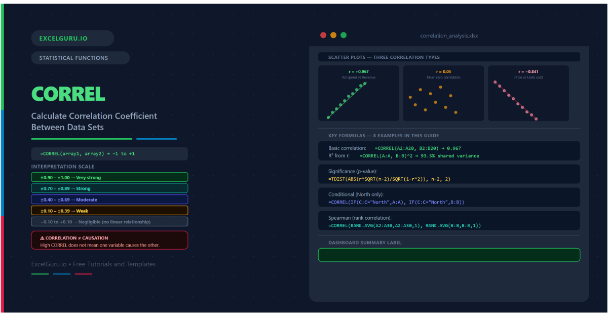
What Is the Correlation Coefficient?
The Pearson correlation coefficient measures the strength and direction of the linear relationship between two variables. It is calculated by dividing the covariance of the two variables by the product of their standard deviations. The result always falls between −1 and +1. A value of +1 means a perfect positive linear relationship — when one variable increases by any amount, the other increases proportionally. A value of −1 means a perfect negative relationship. A value of 0 means no linear relationship exists.
Importantly, correlation measures only linear association. Two variables can have a strong non-linear relationship — for example, a U-shaped curve — and still produce a correlation near zero. Additionally, correlation does not imply causation. Two variables can be highly correlated because they share a common cause, because one is a time index, or simply by coincidence. Always combine the correlation coefficient with domain knowledge and visual inspection.
How Do You Interpret the Correlation Coefficient?
The scale from −1 to +1 is divided into meaningful bands by convention. These thresholds are guidelines, not strict rules. Social science research uses different cutoffs than engineering or finance. Furthermore, sample size matters — a correlation of 0.30 from 200 observations is more reliable than the same value from 10 observations.
| Range | Strength | Direction | Typical interpretation |
|---|---|---|---|
| +0.90 to +1.00 | Very strong | Positive | Variables move almost in lockstep. One reliably predicts the other. |
| +0.70 to +0.89 | Strong | Positive | Clear positive relationship. Useful for prediction with caution. |
| +0.40 to +0.69 | Moderate | Positive | Noticeable positive trend. Other factors also at play. |
| +0.10 to +0.39 | Weak | Positive | Slight positive tendency. Unreliable for prediction. |
| −0.10 to +0.10 | Negligible | None | No meaningful linear relationship detectable. |
| −0.39 to −0.11 | Weak | Negative | Slight negative tendency. |
| −0.69 to −0.40 | Moderate | Negative | Noticeable inverse relationship. |
| −0.89 to −0.70 | Strong | Negative | Clear inverse relationship. |
| −1.00 to −0.90 | Very strong | Negative | Variables move almost perfectly in opposite directions. |
What Is the CORREL Syntax?
| Argument | Required? | What it does |
|---|---|---|
| array1 | Required | The first dataset — a range, column, or array of numeric values. Text, logical values, and empty cells are ignored. Must have the same number of data points as array2. |
| array2 | Required | The second dataset. Must be the same length as array1. CORREL returns #N/A if the lengths differ, #DIV/0! if either array is empty or has zero variance. |
Examples 1–4: Core Correlation Patterns
The simplest use is passing two column ranges to CORREL. The function returns a single decimal between −1 and +1 describing the linear relationship. The result is symmetric — swapping the two arguments always produces the same value. Below, three variable pairs illustrate strong positive, weak, and strong negative correlations from the same dataset.
When you have four or five variables, a correlation matrix shows all pairwise relationships simultaneously. Each cell contains the correlation between the row variable and the column variable. The diagonal is always 1.0 (a variable is perfectly correlated with itself). The matrix is symmetric — the upper-right triangle mirrors the lower-left. Building the matrix with CORREL and absolute references allows the formula to be entered once and copied across the entire grid.
A correlation coefficient is a sample estimate. Even a perfectly random dataset occasionally produces non-zero correlations purely by chance. The t-test converts the correlation and sample size into a t-statistic, which is then converted to a p-value. A p-value below 0.05 means the correlation is statistically significant — unlikely to be a chance result at the 5% significance level.
CORREL does not filter natively. To calculate the correlation between two variables only for rows that meet a condition — for example, only for a specific region or product category — use CORREL wrapped in IF as an array formula. This is the same approach used for conditional standard deviation and variance. In Excel 365, the formula enters normally; in Excel 2019 and earlier, press Ctrl+Shift+Enter.
Examples 5–8: Applied Correlation Analysis
Rolling Windows, Ranking, and Spearman Correlation
A single correlation coefficient describes the average relationship across the entire history. However, the relationship between two variables often changes over time. A rolling correlation — calculated over a fixed window of recent observations — shows when the relationship strengthens, weakens, or reverses. This is particularly useful in finance, where the correlation between assets changes with market conditions.
When a correlation matrix contains dozens of pairs, identifying the strongest relationships manually is tedious. LARGE and SMALL extract the k-th largest and smallest correlation values from the entire matrix array. Additionally, combining this with INDEX and MATCH allows you to identify not just the strongest correlation value but also which variable pair produced it.
Pearson correlation assumes the relationship is linear and the data is approximately normally distributed. When data contains outliers, is skewed, or follows a non-linear but monotonic pattern, the Spearman rank correlation is more appropriate. Spearman correlation ranks each dataset and then applies Pearson correlation to the ranks. In Excel, this is achieved in two steps: rank with RANK.AVG, then correlate the ranks with CORREL.
A self-updating correlation dashboard shows the coefficient, a plain-language strength label, a significance indicator, and the R² value. All cells reference the data directly, so adding new rows updates every figure automatically. Additionally, adding a scatter chart with a trendline provides the visual confirmation that the correlation number alone cannot give.
Common Issues and How to Fix Them
CORREL returns #N/A
#N/A means the two arrays have different numbers of data points. Excel counts the number of values in array1 and array2 after ignoring text, blanks, and logical values — and they must match. Check both ranges for hidden blank rows, accidentally included header rows, or mismatched range sizes. The simplest fix is to make both ranges exactly the same size by selecting the same number of rows for each.
CORREL returns #DIV/0!
#DIV/0! occurs when either array has zero variance — meaning all values in one column are identical. Correlation is undefined when a variable does not vary. Check the data for columns that are all the same value, or for ranges that accidentally include only one unique number. This error also appears when both arrays are empty or contain only non-numeric values after filtering.
The correlation is high but the relationship is not linear
A high Pearson correlation confirms a strong linear relationship. It does not confirm that the relationship exists in the first place — it only measures the linear component. Consequently, always plot the two variables in a scatter chart before drawing conclusions. A scatter chart showing a curved pattern, a cluster of outliers, or a relationship that differs by subgroup all indicate that the correlation coefficient alone is an incomplete description of the data.
Frequently Asked Questions
-
What does the CORREL function return?+CORREL returns the Pearson product-moment correlation coefficient for two datasets. The result is a decimal between −1 and +1. A value close to +1 indicates a strong positive linear relationship. A value close to −1 indicates a strong negative linear relationship. A value near zero indicates little or no linear relationship. The function is equivalent to PEARSON and to taking the square root of the R² value from a simple linear regression of one variable against the other.
-
What is the difference between CORREL and PEARSON in Excel?+There is no difference in results — CORREL and PEARSON are identical functions that calculate the same Pearson product-moment correlation coefficient. CORREL is more commonly used because the name is more intuitive. Both functions handle text, logical values, and blank cells the same way (by ignoring them). Choose whichever name you find more readable. Some style guides prefer CORREL for consistency with COVARIANCE functions in the same family.
-
How do I check if a correlation is statistically significant?+Convert the correlation to a t-statistic using t = r × SQRT(n−2) / SQRT(1−r²), where r is the CORREL result and n is the number of data points. Then use TDIST(ABS(t), n−2, 2) to get the two-tailed p-value. A p-value below 0.05 means the correlation is statistically significant at the 5% level — unlikely to be a chance result. Larger samples make smaller correlations significant. For n = 100, a correlation of just 0.20 is statistically significant. For n = 10, you need a correlation of about 0.63 to achieve significance.
More Questions About CORREL
-
What is a good correlation coefficient value?+What counts as a good correlation depends entirely on the field and context. In physics or engineering, correlations below 0.99 might be considered poor. In social science or psychology, a correlation of 0.40 to 0.60 is often considered meaningful. In financial markets, correlations above 0.50 between different assets are considered high. The key is not just the coefficient itself, but also whether it is statistically significant, whether the relationship is linear, and whether the sample size is sufficient. Always report the sample size alongside the correlation coefficient.
-
How do I calculate Spearman correlation in Excel?+Excel has no built-in Spearman function, but you can calculate it in two steps. First, rank each dataset using RANK.AVG — this handles ties correctly by assigning the average of the tied ranks. Then apply CORREL to the two sets of ranks. The result is the Spearman rank correlation coefficient, which is more robust to outliers and non-linear monotonic relationships than Pearson. In Excel 365, you can do this in one formula without helper columns: =CORREL(RANK.AVG(A2:A30,A2:A30,1), RANK.AVG(B2:B30,B2:B30,1)).
-
Can CORREL handle missing values or blank cells?+CORREL ignores blank cells and text values in both arrays. However, it does this row by row — if a row has a value in array1 but a blank in array2 (or vice versa), both values are excluded from the calculation for that row. This means mismatched blanks effectively reduce the sample size. If your data has many blanks in different positions across the two columns, the effective sample size may be much smaller than the range size suggests. Always check the actual count of matched pairs with SUMPRODUCT((A2:A100<>"")*(B2:B100<>"")).