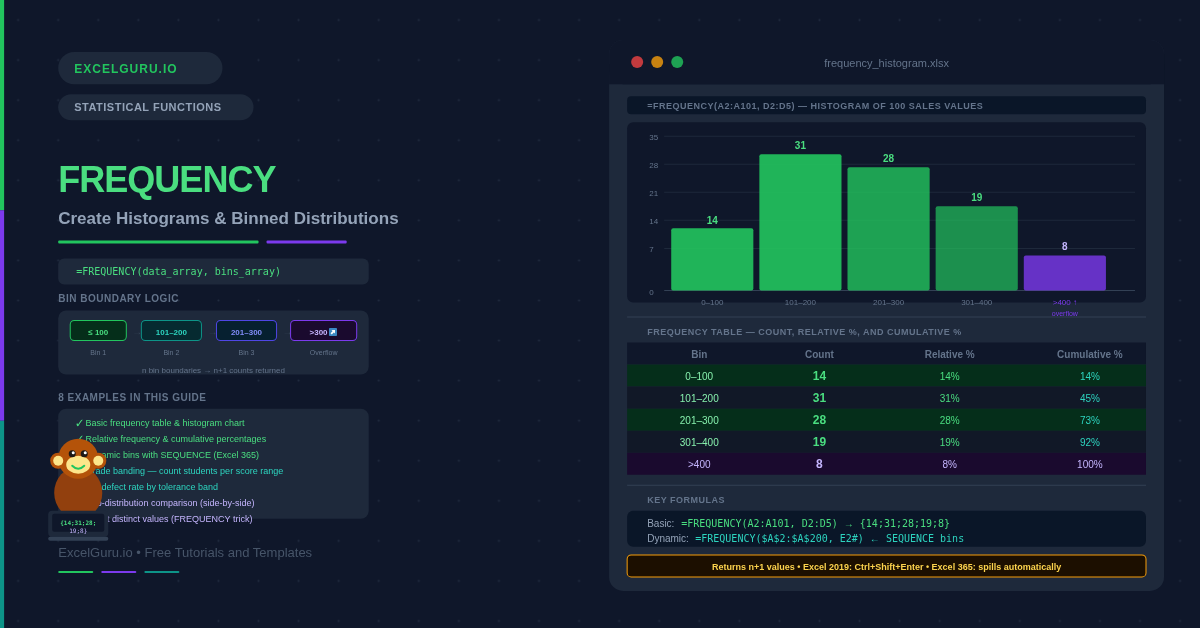
A list of 500 sales figures tells you almost nothing at a glance. Group those figures into bins — 0–100, 101–200, 201–300 — and suddenly you see the shape of the distribution: where the values cluster, where they thin out, whether the data is skewed left or right. The FREQUENCY function performs that grouping in a single formula. It counts how many values fall into each bin and returns the counts as a vertical array. Those counts are the foundation of every histogram, distribution report, and binned analysis in Excel.
This guide covers the full FREQUENCY syntax, the bin boundary logic, and eight practical examples. You will learn how to build a basic frequency table, chart it as a histogram, calculate relative frequencies and cumulative percentages, create dynamic bins that update as data changes, and use FREQUENCY for grade banding and quality control. Each example also includes the Excel 365 spill approach and the Ctrl+Shift+Enter method for older versions.
What Does FREQUENCY Do?
FREQUENCY counts how many values in a dataset fall within each interval defined by a set of bin boundaries. Specifically, each bin captures values greater than the previous boundary up to and including the current boundary. For example, a bin boundary of 50 captures all values from the previous boundary (exclusive) up to and including 50. The first bin captures everything from negative infinity up to the first boundary value.
The function always returns one more value than the number of bin boundaries. The extra value at the end counts everything above the highest boundary — an overflow bucket. This is a distinctive behaviour that catches analysts off guard. If you define five bin boundaries, FREQUENCY returns six counts. The sixth count tells you how many values exceeded the largest bin.
What Is the FREQUENCY Syntax?
| Argument | Required? | What it does |
|---|---|---|
| data_array | Required | The values to count. A range or array of numbers. Text and empty cells are ignored. Logical values (TRUE/FALSE) are ignored. |
| bins_array | Required | The upper boundaries of each bin, in ascending order. FREQUENCY counts values up to and including each boundary. Providing five bin boundaries returns six counts (including the overflow bucket above the last boundary). |
How Does FREQUENCY Handle Bin Boundaries?
Each bin in FREQUENCY captures values strictly greater than the previous boundary and less than or equal to the current boundary. This is sometimes written as (prev, current]. A value that exactly equals a boundary falls into that bin, not the next one. Consequently, if your bin boundaries are 10, 20, 30 and a value is exactly 20, it is counted in the second bin (the 11–20 range), not the third.
| Bin boundary | Counts values that are | Notation |
|---|---|---|
| First boundary = 10 | ≤ 10 (from −∞) | (−∞, 10] |
| Second boundary = 20 | > 10 and ≤ 20 | (10, 20] |
| Third boundary = 30 | > 20 and ≤ 30 | (20, 30] |
| Overflow (no boundary) | > 30 (up to +∞) | (30, +∞) |
Examples 1–4: Core FREQUENCY Patterns
The fundamental use is counting how many data values fall into each interval. Define the bin upper boundaries in a column, then enter FREQUENCY referencing the data and the boundaries. The result is a column of counts — one per bin plus the overflow row. This table is the raw material for a histogram chart.
A histogram is a bar chart where bars are adjacent and represent bin counts. Excel’s built-in Histogram chart type (Insert → Charts → Histogram) calculates bins automatically but gives limited control. Building the chart manually from FREQUENCY output gives you full control over bin boundaries, labels, and formatting. The key step is setting gap width to zero so the bars touch.
Raw counts from FREQUENCY tell you how many values are in each bin. Relative frequency converts those counts to percentages of the total. A cumulative percentage shows the proportion of all values falling at or below each bin. These two derived columns transform a basic count table into a complete distribution summary suitable for reporting.
Hard-coded bin boundaries break when data changes range. A dynamic approach generates bin boundaries automatically from the minimum and maximum of the data, divided by a step size you control. This is specifically useful when the data range changes regularly — for example, monthly sales reports where the maximum order value varies each month.
Examples 5–8: Applied Frequency Analysis
Grading, Quality Control, and Comparison
FREQUENCY is the natural tool for assigning groups of values to score bands. For a class of students, bin boundaries at 39, 49, 59, 69, 79, 89 and 100 divide scores into F, D, C, B, A, A+ ranges. Each bin count tells you how many students fall in that grade category. The table updates instantly when any score changes.
In manufacturing quality control, measurements are compared to specification limits. FREQUENCY counts how many items fall within tolerance, below the lower limit, and above the upper limit. This three-zone breakdown gives a fast summary of defect rates. Additionally, pairing FREQUENCY with conditional formatting highlights which tolerance bands are out of spec.
FREQUENCY makes it straightforward to compare two datasets using identical bin boundaries. Running FREQUENCY on each dataset with the same bins_array produces two count columns that share the same scale. The comparison reveals whether the two distributions have similar shapes, whether one is shifted higher, or whether one has heavier tails.
FREQUENCY has a well-known secondary use: counting the number of distinct (unique) values in a dataset. When you pass data_array as both arguments, FREQUENCY returns 1 for each first occurrence and 0 for every duplicate. Summing a comparison against zero gives a count of distinct values. This works across all Excel versions and is faster than COUNTIF-based alternatives on large datasets.
=ROWS(UNIQUE(A2:A100)) to count distinct values. This is simpler, handles text, and does not require the FREQUENCY trick. However, the FREQUENCY approach works in all Excel versions without any special function availability.Common Issues and How to Fix Them
FREQUENCY only returns one value instead of the full array
In Excel 2019 and earlier, FREQUENCY must be entered as an array formula. Select the output range first — exactly n+1 rows for n bin boundaries — then type the FREQUENCY formula and press Ctrl+Shift+Enter. If you press Enter normally, only the first count appears. In Excel 365 and 2021, FREQUENCY spills automatically from a single cell without any special entry. If you accidentally type a normal formula in Excel 365 and it still only shows one value, check whether Automatic Calculation is turned off in Formulas → Calculation Options.
The counts do not sum to the total data count
If SUM(FREQUENCY results) is less than COUNT(data), some values were excluded. FREQUENCY ignores text and empty cells, so check the data column for accidental text entries that look like numbers — for example, numbers stored as text after importing from a CSV. Use =ISNUMBER(A2) to check individual cells. Additionally, make sure the output range is long enough to include the overflow row. Selecting one row short in Excel 2019 silently drops the overflow count.
Bins are not sorted in ascending order
FREQUENCY requires the bins_array to be sorted from smallest to largest. Unsorted bins produce incorrect counts — values may be allocated to the wrong bin without any error message. Always sort the bin boundaries before passing them to FREQUENCY. In Excel 365, wrap the bins in SORT: =FREQUENCY(A2:A100, SORT(D2:D5)) to sort automatically before the count.
Frequently Asked Questions
-
How does the FREQUENCY function work in Excel?+FREQUENCY takes two arguments: a data range and a bins range. It counts how many values from the data fall into each bin interval. Each bin captures values greater than the previous boundary up to and including the current boundary. The function always returns one more value than the number of bin boundaries — the extra value counts everything above the last bin. In Excel 365, FREQUENCY spills automatically. In Excel 2019 and earlier, select the output range (n+1 rows), type the formula, and confirm with Ctrl+Shift+Enter.
-
Why does FREQUENCY return one more value than the number of bins?+FREQUENCY automatically adds an overflow bucket above the last bin boundary. This captures any values that exceed the largest bin. For example, if your bins are {100, 200, 300}, FREQUENCY returns four counts: values ≤100, values from 101–200, values from 201–300, and values above 300. This overflow count is often zero in practice — but it is always present in the output. Always include this extra row in your output range, especially in Excel 2019 where forgetting it silently drops data from the last bin.
-
How do I use FREQUENCY to count unique values?+Pass the same range as both data_array and bins_array: =SUM(--(FREQUENCY(A2:A100, A2:A100)>0)). When the same array is used for both arguments, FREQUENCY returns 1 for each unique first occurrence of a value and 0 for every duplicate. Summing the results of the >0 comparison gives the count of distinct values. This technique only works for numeric data. In Excel 365, =ROWS(UNIQUE(A2:A100)) is simpler and works for text as well. In Excel 2019 and earlier, the FREQUENCY trick is the most efficient formula-based approach.
More Questions About FREQUENCY
-
What is the difference between FREQUENCY and COUNTIF for binning?+Both count values in ranges, but they work differently. FREQUENCY processes the entire dataset and all bins in a single call, returning all counts at once. COUNTIF counts one range at a time — you need a separate formula for each bin. For a few bins, COUNTIF is simpler: =COUNTIFS(A:A,">"&D2, A:A,"<="&D3). For many bins, FREQUENCY is faster and less error-prone because all intervals share the same data reference and cannot accidentally differ. Additionally, FREQUENCY has the unique value counting trick that COUNTIF cannot replicate as efficiently.
-
Does FREQUENCY work with text values?+No. FREQUENCY only counts numeric values. Text strings, blank cells, and logical values (TRUE/FALSE) are ignored entirely. If your data column contains numbers stored as text — a common issue after CSV imports — those cells are also excluded, which can cause the FREQUENCY totals to fall short of the actual row count. Use =ISNUMBER(A2) to check individual cells, and =VALUE(A2) or the Text to Columns wizard to convert text-stored numbers to genuine numeric values before running FREQUENCY.
-
Can I create a histogram without the FREQUENCY function?+Yes — Excel offers two alternatives. First, the built-in Histogram chart type (Insert → Charts → Histogram) calculates bin counts automatically from your raw data without any formula. It is the fastest approach for exploratory analysis. Second, the Data Analysis Toolpak (Developer → Data Analysis → Histogram) generates a frequency table and chart in one step. However, both alternatives produce static output that does not automatically update when data changes. FREQUENCY-based tables update in real time, which is why formula-driven histograms are preferred for reporting dashboards and automated workbooks.