
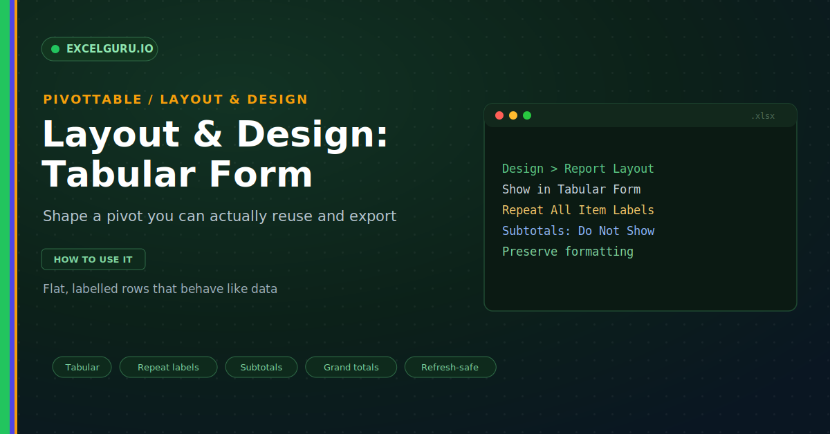
A PivotTable often looks fine on screen yet fails the moment you reuse it. You copy the result into another sheet, and the row labels sit in merged-looking gaps. Subtotals break your formulas, and the layout fights every filter. The cause is almost always the default design. Layout and design settings fix this. A few choices turn a cramped summary into a clean, flat report you can share or reuse.
This guide shows how to shape a PivotTable for any purpose. First, it compares the three report layouts. Then it covers repeating labels, subtotals, and formatting. Real steps and a full troubleshooting section follow. By the end, your pivots will read cleanly and export without a fight.
The Three Report Layouts
Excel offers three layouts on the Design tab. Compact is the default and stacks fields in one column. Outline gives each field its own column with subtotals on top. Tabular also splits the fields but reads like a flat table. The infographic below compares all three.
Compact looks neat for a quick on-screen view. However, it hides the field names and indents everything. Outline improves on that by naming each column. Meanwhile, Tabular gives the cleanest, most reusable shape.
Why Tabular Form Is Best for Reuse
Tabular form is the choice for serious work. Each field sits in its own labelled column. So the output looks and behaves like real data. As a result, you can filter, sort, or feed it onward with ease.
Repeat All Item Labels
Tabular form still leaves one gap to close. By default, a repeated label shows only once. The rows below it look blank, which breaks reuse. Repeat All Item Labels fills them in, as shown below.
Turn Subtotals and Grand Totals On or Off
Subtotals help a summary but ruin a data extract. Fortunately, you control both subtotals and grand totals. The Design tab holds a menu for each. The infographic below shows the options.
Blank Rows and Banded Styles
Small touches make a report easier to scan. A blank line between groups adds breathing room. Banded rows shade alternate lines for the eye. Together they lift a plain pivot into a polished report.
Keep Formatting on Refresh
A refresh can wipe out your careful formatting. It may also reset the column widths you set. Two options in PivotTable Options prevent this. So your design survives every data update.
Troubleshooting Layout and Design
All three problems below are the most common. Each has a clear cause and a quick fix.
Formatting disappears after a refresh
This is the most common design complaint. A refresh often strips manual formatting from the pivot. The fix lives in PivotTable Options, not in the cells. First, right-click the pivot and open PivotTable Options. Then go to the Layout and Format tab. There, tick "Preserve cell formatting on update". After that, your fonts, fills, and borders survive each refresh.
Repeat All Item Labels is greyed out
This means the pivot is still in Compact form. Repeat labels only works in Outline or Tabular. So Excel disables it while Compact is active. First, go to Design and then Report Layout. Next, choose Show in Tabular Form or Outline Form. The Repeat All Item Labels option then turns on. Click it, and every label fills down the column.
Column widths reset every time
Excel re-fits the columns on each refresh by default. So your careful widths snap back to automatic. This is a single setting, and it is easy to change. First, open PivotTable Options from the right-click menu. Then, on the Layout and Format tab, find the autofit box. Untick "Autofit column widths on update" and click OK. Your chosen widths now hold through every refresh.
Frequently Asked Questions
- Which PivotTable layout is best?+Tabular form is best for reuse and export. It gives each field its own labelled column. So the output reads like a real table. Compact suits only a quick on-screen glance.
- How do I fill in the blank row labels?+Switch to Outline or Tabular form first. Then go to Design and Report Layout. Finally, choose Repeat All Item Labels. Each row then carries its full label.
- How do I remove subtotals from a PivotTable?+Go to the Design tab and open the Subtotals menu. Then choose Do Not Show Subtotals. For a data extract, turn off grand totals too. So the result stays flat and clean.
- Why does my formatting vanish on refresh?+Because a refresh resets the pivot by default. So open PivotTable Options and the Layout and Format tab. Then tick "Preserve cell formatting on update". After that, your design survives each refresh.