What Is a PivotTable?
A PivotTable is Excel's built-in tool for summarising, grouping, and analysing large datasets interactively. Instead of writing complex formulas, you simply drag column headers into different areas and Excel instantly recalculates the result.
The key thing to understand: a PivotTable never changes your source data. It creates a separate view that you can reshape at any time. Think of it as a lens you move around your data to see different angles of the same information.
When should you use a PivotTable?
Reach for a PivotTable when you need to answer questions like: "Which product sold the most in Q3?" or "What's our average deal size by sales rep?" — any time you want to group, count, or total data across multiple categories at once.
| Region | Product | Quarter | Sales Rep | Revenue ($) |
|---|---|---|---|---|
| North | Laptop | Q1 | Alice | $4,200 |
| North | Phone | Q1 | Alice | $2,100 |
| North | Laptop | Q2 | Bob | $3,800 |
| South | Phone | Q1 | Carol | $1,900 |
| South | Laptop | Q2 | Carol | $3,600 |
| West | Laptop | Q1 | Dave | $5,100 |
| West | Phone | Q2 | Dave | $3,100 |
| + 5 more rows hidden for display | ||||
Notice how hard it is to answer "which region earns the most?" just by reading rows. A PivotTable answers that in seconds.
The Four Areas of Every PivotTable
Every PivotTable is controlled by four areas in the Field List panel. Understanding what each area does is the entire mental model — everything else flows from here.
Building Your First PivotTable
Let's walk through creating a PivotTable from our sales data. Follow these steps in Excel — it takes under two minutes once you've done it once.
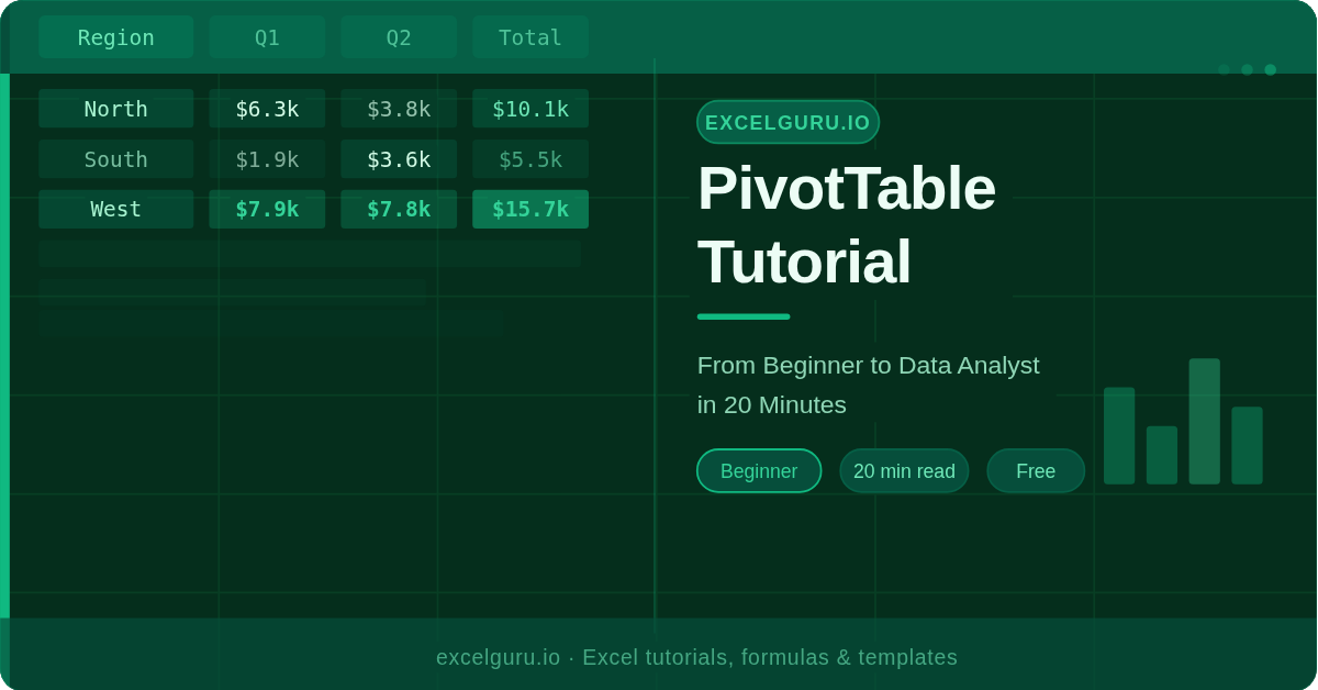
| Region | Q1 | Q2 | Grand Total |
|---|---|---|---|
| North | $6,300 | $3,800 | $10,100 |
| South | $1,900 | $3,600 | $5,500 |
| West | $7,900 | $7,800 | $15,700 |
| Grand Total | $16,100 | $15,200 | $31,300 |
Useful keyboard shortcuts
Changing How Values Are Calculated
By default, Excel uses Sum when you drop a numeric field into Values. Switching calculation types completely changes what question you're answering.
| Calculation | What it answers | Example use case |
|---|---|---|
| Sum | Total of all values | Total revenue per region |
| Count | How many records exist | Number of orders per rep |
| Average | Mean value | Average deal size |
| Max / Min | Highest or lowest value | Best / worst single sale |
| % of Grand Total | Contribution as percentage | Market share by product |
| % of Row Total | Share within each row | Q1 vs Q2 split per region |
To change the calculation: right-click any value cell → Summarise Values By → pick your calculation. For percentages and running totals, right-click → Show Values As.
Slicers: Visual Filters You Can Click
Slicers are visual button panels you click to filter your PivotTable instantly — and a single Slicer can control multiple PivotTables at once, making them ideal for dashboards.
To add a Slicer: click anywhere in your PivotTable → PivotTable Analyze tab → Insert Slicer → tick the fields you want to filter by.
Refreshing Data and Common Mistakes
PivotTables do not update automatically when you change your source data. You must refresh them manually — or set up automatic refresh on file open.
The most common PivotTable mistakes
| Mistake | What happens | Fix |
|---|---|---|
| Blank rows in source data | PivotTable stops at the first blank row | Remove blanks or use an Excel Table |
| Numbers stored as text | Count instead of Sum, totals are zero | Convert with Text to Columns or VALUE() |
| Merged cells in headers | Duplicate or missing column names | Unmerge all header cells first |
| Inconsistent date formats | Dates don't group by month or quarter | Ensure all dates use the same Excel format |
| Not refreshing after edits | Stale numbers, wrong totals | Always press Alt+F5 after changing source data |
Frequently Asked Questions
Yes. When creating the PivotTable, manually type or select the range from the other sheet in the dialog box. Alternatively, use Power Query to combine sheets first — ideal when your data spans multiple sheets or files.
This almost always means Excel found text or blank cells in your Revenue column. It treats mixed columns as text and defaults to Count. Fix the source data first, then refresh.
Yes — use Calculated Fields. In the PivotTable Analyze tab, click Fields, Items & Sets → Calculated Field. You can write a formula using existing fields (e.g. Revenue / Units to get average price) without touching your source data.
Yes. In Google Sheets, go to Insert → Pivot Table. The interface is slightly different but covers the same four areas. Slicers are available from the Data menu.
Power Pivot is a more advanced data modelling engine built into Excel. It handles millions of rows, lets you connect multiple tables without VLOOKUP, and supports DAX formulas for complex calculations. Think of it as PivotTables with superpowers.
Explore our full PivotTable course — PivotCharts, Power Pivot, DAX formulas, and dashboard design — all free on ExcelGuru.
Browse All Tutorials →