
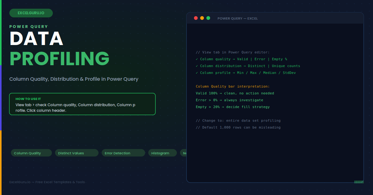
Before transforming imported data, you need to understand its quality and shape. Power Query's data profiling tools — Column Quality, Column Distribution, and Column Profile — provide this picture instantly without writing a single formula. Column Quality shows what percentage of each column's values are valid, empty, or in error. Column Distribution shows a frequency chart of unique vs duplicate values. Furthermore, Column Profile gives a full statistical summary including min, max, mean, median, and a value distribution histogram. Together they turn a 30-minute manual quality assessment into a 30-second visual scan. This guide covers all three profiling views, how to use them effectively, and six practical scenarios.
Enabling the Profiling Views
All three profiling tools live on the View tab in the Power Query editor. They are disabled by default and must be enabled for each editor session — they do not persist across sessions. So re-enable them each time you open the Power Query editor for a profiling task.
Column Quality — Valid, Error, and Empty
Column Quality adds a three-segment bar under each column header. Specifically, Valid is the percentage of non-null, non-error values — what you typically want to maximise. Additionally, Error shows the percentage that Power Query could not parse, often caused by incorrect type conversion. Finally, Empty shows the percentage of null or blank values. Hovering over the bar reveals the exact counts and percentages. Together, these three numbers immediately identify which columns need cleaning before any transformation steps are added.
Column Distribution — Spot Duplicates and Skew Instantly
Column Distribution adds a small histogram under each column header. Below the histogram, two numbers appear: the count of distinct values and the count of unique values. Specifically, distinct is the total count of different values (each counted once), while unique is the count of values that appear exactly once with no duplicates. The relationship between them immediately signals key data quality patterns without reading a single row of data.
Column Profile — Full Statistical Summary
Column Profile shows detailed statistics for the currently selected column in a panel at the bottom of the Power Query editor. Simply click any column header to see its profile. The statistics depend on the column's data type. For example, numeric columns show min, max, mean, median, and standard deviation. Similarly, text columns show the most common values and min/max string lengths. Date columns show the date range span and a timeline distribution. Clicking any bar in the histogram filters the preview to show only rows in that value range.
Example 1: Validate a Primary Key Column Before Joining
Before joining two tables on a key column, confirm the key is truly unique in both tables. Select the key column and check Column Distribution. If Distinct equals the row count and Distinct equals Unique, every value appears exactly once — the column is a valid primary key. If duplicates exist, however, a merge will produce unexpected row multiplication. Specifically, a merge between a 500-row table and a key with 50 duplicates can produce up to 550 output rows, silently inflating all downstream aggregations.
Example 2: Investigate Error Values Before Type Conversion
When Column Quality shows errors after a data type conversion step, right-clicking the error segment and choosing "Keep errors only" is the first diagnostic step. This filters the table to show only the error rows, revealing the source values immediately. Common causes include currency symbols in numeric columns ("£12,500"), European decimal formats ("12.500,00"), and text sentinel values ("N/A", "TBC") mixed into otherwise numeric data. Consequently, cleaning steps must be added before — not after — the type conversion step.
Example 3: Assess Missing Values Before Filling
Column Quality shows the empty percentage for every column simultaneously — providing a complete missing data overview in one view. Columns with 0% empty are complete and need no action. Columns with 1–5% empty have isolated gaps suitable for Fill Down or a default value. Columns with 20–80% empty are mostly absent — likely optional fields or a structural issue. Specifically, columns with 90%+ empty are essentially unused and strong candidates for removal before loading to the model.
Example 4: Detect Outliers Using the Histogram
The Column Profile histogram for a numeric column shows the distribution of values across ranges. Extreme outliers appear as isolated bars far from the main cluster — immediately visible without sorting or writing any formula. Simply click on an outlier bar in the histogram and the preview automatically filters to show only rows in that value range. This lets you inspect the specific records and decide whether they are genuine data points or entry errors that need correction before analysis.
Example 5: Text Column Audit — Check Category Consistency
The Column Profile "Most common values" list for a text column shows all distinct values with their occurrence counts. This immediately reveals category inconsistencies invisible in the raw data — for example, "Electronics", "electronics", "ELECTRONICS", and "Electronic" all appear as separate items, confirming a case and spelling problem. Right-clicking any value provides options to filter to those rows, helping you assess how widespread each variant is before applying Replace Values or Text.Proper to standardise the entire column.
Example 6: Date Column Range Validation
The Column Profile for a date column shows the earliest and latest dates present. For an order date column in a financial year query, the range should fall within the expected year boundaries. If the earliest date is in 1900 or the latest is in 2099, these are likely default or sentinel dates from the source system rather than real business dates. Similarly, Column Quality errors in a date column after type conversion reveal date strings that do not match the expected format — specifically, "01/13/2025" fails in a dd/mm/yyyy parser because month 13 does not exist.
Troubleshooting Data Profiling
All three issues below are the most common Power Query data profiling problems. Each has a specific fix that takes under two minutes to identify and apply.
Column Quality and Distribution bars are not visible
The profiling views must be enabled in the Power Query editor's View tab for each session — they do not persist by default. Go to View > Column quality, View > Column distribution, and View > Column profile and check each option. If the View tab is not visible, the Power Query editor may not be fully loaded — simply click into the query preview area and wait for the data preview to finish loading before checking the View tab options. Also verify you are in the Power Query editor window, not the main Excel worksheet.
Profiling shows 100% valid but errors appear after loading to the sheet
This almost always means profiling is set to "top 1,000 rows" and the errors exist only beyond row 1,000. Specifically, change to full-dataset profiling: click the "Column profiling based on top 1000 rows" link in the status bar at the bottom-left of the editor and select "Column profiling based on entire data set". Re-run the quality check. Full-dataset profiling is slower on large tables, however it gives accurate metrics that can be trusted for production data cleaning decisions.
Column Profile statistics are absent — the bottom panel is empty
Column Profile statistics appear only when a column header is actively selected. Simply click directly on the column header cell (the column name at the top of the column), not on a data cell within the column body. If you click a data cell rather than the header, the profile panel remains empty or shows the previous column's statistics. Also verify Column profile is enabled in the View tab. If the panel is visible but shows "No column selected", click the column header and the statistics will populate immediately.
Frequently Asked Questions
- How do I enable Column Quality and Column Profile in Power Query?+Open the Power Query editor by going to Data > Get Data and clicking Transform Data on any query. Go to the View tab in the ribbon. In the Data Preview group, check Column quality, Column distribution, and Column profile. Column Quality and Distribution bars appear immediately under each column header. Column Profile statistics appear in a bottom panel when you click a column header. These settings must be re-enabled each time you open the Power Query editor — they do not persist across sessions.
- Why does Power Query only profile the first 1,000 rows by default?+The default 1,000-row limit exists for performance — profiling millions of rows is computationally expensive and slows the editor. For data quality decisions, however, this limit is often misleading. To profile the complete dataset, click the status bar text at the bottom-left of the editor that reads "Column profiling based on top 1000 rows" and select "Column profiling based on entire data set". This setting applies only to the current editor session and reverts to 1,000 rows when you reopen the editor.
- What is the difference between distinct and unique in Column Distribution?+Distinct count is the number of different values in the column — each value counted once regardless of how many times it appears. Unique count, by contrast, is the number of values that appear exactly once — values with no duplicates at all. For example, in a column with values [A, A, B, C, C, C, D], the Distinct count is 4 (A, B, C, D) and the Unique count is 2 (B and D appear exactly once). A primary key column has Distinct = Unique = row count. A category column typically has Distinct much less than row count, with Unique potentially zero if every category appears more than once.
- Can I act on profiling results directly without writing M code?+Yes. Right-clicking the Column Quality or Column Distribution visualisations provides direct action options. Right-clicking the Error segment gives options to Remove Errors or Keep Errors Only for investigation. Right-clicking the Empty segment gives Remove Empty. Additionally, right-clicking values in the Column Profile "Most common values" list gives options to Filter Rows keeping or removing those values. These right-click actions add transformation steps directly to the Applied Steps pane, making data profiling both diagnostic and actionable within the same Power Query session without writing any M code manually.