As a team grows, its structure gets fuzzy. Who reports to whom, and how many people each manager carries, becomes surprisingly hard to answer.
This free reporting structure template makes it clear. You enter each reporting line, and the sheet counts direct reports and span of control. You will also find realistic sample data already inside the file. Therefore, you can explore every formula, dropdown and chart first, and then replace the samples with your own records in minutes.
Below, we explain the formulas, the workflow, and how to adapt the structure to your own organisation.
What Is a Reporting Structure?
A reporting structure records who each person reports to, their level and their department. It is the data behind any org chart.
From that data, it counts how many people each manager leads. As a result, you can see your structure and span of control clearly.
Why Does Reporting Structure Matter?
Unclear structure causes confusion, duplicated work and overloaded managers. People are unsure who decides, and accountability slips.
A clear structure fixes that. Therefore, everyone knows the reporting lines, and you can spot managers who are stretched too thin. Span-of-control data also supports sensible decisions when you reorganise.
Why Use This Template?
A clear structure keeps the organisation legible. In particular, this one helps you:
- Map every reporting line in one place.
- Count each manager’s direct reports automatically.
- Classify everyone as a manager or contributor.
- See headcount by level.
- Spot spans of control that are too wide or narrow.
What’s Inside the Template?
The workbook has four tabs:
- How to Use — a built-in guide.
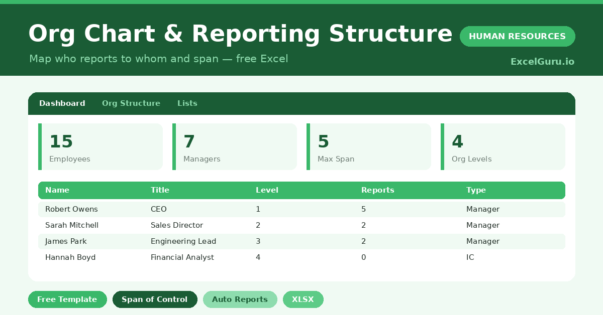
- Dashboard — managers, span and level KPIs.
- Org Structure — one row per employee.
- Lists — the department dropdown.
What Formulas Does the Template Use?
The structure uses dependable Excel formulas:
| Formula | What it does |
| =COUNTIF(Manager column, this name) | Counts each person’s direct reports. |
| =IF(Reports>0,”Manager”,”Individual Contributor”) | Classifies the role type. |
| =COUNTIF(Role Type,”Manager”) | Counts your managers. |
| =MAX(Direct Reports) | Finds the widest span of control. |
| =AVERAGEIF(Direct Reports,”>0″) | Calculates the average span for managers. |
How Do You Use the Template?
The structure is quick to build. Just follow these steps:
- Open the Org Structure tab and list everyone.
- Enter each person’s title, department and level.
- Set each person’s manager by name.
- Let direct reports and role type calculate.
- Check spans of control on the Dashboard.
- Review headcount by level.
What Are the Best Use Cases?
The structure fits many teams, such as:
- Founders mapping a growing team.
- HR teams documenting the organisation.
- Leaders planning a reorganisation.
- Managers checking their span of control.
- Anyone clarifying reporting lines.
How Can You Modify the Template?
You can tailor it freely. To add detail, insert columns for location or a second-line manager.
You can also use the level field to group the structure into clear tiers.
Moreover, the sheet covers 40 employees by default, and you can copy the formula row downward for more.
What Mistakes Should You Avoid?
A few habits weaken the structure. Therefore, avoid these common mistakes:
- Spelling manager names inconsistently, which breaks the count.
- Leaving the manager blank for anyone but the top.
- Ignoring very wide spans of control.
- Letting the structure drift out of date.
Tips to Get the Most From It
- Use names exactly so reporting links resolve.
- Watch for managers with too many reports.
- Keep the structure current as people move.
- Use levels to see the shape of the organisation.
Frequently Asked Questions
How are direct reports counted?
The sheet counts how many people name each person as their manager. So the spelling of names must be consistent for the count to work.
What is span of control?
It is the number of people who report directly to a manager. Very wide spans can overload a manager, while very narrow ones can signal too many layers.
Can it draw a visual org chart?
This template focuses on the structured data and span of control. You can feed that data into a drawing tool if you need a visual tree.
Why do names need to match exactly?
Direct reports are counted by matching manager names to employee names. A misspelling breaks the link, so consistency is essential.
Does it work in Google Sheets?
It does, with minor adjustments to formatting after importing.
Download the Template and Get Started
A clear structure is the backbone of a well-run team. This template maps your reporting lines and span in minutes.
Download the Org Chart & Reporting Structure Template and clarify your structure today.