
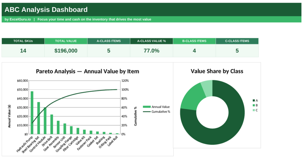
Not every item in your stockroom deserves the same attention. A handful of products usually tie up most of your money, while a long tail barely moves the needle. ABC analysis sorts them out, so you can focus your control where it counts. This free Excel template ranks every item by value, classifies each one into A, B or C, and shows the Pareto pattern at a glance. Below you will learn what ABC analysis is, the formula behind it, and how the template classifies each item.
What is ABC analysis?
ABC analysis is an inventory method that groups items by their value to the business. It rests on the Pareto principle, the familiar idea that roughly 80% of value comes from 20% of items.
The method sorts stock into three classes. Class A holds the vital few, the high-value items that make up most of your consumption value. Class B holds the middle ground. Class C holds the trivial many, low-value items that fill the shelves but tie up little money. Because A items carry the most value, they earn the tightest control, while C items can be managed loosely. So ABC analysis turns one long stock list into three clear priorities.
The ABC analysis formula
The classification runs on annual consumption value, not just quantity or price. A cheap part used constantly can outrank an expensive one that rarely sells.
Annual consumption value = Annual usage × Unit cost
Cumulative value % = running total of value ÷ total value
So you first multiply each item’s usage by its unit cost to get its value. Then you sort every item from highest value to lowest. Next you build a running total of value as a share of the whole, called the cumulative percentage. Finally you draw the class lines: items up to 80% of cumulative value fall into A, the next slice up to 95% into B, and the rest into C. So the split follows value, exactly as Pareto intended.
How the template performs ABC analysis
The template does every step for you once you enter each item with its usage and unit cost. The calculations sit in plain formulas you can follow.
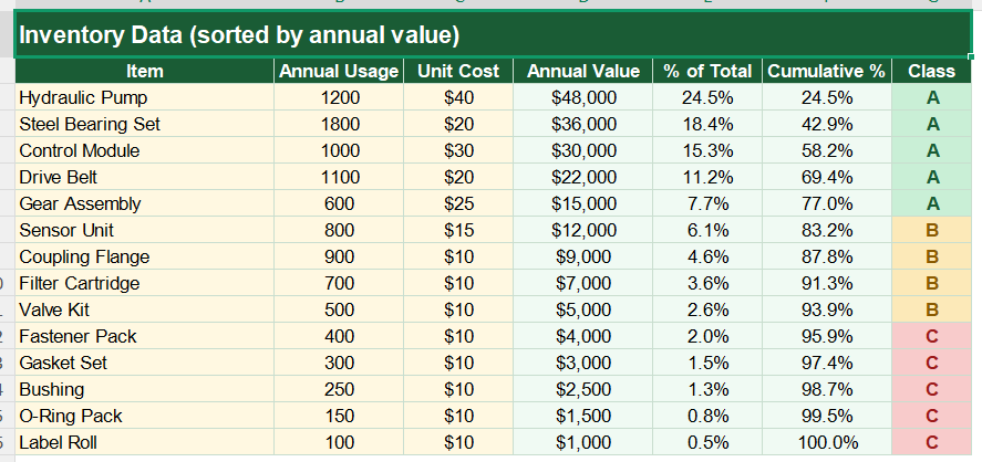
Each item’s value uses =B3*C3, the usage times the unit cost. Its share of the total uses =D3/SUM(D3:D16). The cumulative percentage uses =SUM($D$3:D3)/SUM($D$3:$D$16), a running total that grows as you move down the sorted list. The class then falls out of =IF(F3<=0.8,”A”,IF(F3<=0.95,”B”,”C”)), which reads the cumulative percentage and assigns A, B or C. To summarise, the dashboard uses SUMIF and COUNTIF to total the value and count the items in each class. So the whole classification updates the moment you change a figure.
A worked ABC example
Follow the top of a sample list and the logic shows through. Suppose a hydraulic pump sees 1,200 units of annual usage at 40 each.
Its consumption value is 1,200 times 40, or 48,000. Against a total of 196,000, that is about 24.5% of value, so its cumulative percentage starts at 24.5%. The next item, a bearing set, adds another 36,000 and pushes the cumulative figure to about 42.9%. A third item lifts it to roughly 58.2%. All three sit under the 80% line, so all three are class A. Because a few items climb the cumulative curve so quickly, they reveal themselves as the vital few worth the tightest control.
Reading the charts
The main chart is a Pareto view. Bars show each item’s value from largest to smallest, while a line tracks the cumulative percentage climbing toward 100%.
The steep early rise of that line is the Pareto effect in action, showing how fast a few items pile up value. The second chart is a doughnut that splits total value across the A, B and C classes. Because you see the ranking and the class split together, the priorities are obvious. So together the charts show both which items matter and how concentrated your value really is.
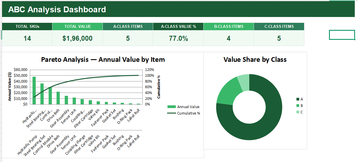
Count your A Class items and guard them closely. Tight reorder control on that small group protects most of your inventory value for the least effort.
Who uses ABC analysis
Inventory and warehouse managers use it to focus their control where value concentrates. It tells them which items to watch daily.
Procurement teams use it to prioritise supplier negotiations on high-value stock. Operations leaders use it to set stock policies by class. Small businesses use it to spend their limited time on the items that matter. Because almost every stockroom follows the Pareto pattern, the method suits many settings.
Making the template your own
The template is a starting point, not a fixed form. You can add items as your catalogue grows. You can move the 80% and 95% class lines to suit your own policy.
The dashboard bends to your needs, so you can classify by sales revenue instead of consumption value if that fits your business. A quick edit does it. You might also set different reorder rules for each class. The structure welcomes that kind of extension without complaint.
Managing every item the same way wastes effort on stock that barely matters. ABC analysis ranks your inventory by value and sorts it into three clear priorities, so your control lands where it counts. So download the template, enter your items, and let the Pareto pattern show you the vital few.