Every organization has a long list of expenses. Most cost-reduction efforts spread attention across all of them equally — a 5% target here, a review meeting there, a general directive to spend less. The result is modest savings distributed across costs that barely matter, while the few expenses that actually drive the majority of spending receive the same shallow attention as everything else.
The Pareto chart cost analysis approach works differently. It ranks every cost center by annual spend, calculates what percentage of total cost each represents, and builds a cumulative percentage line that makes the 80/20 rule visible at a glance. The top two or three cost centers — which typically account for 50 to 80 percent of all spending — become immediately obvious. Consequently, management effort concentrates where it generates the highest return.
This free Excel Cost Analysis with Pareto Chart Template gives you all of this in one structured sheet. Enter your cost centers and annual figures, and the template calculates percentages, cumulative totals, and the Pareto chart automatically. No manual sorting. No formula writing. No chart building.
Download the free Cost Analysis Pareto Chart Template and find your 80% within minutes.
What Is a Pareto Chart Cost Analysis?
A Pareto chart is a combined bar and line chart used to identify which factors account for the largest share of a total. In a cost analysis context, it displays each cost center as a descending bar — largest spend on the left, smallest on the right — alongside a rising cumulative percentage line that crosses the 80% threshold at the point where the dominant costs end.
The principle behind the chart is the Pareto principle, also known as the 80/20 rule. It observes that roughly 80 percent of effects come from 20 percent of causes. In cost analysis, this typically means that 2 or 3 of your 10 cost centers are responsible for the majority of all spending. The Pareto chart makes this relationship visible and precise — not approximate or anecdotal.
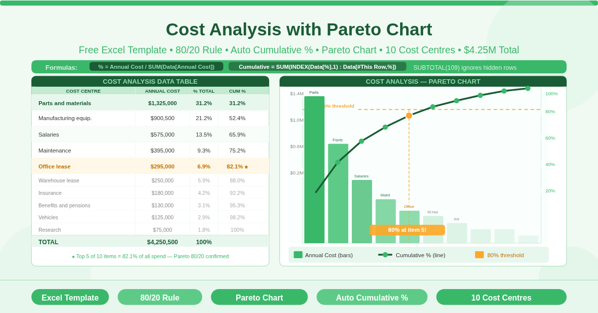
The template contains a single sheet, COST DATA and CHART, with a structured table named Data. The table drives both the calculations and the Pareto chart simultaneously.
The Cost Data Table — Three Calculated Columns
The template’s Data table has three active columns that do all the analytical work. Enter your cost centers and annual figures, and these columns calculate the Pareto analysis automatically.
Percent of Total
Each cost center’s share of total annual spend calculates using: = Annual Cost / SUM(Data[Annual Cost])
This formula uses the structured table reference Data[Annual Cost] to sum the entire cost column, making the percentage robust against row additions and deletions. Add a new cost center and all percentages recalculate instantly without any formula adjustments.
Cumulative Percent
The cumulative percentage column is the Pareto chart’s signature element. It uses a running SUM from the first row to the current row: = SUM(INDEX(Data[Percent of Total], 1) : Data[#This Row, Percent of Total])
This formula combines INDEX — which anchors the start of the sum range to row 1 of the Percent column — with a colon range reference that extends to the current row. The result is a cumulative running total that starts at the first (largest) cost center’s percentage and rises to 100% at the final row. This cumulative line is what gets plotted as the S-curve on the Pareto chart’s secondary axis.
The Total Row
The bottom of the table uses =SUBTOTAL(109, Data[Annual Cost]) and =SUBTOTAL(109, Data[Percent of Total]) for the totals. Function 109 sums only visible rows — so if you hide a cost center to explore a subset of the data, the totals and percentages recalculate to reflect only the visible items. This makes the template useful for scenario analysis as well as full portfolio review.
What Does the Sample Data Show?
The template ships with 10 real cost centers from a manufacturing operation, entered in descending order by annual cost. This ordering is essential — the Pareto chart requires costs to be sorted from largest to smallest for the cumulative line to rise correctly.
The ten cost centers and their annual figures are:
- Parts and materials: $1,325,000 — the largest single cost, representing 31.2% of all spending on its own.
- Manufacturing equipment: $900,500 — the second largest, bringing the cumulative total to 52.4% after just two items.
- Salaries: $575,000 — adds 13.5 percentage points, bringing cumulative spend to 65.9%.
- Maintenance: $395,000 — the fourth item raises cumulative spend to 75.2%.
- Office lease: $295,000 — the fifth item crosses the 80% threshold, bringing cumulative spend to 82.1%.
The remaining five cost centers — Warehouse Lease ($250,000), Insurance ($180,000), Benefits and Pensions ($130,000), Vehicles ($125,000), and Research ($75,000) — together account for only 17.9% of total spend. The total across all 10 items is $4,250,500.
This data illustrates the Pareto principle precisely. The top 5 of 10 cost centers — 50% of the categories — account for 82% of all annual spending. Furthermore, the top 2 alone (Parts and Equipment) account for more than half of everything spent.
How the Pareto Chart Works
Chart in the template plots both data series on a single chart with dual axes.
The vertical bar chart (primary axis, left) shows each cost center as a descending bar representing annual cost in dollars. The tallest bar — Parts and Materials — appears first on the left. Each subsequent bar decreases in height. This descending sequence is what makes the chart immediately readable: the most significant costs are always on the left.
The cumulative line chart (secondary axis, right) plots the Cumulative Percent column as a rising S-curve that starts near 0% for the first item and ends exactly at 100% at the final item. The 80% mark on the right axis creates a visual reference point. Any bar whose corresponding point on the cumulative line sits below 80% belongs to the dominant cost group. Any bar to the right of that threshold belongs to the long tail.
Together, these two chart elements make the Pareto principle not just a theory but a measurable, visual fact about your specific cost profile.
How to Adapt the Template to Your Organization
The template is straightforward to customize for any organization, industry, or cost review period.
- Replace the cost centers. Delete the 10 sample rows and enter your own cost categories in the Cost Center column. Use departments, product lines, vendors, project codes, or any grouping that matches your chart of accounts.
- Enter annual costs. Type each category’s annual spend in the Annual Cost column. The Percent of Total and Cumulative Percent columns calculate automatically. The Pareto chart updates simultaneously.
- Sort before analyzing. The template’s chart and cumulative percentage column assume costs are entered in descending order — largest first. Sort your data before entering it, or use Excel’s Data > Sort feature after entry to reorder the rows. The formulas update correctly after sorting.
- Add or remove rows. Because the table is a structured Excel table (Data), adding a new row inside the table boundary automatically extends all formulas. Click below the last row within the table and type a new cost center. The IFERROR formula replicates, the totals update, and the chart adds the new bar.
- Adjust for different time periods. The column header reads “Annual Cost” but the formulas contain no time-specific logic. You can use monthly, quarterly, or project-period costs equally well — simply relabel the column header to match your analysis period.
Practical Use Cases
- Manufacturing and operations managers reviewing annual overhead will use the Pareto chart to identify which cost centers justify renegotiation, process improvement investment, or engineering redesign. In the sample data, Parts and Materials alone at $1.325 million is the obvious starting point for any cost reduction initiative.
- Finance teams preparing annual budget reviews will use the cumulative percentage line to demonstrate to leadership which cost categories drive the bulk of spend — and therefore where budget scenario planning should focus first.
- Operations analysts comparing cost profiles across sites or business units will adapt the template for each unit, then compare the Pareto rankings to identify whether cost structure differences represent efficiency gaps or legitimate operational differences.
- Small business owners conducting their first structured cost review will use the descending bar chart to see their spending structure clearly for the first time. The visual format often reveals concentrations that a plain cost table obscures.
- Project managers reviewing project cost breakdowns will replace cost centers with work packages or cost codes, using the Pareto chart to identify which deliverables consume the majority of project budget.
Download the Free Pareto Chart Cost Analysis Template
Finding the 80% of your spending that comes from 20% of your cost centers takes one sheet, four columns, and the formulas already built into this template. Enter your cost centers, sort them by spend, and the Pareto chart does the rest.
Download the free Cost Analysis with Pareto Chart Template now and focus your cost management where it will actually make a difference.