
Judging a company on money alone is like driving while looking only in the mirror. Financial results tell you where you have been, not where you are heading. The balanced scorecard fixes that by measuring strategy across four connected perspectives. This free Excel template scores your measures in each perspective, shows how they balance, and flags what is on track. Below you will learn what the balanced scorecard is, the formula behind it, and how the template scores every measure.
What is a balanced scorecard?
The balanced scorecard is a strategic management framework created by Robert Kaplan and David Norton. It measures performance across four perspectives instead of relying on financial numbers alone.
Those four perspectives are financial, customer, internal process, and learning and growth. The financial perspective covers results such as revenue and margin. The customer perspective covers satisfaction and loyalty. The internal process perspective covers how well the business runs. The learning and growth perspective covers people, skills and culture. Because these perspectives feed one another, balancing them keeps strategy whole. So the scorecard links long-term capabilities to the financial results they eventually produce.
Why the four perspectives matter
Financial measures are lagging indicators. They report the outcome long after the decisions that caused it.
The other three perspectives act as leading indicators. Happy customers, smooth processes and skilled people drive tomorrow’s financial results. By watching all four together, you catch a weakness in learning or process before it drags the numbers down. So the balanced scorecard gives an early, rounded view that a profit figure alone can never offer.
The balanced scorecard formula
Each measure in the scorecard carries a target and an actual result. The scoring turns those two figures into a comparable achievement.
Achievement = Actual ÷ Target
Status: 100%+ On Target, 85–99% Near, below 85% Off Target
So you first divide each measure’s actual result by its target to get an achievement percentage. Then you average those achievements within each perspective to score the perspective, and average everything for an overall figure. A status flag reads each achievement and labels it on target, near or off target. So the framework rolls many measures into one clear picture of strategy.
How the template scores the balanced scorecard
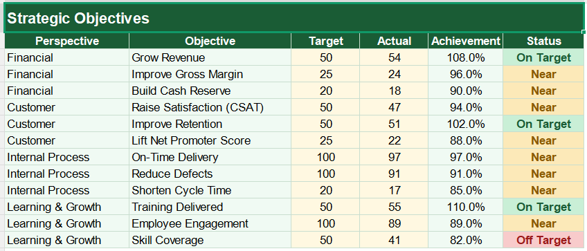
The template asks for your measures grouped by perspective, each with a target and an actual. From there it scores everything for you.
Achievement appears as =D3/C3, the actual over the target. The status uses =IF(E3>=1,”On Target”,IF(E3>=0.85,”Near”,”Off Target”)). Each perspective score uses AVERAGEIF, which averages only the measures in that perspective, while the overall score uses AVERAGE across every measure. The dashboard counts the on-target measures with COUNTIF. So the whole scorecard updates the moment you enter a new result.
A worked scorecard example
Take one measure and the maths is simple. Suppose a customer-satisfaction score has a target of 90 and comes in at 87.
Its achievement is 87 divided by 90, which is about 96.7%. Because that sits above 85% but below 100%, the status reads near. Averaged with the other customer measures, it sets the customer-perspective score, which in turn feeds the overall figure. So a single measure flows all the way up to the headline number.
Reading the charts in Dashboard
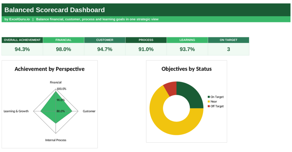
The main chart is a radar with four points, one for each perspective. The shape it draws shows instantly whether your strategy is balanced.
A wide, even shape means every perspective is performing, while a dented one exposes a weak area. The second chart is a doughnut that splits measures by status. Because you see the balance and the status together, the gaps are obvious. So together the charts show both the shape of your strategy and where it needs work.
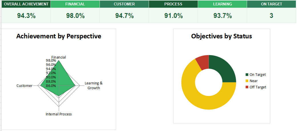
Look for the dent in the radar. A perspective lagging behind the others is where a small improvement does the most to rebalance your whole strategy.
Who uses a balanced scorecard
Executives use it to translate strategy into measurable goals. It keeps the whole company pointed the same way.
Managers use it to track performance beyond the financials. Consultants use it to structure a client’s strategy. Business owners use it to balance short-term results with long-term health. Because every organisation needs more than a profit figure, the scorecard suits many settings.
Making the template your own
The template is a starting point, not a fixed form. You can swap in your own measures and targets. You can add measures to any perspective.
The dashboard bends to your needs, so you can adjust the status thresholds to be stricter or gentler. A quick edit does it. You might also add an owner to each measure so accountability is clear. The structure welcomes that kind of extension without complaint.
A business measured on money alone is flying half blind. The balanced scorecard scores strategy across four connected perspectives, so you see the drivers of tomorrow’s results, not just yesterday’s numbers. So download the template, enter your measures, and turn your strategy into a scorecard you can steer by.
Add another measure and the averaging becomes clear. Suppose a financial measure targets a 20% margin and delivers 21%.
Its achievement is 21 divided by 20, or 105%, so its status reads on target. Averaged with the other financial measures, it lifts the financial-perspective score above target. Because each perspective is simply the average of its own measures, one strong result pulls its perspective up while a weak one drags it down. So the scorecard stays sensitive to every measure you track.