
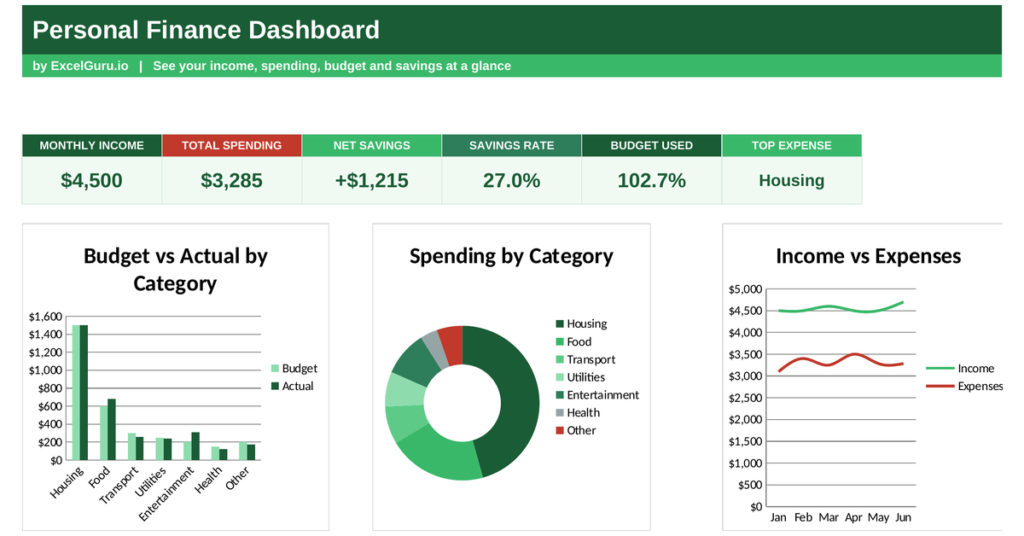
Most people know roughly what they earn, but far fewer know where it all goes. That gap is where budgets quietly fail. A personal finance dashboard closes it, turning your income and spending into one clear picture of what you keep. This free Excel template tracks your budget against actual spending, works out your savings rate, and shows where your money goes. Below you will learn what a personal finance dashboard tracks, the formulas behind it, and how the template calculates each figure.
What is a personal finance dashboard?
A personal finance dashboard is a single view of your money. It brings income, spending and savings together in one place.
It shows what you earn, what you spend by category, how much you save, and how closely you stick to your budget. Because money leaks away in small amounts that are easy to miss, seeing it all together changes behaviour. So a personal finance dashboard turns a vague sense of your finances into hard numbers you can act on.
Why track your money this way
You cannot manage what you do not measure, and personal spending is easy to lose track of. Small, frequent costs add up in ways a bank balance hides.
Watching income against spending reveals whether you are truly saving or slowly slipping. Breaking spending into categories shows which habits cost the most. Because awareness is the first step to control, simply seeing the numbers often changes them. So the dashboard is as much a behaviour tool as a record.
The savings rate formula
Two figures tell you most of what you need to know: your savings rate and your budget adherence. Both compare simple totals.
Net savings = Income − Total spending
Savings rate = Net savings ÷ Income
Budget used = Total actual ÷ Total budget
So net savings is simply what is left after spending, and the savings rate expresses that as a share of income. A higher rate means more of every pound kept. Budget adherence divides your actual spending by your planned budget, showing whether you stayed within plan. So a few divisions turn your monthly numbers into a clear verdict on your finances.
How the personal finance dashboard calculates the figures
The template needs your income, plus your budget and actual spending by category. From there it does the maths for you.
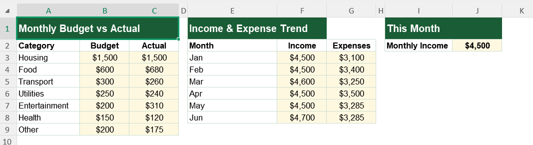
Total spending appears as =SUM(Budget!C3:C9), adding every category’s actual spend.
Net savings uses =Budget!J2-SUM(Budget!C3:C9), income minus spending.
The savings rate uses that net figure divided by income, and budget adherence uses =SUM(actual)/SUM(budget).
To name your biggest cost, the dashboard uses INDEX and MATCH on the highest actual spend. So every figure updates the moment you record a transaction.
A worked savings example
Put numbers in and the picture is clear. Suppose you earn 4,500 in a month and spend 3,285 across all categories.
Your net savings are 4,500 minus 3,285, which is 1,215. Your savings rate is 1,215 divided by 4,500, or 27%. Meanwhile the dashboard scans your categories and flags whichever cost the most, often housing or food. So a healthy month shows up as a solid savings rate and spending within budget.
Reading the charts
The first chart compares your budget with actual spending by category, so overspending stands out at once. The second chart is a doughnut splitting your spending, showing where the money really goes.
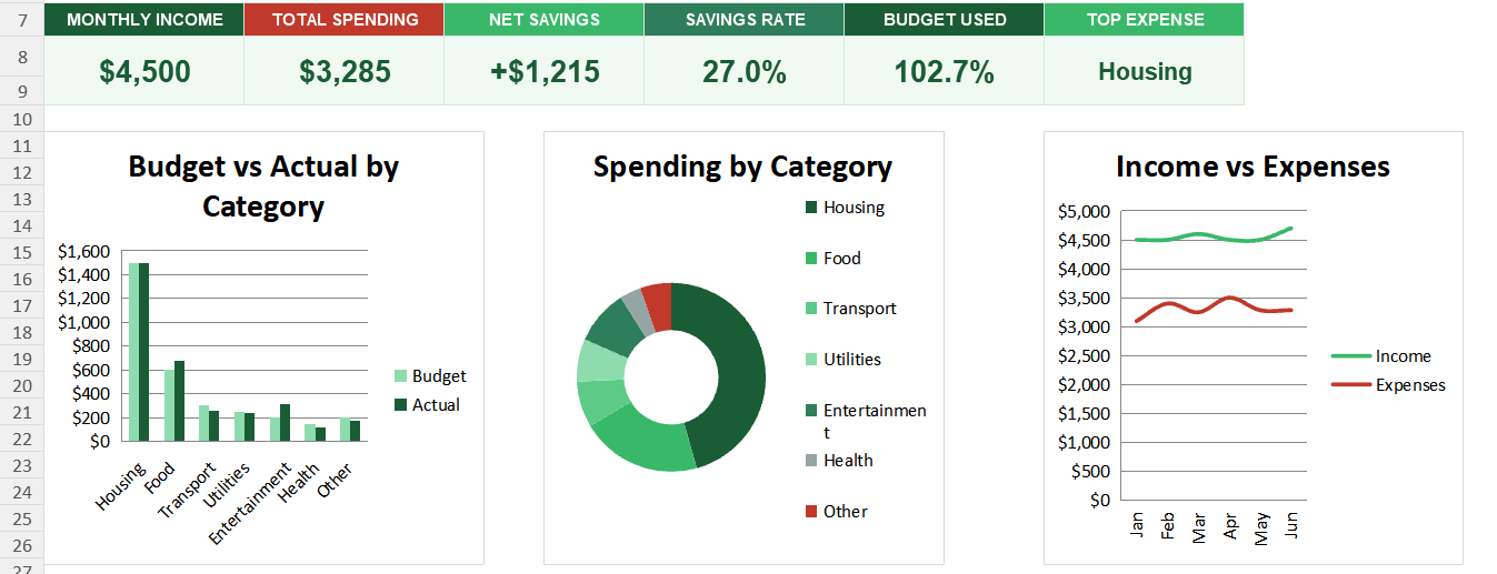
The third chart plots income against expenses month by month, revealing whether you are pulling ahead or falling behind. Because you see the categories and the trend together, the full picture emerges. So together the charts show both where your money goes and how your finances move over time.
Watch your savings rate, not just your balance. A healthy rate each month builds wealth steadily, even when the account balance barely seems to move.
Who uses a personal finance dashboard
Anyone trying to save uses it to see where their money goes. It makes spending visible.
Budgeters use it to stick to a plan. Couples use it to manage shared finances. People clearing debt use it to free up cash. Because everyone earns and spends, the dashboard suits almost anyone.
Making the template your own
The template is a starting point, not a fixed form. You can change the categories to match your life. You can extend the trend across a full year.
The dashboard bends to your needs, so you can add a savings-goal tracker alongside your spending. A quick edit does it. You might also split spending into needs and wants. The structure welcomes that kind of extension without complaint.
Money slips away fastest when nobody is watching it. A personal finance dashboard shows what you earn, what you spend and what you keep, so your finances stop being a mystery. So download the template, enter your income and spending, and turn a vague sense of your money into a clear plan.
A simple budgeting rule
If a full budget feels daunting, a simple rule can start you off. One popular guide splits income three ways.
It suggests putting around half toward needs, a third toward wants, and the rest toward savings and debt. The exact split matters less than having one, because a rough plan beats no plan at all. So you can use the template to test your own spending against a rule like this and adjust from there.