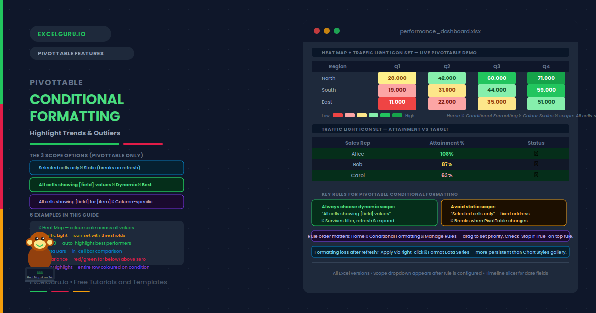
PivotTable Conditional Formatting: Highlight Trends & Outliers
A PivotTable showing 200 rows of revenue data tells you everything and nothing at once. Conditional formatting changes that — it applies color scales, icon sets, data bars, and threshold rules automatically, so outliers and top performers become visible at a glance. The key is choosing the right scope. Using “Selected cells only” creates a static rule that breaks the moment you filter or refresh the table. Using “All cells showing [field] values” creates a dynamic rule that follows the data everywhere it moves. This guide covers all three PivotTable scope options, with six practical examples: a green-yellow-red heat map across all revenue cells, a traffic light icon set with exact percentage thresholds, a Top 10 auto-highlight that recalculates on filter, data bars for in-cell visual comparison, a positive/negative variance rule pair, and a formula-based row highlight with a warning about its limitations.