
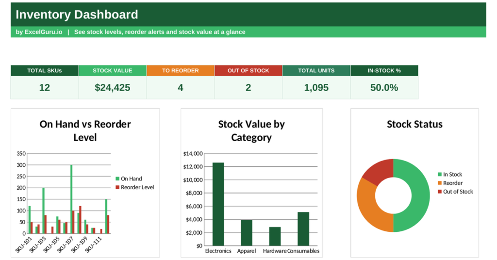
Run out of a best-seller and you lose the sale; overstock a slow mover and you freeze your cash. Good stock control lives between those two mistakes. An inventory dashboard keeps you there, showing what you hold, what it is worth, and what needs reordering right now. This free Excel template values every item, checks it against its reorder point, and flags the stock that needs attention. Below you will learn what an inventory dashboard tracks, the reorder formula, and how the template works it all out.
What is an inventory dashboard?
An inventory dashboard is a single view of your current stock position. It turns a long product list into clear, actionable status.
It shows how many units you hold, what your stock is worth, and which items are running low or have run out. At its heart sits the reorder point, the stock level that triggers a new order. Because holding too much or too little both cost money, the dashboard keeps you balanced. So an inventory dashboard turns a static stock list into a live control tool.
How reorder points work
A reorder point is the stock level at which you should place a new order. Set it right and fresh stock arrives just as the old runs low.
Stock value = On-hand quantity × Unit cost
Status: 0 units Out of Stock, at or below reorder point Reorder, otherwise In Stock
So each item carries a reorder point based on how fast it sells and how long resupply takes. When on-hand stock falls to that level or below, the item flags for reorder. When it hits zero, it flags as out of stock. Because the status updates the moment stock changes, you never have to scan the whole list by hand. So the reorder point does the watching for you.
How the inventory dashboard calculates status
The template needs each item with its on-hand quantity, reorder point and unit cost. From there it values and flags everything.
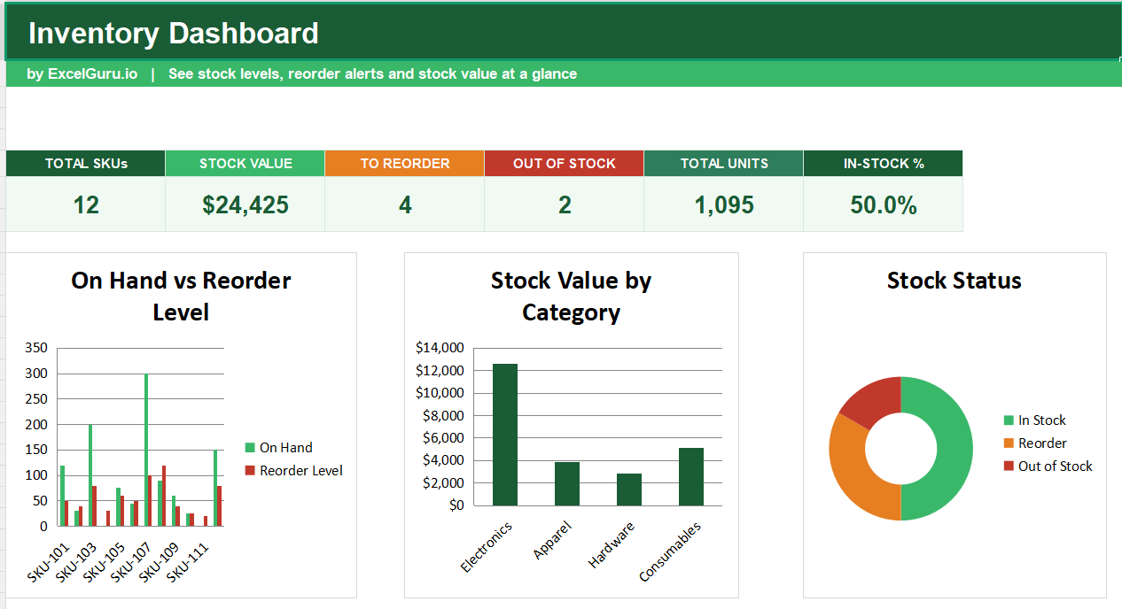
Stock value appears as =C3*E3, the on-hand quantity times the unit cost. The status uses =IF(C3=0,”Out of Stock”,IF(C3<=D3,”Reorder”,”In Stock”)), comparing on-hand stock with the reorder point. The dashboard then counts the items needing reorder and those out of stock with COUNTIF, totals stock value with SUM, and works out the in-stock share. So every flag updates the moment you change a quantity.
A worked stock example
Follow one item and the logic is clear. Suppose you hold 8 units of a product with a reorder point of 10 and a unit cost of 25.
Its stock value is 8 times 25, or 200. Because 8 sits at or below the reorder point of 10, the item flags for reorder. Had the quantity been zero, it would flag as out of stock instead, and above 10 it would read in stock. So each item earns a clear status from a simple comparison.
Reading the charts
The first chart compares on-hand stock with the reorder level for each item, so low stock stands out at once. The second chart shows stock value by category, revealing where your money sits.
The third chart is a doughnut that splits items by status, showing how many are in stock, need reorder or have run out. Because a large reorder or out-of-stock slice signals trouble, it flags a supply problem instantly. So together the charts show both what you hold and what needs action.
Set reorder points from real lead times. An item that takes two weeks to restock needs a higher reorder point than one that arrives overnight, so you never run dry mid-resupply.
Who uses an inventory dashboard
Inventory and warehouse managers use it to keep stock at the right level. It tells them what to order today.
Retailers use it to avoid empty shelves on popular lines. Small businesses use it to control stock without costly software. Operations teams use it to track stock value. Because every business holding stock needs this view, the dashboard suits many settings.
Making the template your own
The template is a starting point, not a fixed form. You can add items as your range grows. You can change the categories to match your business.
The dashboard bends to your needs, so you can add a supplier column to speed up reordering. A quick edit does it. You might also add a preferred order quantity for each item. The structure welcomes that kind of extension without complaint.
The cost of getting stock wrong
Stock errors cut both ways, and both are expensive. Getting the balance right is what protects your margin.
Run out of a popular item and you lose the sale, and sometimes the customer for good. Overstock a slow mover and your cash sits frozen on the shelf while holding costs mount. Between those two failures lies healthy stock control, and it depends on knowing your position at all times. So a dashboard that flags low stock early and highlights where value concentrates pays for itself quickly. Because both mistakes creep up quietly, a live view is the surest way to avoid them.