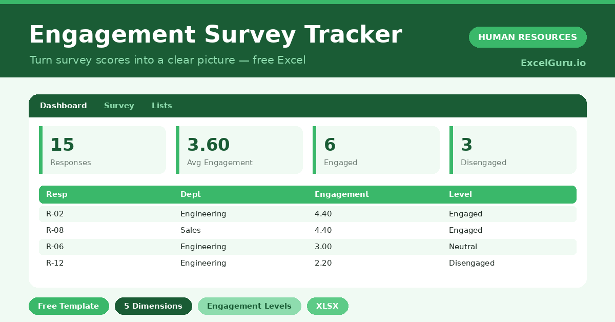
Marketing Expense Tracker Excel template preview with KPI cards for total expenses, paid expenses, pending expenses, and vendors in a clean green ExcelGuru-style design.

Marketing Expense Tracker

Stay on top of every marketing cost with this free Marketing Expense Tracker Excel Template. Record expenses by campaign, vendor, category, date, owner, payment status, and budget allocation while tracking actual spend against planned budgets. Ideal for marketers, agencies, startups, and business owners who need a simple Excel-based system to manage marketing expenses and improve budget control.

Power Pivot KPI feature image showing a PivotTable with four regions where North has 102% attainment and a green traffic light, South has 82% and a yellow light, East has 67% and a red light, and West has 98% and a green light, alongside the three status threshold zones (Bad below 80%, Neutral 80-95%, Good 95%+), the Total Revenue DAX measure, the five-step KPI creation path through Power Pivot Manage, and six example pills including Revenue vs Budget, Customer Satisfaction, Defect Rate lower-is-better, and YoY Growth.

Power Pivot KPIs: Create Key Performance Indicators with Icons in Excel

A KPI in Power Pivot is more than a number — it is a comparison with a visual verdict. You define a base measure (Actual Revenue), a target (Budget Revenue), and two threshold values that divide performance into bad (red), neutral (yellow), and good (green). Power Pivot calculates the ratio automatically and displays a traffic light, arrow, or star icon in the PivotTable alongside the value and the goal. No conditional formatting setup is needed — the logic lives in the data model and updates on every refresh. This guide covers the full five-step creation workflow, the three KPI components, how to handle reversed thresholds for metrics where lower is better (defect rate, churn), Year-over-Year growth KPIs with a zero baseline, Sales Attainment with star rating icons, and the correct way to display Value, Goal, and Status fields together in a polished PivotTable layout.

Power Query Fuzzy Matching feature image showing a company name match table where Microsoft Ltd matches Microsoft Limited with a similarity score of 0.82 in green and IBM UK fails to match IBM United Kingdom at 0.68 below the 0.75 threshold in yellow, a Transformation Table panel showing Ltd mapped to Limited and Corp. mapped to Corporation, a five-step threshold selector from 0.9 strict to 0.5 risky, and six example pills including company name matching, self-merge deduplication, product normalization, and performance at scale.

Power Query Fuzzy Matching: Merge Tables with Approximate Text Joins

“Microsoft Corp.” in one table. “Microsoft Corporation” in the other. A standard merge returns zero matches. Fuzzy matching solves this by joining rows based on similarity rather than exact equality — you set a threshold between 0 and 1, and any pair scoring above it is treated as a match. The Transformation Table feature takes this further, letting you pre-map known abbreviations (Ltd → Limited, Corp. → Corporation) so they match exactly before the similarity calculation even runs. This guide covers the five-step fuzzy merge workflow, the similarity threshold selector, when to use the Transformation Table, a self-merge technique for finding near-duplicate names within a single table, product name normalisation, performance strategies for large datasets, and a frank assessment of when cleaning the data first with Trim, Text.Lower, and exact replacements is a faster and more reliable alternative to fuzzy matching.

Power Query Fill Down feature image showing a before-and-after HR report where the Department column had null cells below Engineering and Finance labels, and after Fill Down every row shows the correct department name in green or purple, alongside the Table.FillDown M code, a Fill Up example showing a Travel footer label propagated upward, six example pills including merged cells fix and running total, and a warning that Fill Down crosses group boundaries if blank separator rows are not removed first.

Power Query: Fill Down & Fill Up to Replace Nulls with Above or Below Values

Exported reports often put a category label in the first row of each group and leave blank cells below for all other rows in that group. This looks tidy in a formatted report but breaks every formula and PivotTable that expects each row to be self-contained. Fill Down fixes it instantly — it replaces every null with the last non-null value above it, propagating the label through all rows in the group. Fill Up does the reverse, pushing a footer label upward through null cells above it. The critical detail most users miss: Fill Down only replaces null, not empty strings. This guide covers the five-step workflow, how to convert empty strings to null before filling, how to prevent Fill Down from bleeding across group boundaries, and six examples including classic category propagation, merged-cell repair, footer label fill-up, multi-column simultaneous fill, and a running balance using List.Accumulate.

Power Query Group By feature image showing a grouped sales summary table with North GBP 88,500 revenue, 342 orders, and GBP 258.77 average order value, alongside the Table.Group M code for multiple aggregations, the advanced multi-column grouping pattern using Region and Product, the distinct count formula using Table.Distinct inside the group expression, and six example pills including SUMIF equivalent and weighted average.

Power Query Group By: Sum, Count, Average, and Custom Aggregations

Fifty thousand transaction rows need to become a clean summary — total revenue by region, order count by product, average order value by month. Power Query’s Group By builds this in a few clicks and delivers a real flat table you can load anywhere, merge into other queries, or use as a lookup source. Advanced mode lets you add multiple group columns and multiple aggregations simultaneously. The All Rows aggregation type unlocks custom M expressions for patterns the UI doesn’t natively support — distinct customer counts, SUMIF-style conditional sums, and weighted averages. This guide covers both Basic and Advanced mode, six worked examples including regional revenue summaries, multi-metric aggregations, distinct customer counts, conditional aggregation using Table.SelectRows inside a group, and a revenue-weighted average price pattern.

Excel tutorial showing how to add an index column for custom sorting and organizing data in a specific order

Power Query: Add Index Column & Custom Sorting in Excel

Need more control over how your Excel data is sorted? This practical tutorial shows you how to add an index column to create a custom sorting order and organize rows exactly the way you want. Learn how to assign numerical or sequential index values, use them to control the order of categories, and sort your data without changing the underlying information. This technique is useful for custom category orders, priority lists, workflow stages, reporting, dashboards, and structured data analysis. Ideal for Excel users, analysts, data professionals, and anyone who needs more flexibility than standard alphabetical or numerical sorting.

Power Query Remove Duplicates feature image showing a before-and-after table where a duplicate ORD-101 row is marked Removed in red while the first occurrence is marked Kept in green, the M code index trick pattern using Table.AddIndexColumn and Table.Sort Descending, four method cards covering all-columns, key-column, sort-first, and index-trick approaches, and six example pills including exact row deduplication and case-insensitive matching.

Power Query: Remove Duplicates & Keep First or Last Occurrence

Fifty thousand rows and duplicates inflating every total — Power Query’s Remove Duplicates fixes this in one step. But there’s a choice most people miss: which duplicate survives? Power Query always keeps the first row it encounters in the current order. Sort the table before deduplicating and you control exactly which row wins — the most recent, the highest-value, or the last entry received. This guide covers four deduplication patterns: entire-row exact matching, single-column key deduplication, the sort-first technique for keeping the most recent record, and the index-column trick that guarantees the last original row is preserved. Six worked examples include removing CRM duplicates, keeping one row per customer, flagging duplicates for manual review, composite-key deduplication, and case-insensitive matching.

Paid Ads Budget Tracker Excel template preview with KPI cards for budget, spend, remaining budget, and ROAS in a clean green ExcelGuru-style design.

Paid Ads Budget Tracker

Track and control your paid advertising spend with this free Paid Ads Budget Tracker Excel Template. Monitor planned budget, actual ad spend, remaining budget, impressions, clicks, conversions, CPC, CPM, CTR, CPA, ROAS, and campaign performance in one clean Excel dashboard. Ideal for marketers, agencies, and business owners managing Google Ads, Meta Ads, LinkedIn Ads, TikTok Ads, or other paid media campaigns.

Campaign Budget and ROI Excel template preview with KPI cards for budget, spend, revenue, and ROI in a clean green ExcelGuru-style design.

Campaign Budget and ROI

Measure campaign profitability with this free Campaign Budget and ROI Excel Template. Track planned budget, actual spend, campaign revenue, ROI, ROAS, cost variance, and performance by campaign in one easy-to-use Excel file. Ideal for marketers, agencies, founders, and business owners who want a simple way to compare marketing spend against returns and make better budget decisions.

Marketing Budget Excel template preview with KPI cards for total budget, actual spend, remaining budget, and variance in a clean green ExcelGuru-style design.

Marketing Budget

Plan and control your marketing spend with this free Marketing Budget Excel Template. Track campaign budgets, actual costs, remaining budget, monthly burn rate, owners, timelines, and key performance indicators in one clean Excel dashboard. Ideal for business owners, founders, agencies, and marketing teams that need a simple, editable budget tracker for better planning and reporting.

Power Query Split Column into Rows feature image showing a before-and-after comparison where a cell containing "Excel, Charts, Reporting" for product P001 is expanded into three separate green-highlighted rows (one per tag), alongside the five-step process, the M code pattern using Table.ExpandListColumn, six example pills including product tags and survey multi-select, and a tip to always include a unique ID column before splitting.

Power Query: Split Column by Delimiter into Rows (Not Columns)

When a cell holds “London, Paris, Berlin” and you need three separate rows, Split Column into Rows is the answer. Unlike Split to Columns — which creates a wide, ragged table with empty cells — splitting to rows stacks every value vertically under the same header. The result is clean, normalized data that works perfectly with PivotTables and Power Pivot relationships. This guide walks through the full five-step process, explains how to handle comma, semicolon, and line-break delimiters, shows how to remove blank rows caused by trailing delimiters, and covers six worked examples including product tag expansion, multi-select survey answers, mixed delimiter handling, and a rejoin-after-split pattern for tag popularity scoring.

PivotChart vs Regular Chart in Excel — showing a Region slicer with North and East selected driving a live bar chart with quarterly revenue grouped by region in green and indigo bars, a five-row feature comparison table marking PivotChart with green ticks for filter response, slicer support, and drill-down and Regular Chart with red crosses for those same features, six example pills from filtered bar chart through combo chart and dashboard card, and a how-to note for creating a PivotChart via PivotTable Analyze.

PivotChart vs Regular Chart: Dynamic Visualizations from PivotTables

A regular chart reads a fixed range and stays fixed. A PivotChart is linked directly to a PivotTable — every filter, slicer click, and field expansion instantly redraws the chart with no manual editing required. Change the Region slicer from All to North and East, and the bars update in real time. Expand a Year node and the quarterly breakdown appears automatically. This guide explains exactly how PivotCharts work and how they differ from regular charts, with a clear decision rule for choosing between them. Six practical examples cover: a filtered column chart that updates with PivotTable filters, a slicer-connected chart shared across multiple PivotTables, a drill-down hierarchy chart from year to quarter to month, a dynamic trend line driven by a Timeline slicer, a Combo chart pairing revenue bars with a margin percentage line on a secondary axis, and a polished dashboard card with field buttons hidden and formatting locked. It also explains why Scatter and Bubble charts are not supported in PivotCharts and how to work around this using GETPIVOTDATA.