Home Maintenance Schedule
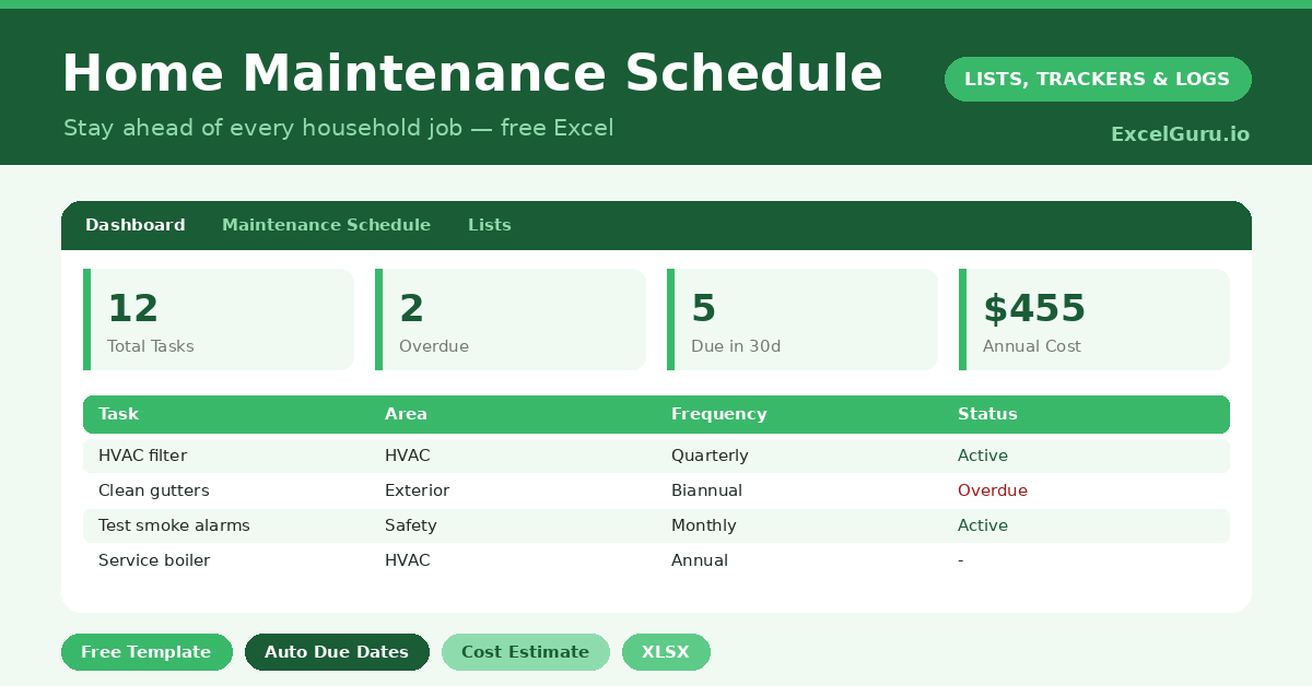
Keep your home maintenance tasks organized with this free Home Maintenance Schedule Excel Template. Track repair tasks, service dates, room or area, priority level, assigned person, estimated costs, completion status, and next maintenance dates in one simple Excel file. Ideal for homeowners, families, landlords, tenants, and property managers who need an easy way to plan repairs, prevent missed maintenance, and manage household upkeep.