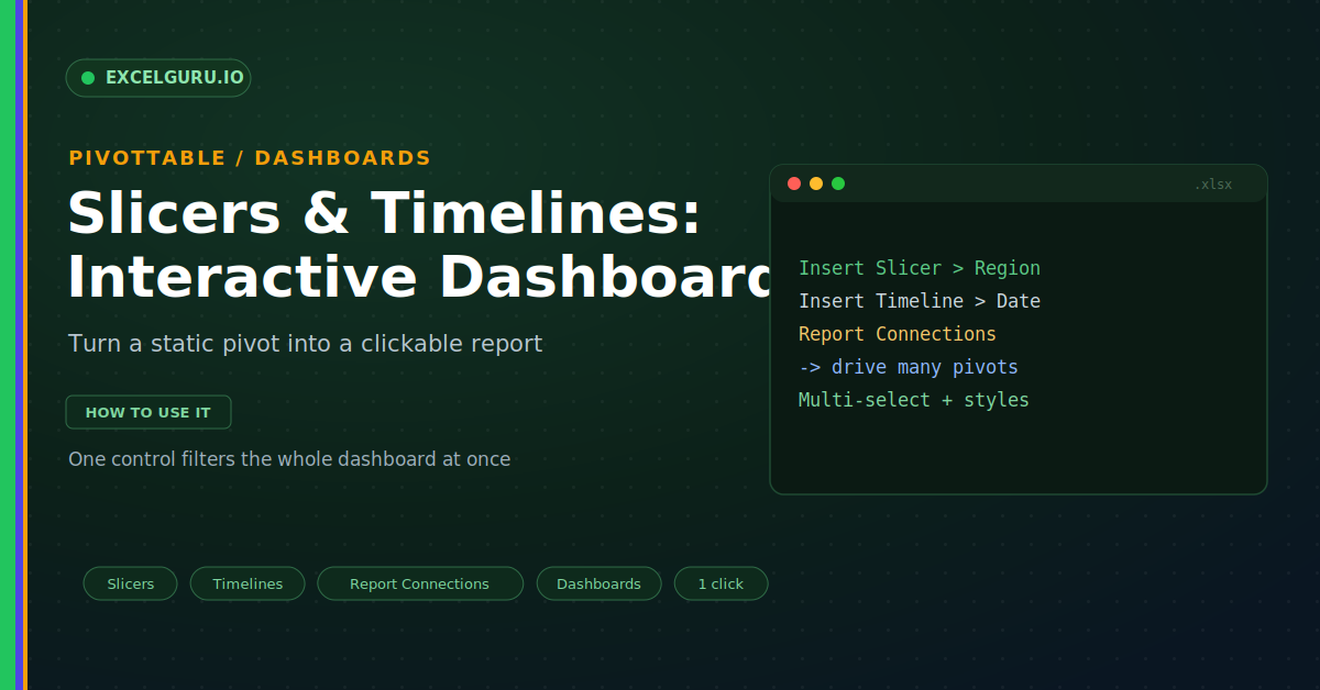
PivotTable Slicers & Timelines: Interactive Dashboards Made Easy
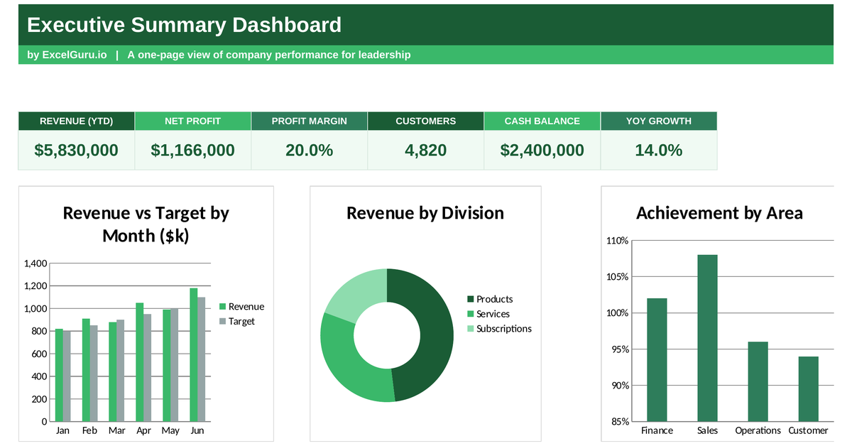
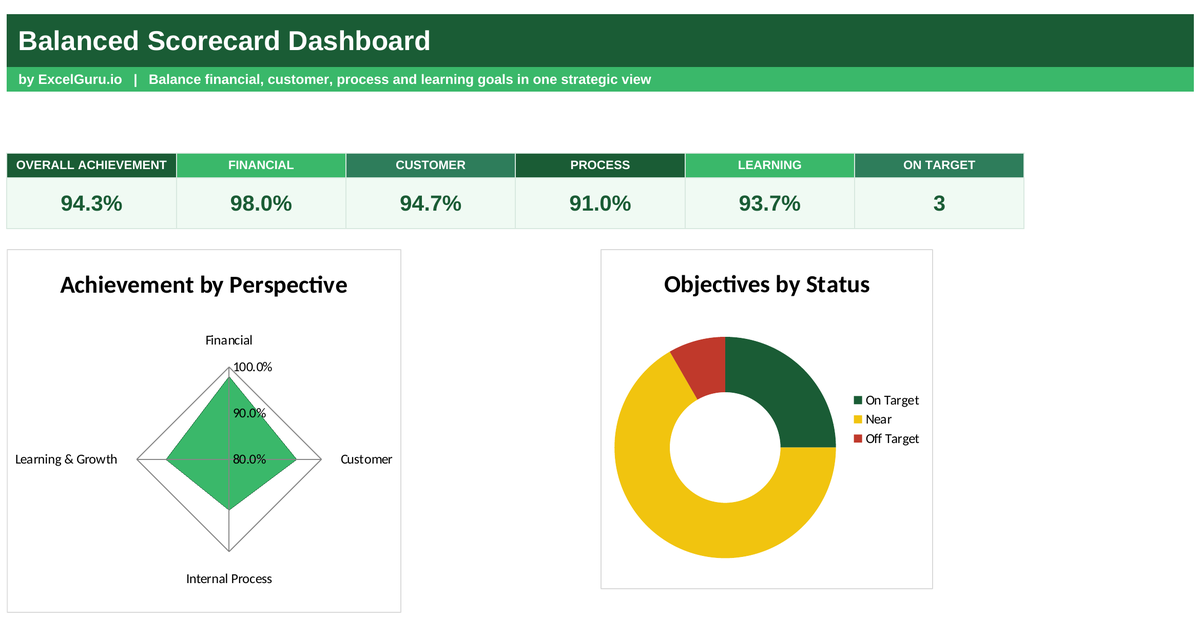
Turn static PivotTable reports into interactive Excel dashboards with Slicers and Timelines. This practical tutorial explains how to add visual filters to PivotTables, filter data by categories, and use Timelines to quickly analyse dates and time periods. Learn how to connect Slicers to multiple PivotTables, create cleaner reports, and give users an easier way to explore large datasets without changing formulas. Ideal for Excel users, analysts, accountants, finance professionals, managers, and anyone who wants to build more interactive reports and dashboards.